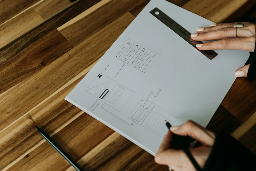

The real strength of a great website lies in the experience it gives people, not in flashy visuals alone. Successful website design goes beyond surface appeal. It guides visitors smoothly from one step to the next, builds meaningful connections between a business and its audience, and ultimately delivers results that can be measured.
At our London web design agency, we approach every project as both a creative and technical challenge, with UX at the centre.
Over the years, we’ve partnered with businesses to create exceptional websites across different industries, from ballet coaching platforms, private aviation providers, and investment platforms to sports medicine clinics.
Each project brings its own requirements, but one constant remains: UX decisions shape outcomes. We’re sharing five lessons we’ve learned from key projects that show how thoughtful design choices not only solve immediate challenges but also prepare websites for long-term growth.
Ballet With Isabella
The Challenge
Ballet With Isabella is a global online platform for adult ballet learners. Founded by Isabella, a renowned professional dancer who trained at The Royal Ballet School and the Vaganova Academy, it was created to share her expertise with students around the world.
She needed a website that matched the elegance of her craft while remaining simple to use and adaptable for growth. The aim was to provide both beginners and advanced dancers with a platform to explore courses, enroll with ease, and return regularly.
We designed the site in WordPress using a flexible, modular CMS that makes it easy to grow and adapt. A tailored course management system was added so students could sign up and learn without friction. The result was a conversion-focused platform that balanced beauty with practicality, showcasing Isabella’s artistry while giving learners an intuitive, enjoyable experience.
UX Lesson 1: Futureproofing your design for scalability
One of the biggest takeaways from this project was the importance of designing a site that could grow without compromising the user journey. Ballet With Isabella was expanding quickly, so we wanted to ensure the website could scale while staying intuitive and easy to use.
We focused on creating a clear, consistent navigation structure and flexible content layouts, so new pages and features could be added without compromising on user experience.
By planning for scalability in the design stage, we made sure that users always experience a smooth, logical flow through the site, no matter how much it grows.
This approach highlights a key UX principle: growth shouldn’t come at the cost of usability. When a site is designed to grow while maintaining usability, it continues to deliver value to users as the business changes and grows.
UX Lesson 2: Building with SEO in mind
A stunning web design only works if it’s also discoverable in the search results. For Ballet With Isabella, online visibility was equally important as an elegant, bespoke design. With students all around the world searching for online ballet classes, strong search rankings were needed to find the right audience. That’s why SEO was a priority for the project from day one.
We focused on speed, accessibility, and a logical site structure. Every page was arranged with a clear hierarchy, so both search engines and visitors could move through the site with ease. By blending design with optimisation, we created a platform that not only attracted more traffic but also guided learners smoothly from first click to course enrolment. As specialists in WordPress web design London businesses rely on, we ensure that UX thinking is supported by a technically robust WordPress build that performs as well as it looks.
The lesson here is that SEO and UX work hand in hand. A project guide to UX design should always consider SEO from the outset. If people can’t find your website, even the most polished design won’t meet its goals.
Pure Sports Medicine
The Challenge
Pure Sports Medicine is a leading London-based clinic group specialising in physiotherapy, rehabilitation, and sports medicine. Their audience includes athletes, patients recovering from injuries, and people seeking specialist medical support. They needed a site that connected users quickly with the right care pathway, whether by condition, treatment, or clinic location.
The challenge was balancing large amounts of information with a clear and intuitive navigation system. Many patients arrive with specific needs, such as back pain or recovery from surgery. The site needed to guide them towards the right practitioner or service without overwhelming them.
UX Lesson 3: Prioritising clarity in complex structures
Healthcare websites often involve complex hierarchies, with information divided by symptoms, treatments, and specialists. For Pure Sports Medicine, we created a clear navigation system supported by an updated visual hierarchy, sitemap and UX style guide. Each page had a clearly defined purpose, so we avoided getting penalised for duplication and made sure it was easy for visitors to find exactly what they were looking for.
The most important lesson here is that even the most complex websites can feel straightforward to navigate and use when the structure is right. For businesses offering a wide range of services, clarity matters most. A simplified sitemap, consistent labelling, responsive design for mobile users, and straightforward navigation give visitors clear direction, making it easy for them to find what they need and stay engaged.
UX Lesson 4: Designing for trust in professional services
When people search for healthcare, they want more than a contact number, address and name. They want reassurance that they will be in safe hands. For Pure Sports Medicine, the website had to create that trust from the moment they arrived.
Design choices and landing page content were developed to balance professionalism with warmth, and included authentic patient testimonials, clear practitioner profiles that highlighted real expertise, and a polished yet approachable visual style.
Together, these elements reduced uncertainty, made people feel confident in their choice, and showed visitors they had found a team they could rely on.
For businesses in professional services, trust is one of the most important outcomes of UX design. A guide to UX design should always address how design elements like imagery, content layout, and calls-to-action support credibility. In this project, attention to detail translated into higher engagement and more appointment bookings.
City and Guilds Training
The Challenge
City and Guilds Training is a specialist electrician training provider. Their website needed to present a wide range of technical courses in an engaging, easy-to-navigate format. Students and professionals visiting the site wanted to browse training options, quickly understand course content and requirements, and book their place quickly and easily.
The challenge was turning large amounts of technical information into a clear and appealing interface that actively supported enquiries and complemented long-term digital marketing strategies.
UX Lesson 5: Creating conversion-focused pathways
For City and Guilds, the key was ensuring every page drove a specific action. The homepage introduced the brand and guided visitors toward course categories. Each course page functioned as a landing page in its own right, with detailed descriptions, trust signals, and simple enquiry options.
Calls-to-action were placed strategically, so users were never more than a step away from registering interest or making a booking. This conversion-focused design made the site more than an information hub. It became a lead-generation tool.
The takeaway here is that UX should always serve business goals. A project guide to UX design should look at how user pathways translate into tangible outcomes, including high-quality leads and conversions. Every click should lead visitors closer to completing the action you want them to take. For City and Guilds, this meant turning browsing into enquiries and enrolments.
Great UX is Worth the Investment
These five lessons show how UX principles shape real business outcomes. From scalability and SEO to clarity, trust, and conversion design, each case study demonstrates how user experience drives results across different industries.
For Ballet With Isabella, futureproofing the design and building with SEO in mind opened the door to global growth. For Pure Sports Medicine, clear navigation and trust-focused design helped patients connect with the right care. For City and Guilds, conversion-focused pathways turned a technical training website into a tool for lead generation.
A guide to UX design is not a checklist. It’s a process shaped by the needs of users and what actions the business wants people to take. Whether you are building a healthcare platform, an e-learning site, or a professional services website, the principles remain the same: design with your audience in mind, plan for the future, and align every pathway with a clear purpose.
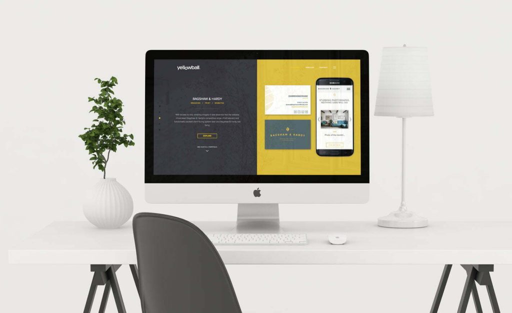
At our SEO and web design agency in London, these lessons continue to shape how we approach new projects. They remind us that UX is not only about creating beautiful websites but about building digital platforms that perform, adapt, and deliver measurable value.
Choosing Yellowball means choosing a partner who understands the balance between design and performance. Take a look at our websites and see for yourself how they feel effortless for users and deliver measurable value for businesses. As an award-winning London web design agency, our goal is simple: to build platforms that connect, convert, and stand the test of time. Interested in optimising your website for user experience? Chat to us today and get the ball rolling!