When designed optimally, an annual report can form a powerful storytelling tool for your business. A great annual report should engage your audience, reinforce your brand identity and clearly communicate your business’s key messaging. In this guide, we’ll explore annual report design styles, trends and elements to include to create a great impression.
Key Elements of a Great Annual Report Design
Key elements of a great annual report design include:
- Strong Visual Hierarchy
- Consistent Branding
- Clear Typography
- Infographics and Data Visualisation
- Imagery and Photography
- Interactive and Digital Elements for web reports
Strong Visual Hierarchy
A strong visual hierarchy is key to making a professional impression. Incorporating elements like typography, colour palette, layout, visuals, spacing, alignment and repetition can help to build a strong visual hierarchy.
Consistent Branding
Consistently apply your company’s colour palette, logo, and fonts throughout the document to reinforce brand recognition and demonstrate attention to detail. Maintain uniform spacing for elements like the logo and title to create a clean, cohesive experience as readers move through the document.
Clear Typography
Sans-serif fonts are often good choices for clear and readable typography, particularly on screens. This includes fonts like Helvetica, Arial, Open Sans, Roboto, Source Sans Pro, Montserrat, Lato and Karla.
If you’re after a more traditional look for print, consider serif fonts like Georgia, PT Serif, Garamond, Verdana and Calibri.
Body text should be between 16px to 18px (11-12pt), and headings should be about 2x larger than the body text.
Infographics and Data Visualisation
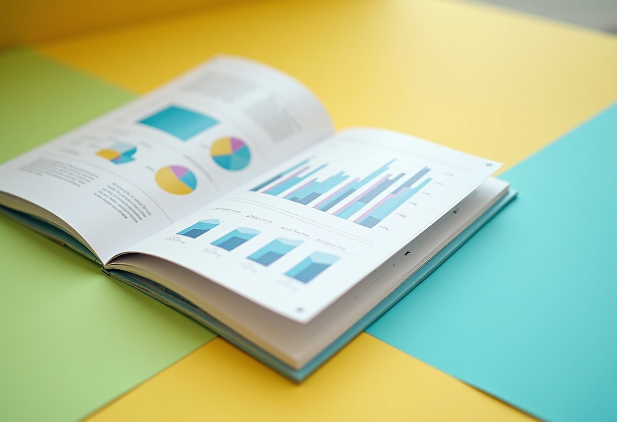
Incorporate infographics and data visualisations to boost clarity, increase engagement, and effectively highlight key performance indicators (KPIs) and trends.
Explore using various formats such as statistical and informational infographics, process diagrams, flowcharts, maps, and timelines to present information in a clear and compelling way.
Imagery and Photography
Including high-quality imagery and photography can help to build engagement and demonstrate your business’s identity. Choose images that reflect your company’s mission and values.
Interactive and Digital Elements for Web Reports
Creating an interactive annual report with digital elements can add an extra pop to your annual report and a higher level of professionalism through visual storytelling.
Best Practices for Designing an Annual Report
Plan Content and Narrative Flow
Ensure to outline your story and structure before designing. Consider the narrative thread.
Use Whitespace Effectively
Use whitespace to prevent clutter on the page, and draw focus to your key messaging.
Highlight Key Metrics
Use bold statistics and headers to draw attention.
Test for Accessibility
Follow accessible web guidelines to ensure your content is accessible for all users.
Yellowball is an official AccessiBe partner, through which we offer VPAT (A Voluntary Product Accessibility Template, which is a standardised document that assesses how well a product conforms to accessibility standards.) Contact us for more information on accessible report design.
Include Clear Financial Reporting
Include data visualisations, tables, and graphs to present financial information in a clear and accessible format. Consider what format would work best to help readers quickly understand key figures, trends, and comparisons.
Tools and Software for Annual Report Design
Tools and software to use for annual report design include:
- Adobe InDesign: Industry standard for professional layouts
- Canva: A good beginner-friendly option
- Figma: Good for collaborative design
- Microsoft Publisher: An option for simple reports
Creating a custom design for your business ensures your report is in line with your brand’s messaging and values.
Annual Report Layout Examples
Patagonia
Patagonia’s Annual Benefit Corporation Report is a great example of using whitespace and data visualisation to communicate key messaging. The bold and clear colour palette helps to add visual interest and provides clear section dividers.
Mailchimp
Mailchimp uses illustrations to add visual interest and demonstrate their brand identity.
For more examples of annual report design layout ideas, see our annual report design projects.
Common Mistakes to Avoid
Common mistakes to avoid when creating an annual report include:
- Text-heavy layouts: Text-heavy layouts can reduce engagement and can overwhelm the reader. Breaking up text with images and infographics helps engage readers and improves information retention.
- Inconsistent Design: Mixing styles or fonts weakens your message and can create an unprofessional image.
- Poor data visualisations: Unclear, confusing charts or graphs can create an unclear message and confuse readers.
- Ignoring mobile users: Over half of web traffic comes from mobile. Ensure digital reports are responsive and mobile-friendly so mobile users can access your content.
Working with a Professional Designer or Agency
Hiring a professional designer or a dedicated annual report design agency can ensure your report makes a strong impression and reflects a polished, high-quality presentation. When selecting an agency or designer, look at their portfolio, experience with similar projects, and the level of understanding of your brand. A good agency or designer should be able to clearly articulate the process, timelines and how revisions are handled.
Hiring a report designer can help to enhance your report’s professionalism and effectiveness, as well as providing time and cost savings, allowing you to spend more time on core business activities.
Annual Report Design Trends
Current annual report design trends include:
- Custom illustrations and typography
- Interactive digital reports and microsites
- Innovative infographics
- Sustainability focus
Annual Report Design FAQs
Add infographics and data visualisations to make your report more engaging. For digital projects, consider adding interactive elements that can add an additional layer of polish to your report.
The key elements of a successful annual report include clear messaging, polished data visualisations, consistent branding and readability.
Storytelling is crucial in annual report design to build engagement and to make your report easy-to-understand. Working with an agency can help to build the story behind your annual report and emphasise key messaging.
An annual report will typically be between 10-40 pages depending on the nature of your business and report requirements.
Typically, PDF is the best file format for a digital annual report.
Get a report quote today by contacting us.
Yellowball is a web design agency and annual report design agency based in London. For more information on our annual report design services, explore our projects and contact us to speak to our designers today.
Read more: A Guide to Pitch Deck Design

