When someone clicks through to your website, your homepage is your chance to make a powerful first impression. It’s where visitors decide whether to explore further or click away. That’s why your homepage design matters so much in the overall web design process – it’s your chance to make that all-important first impression that shows visitors that you can get them what they want!
So, what does it take to create a homepage that works? Let’s dive into the essential principles, fresh ideas, and real-world examples to inspire you, with the help of a top London web design agency and specialists in UX/UI design.
Why Your Website Homepage Needs to be Brilliant
Your homepage is the front door to your website and the anchor for your website layout. It sets the tone for the entire experience. Whether you’re a small business or a global brand, your homepage needs to instantly convey what you do, who you are, and why it matters.
Visitors might come to your site from a search, a social media post, or a friend’s recommendation. No matter how they arrive, they’ll quickly judge whether to stay or leave. In fact, studies show that people form opinions about your site in just a fraction of a second. That means your homepage design is key to your website redesign and needs to be both striking and straightforward.
Key Principles and Best Practices of Homepage Design
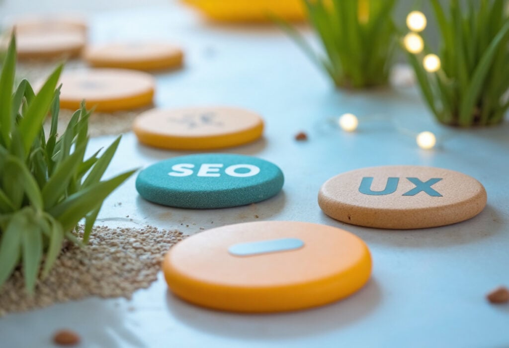
Let’s start with the building blocks of great homepage design. These are the principles that guide how you shape the experience for visitors, whether you’ve got a WordPress website, an ecommerce website, or a completely bespoke Laravel design.
Clarity Above All
A homepage should never leave people guessing. It should instantly communicate what your business offers. Clear headlines, concise copy, and visuals that match your message work together to tell visitors who you are and what you do.
Simplicity Wins
There’s a temptation to cram everything onto your homepage. But too much information or clutter can be overwhelming and confusing. A clean layout with enough white space highlights the information you’re sharing and makes it easier for visitors to find what matters.
Visual Hierarchy
Good homepage design uses size, colour, and placement to show what’s most important. Your main message should be front and centre, with supporting details following naturally. This hierarchy helps guide the visitor’s eye through your page.
Consistent Branding
Your homepage should feel like a natural extension of your brand. Use your colours, fonts, and imagery to create a cohesive look that makes your business memorable and recognisable.
Fast Loading Times
No matter how beautiful your homepage is, it won’t matter if it’s slow to load. People are quick to leave if a site doesn’t load within a few seconds, especially on mobile. Compressing images and using reliable hosting are simple steps to keep your homepage loading quickly.
Mobile-Friendly Design
More people browse on their phones than ever before, so a creative homepage web design that adapts gracefully to smaller screens is essential. Responsive mobile-first design ensures your homepage looks great on any device.
Here’s What Should Be on a Good Homepage Design
Once you have the basics and best practices covered, it’s time to think about what will make your homepage memorable and engaging.
Compelling Hero Section
The hero section is the large, prominent area at the top of your homepage. It’s the first thing people see, so it should grab their attention. A striking image or video background, paired with a headline that clearly states what you do, can be very effective.
For example, if you’re a landscaping company, a beautiful image of a completed garden project and a short, punchy headline like “Transforming Outdoor Spaces” instantly tells visitors what you’re about.
Calls-to-Action That Pop
A creative homepage web design needs to be incredibly persuasive, showing people that they’ve arrived at the right place and incentivising them to make contact. Think about the action you want visitors to take. Whether it’s calling you, signing up for a newsletter, or viewing your services, make those calls-to-action clear and visually prominent.
Social Proof
People trust what others have to say about you more than what you say about yourself. Adding a few glowing testimonials or a row of logos from clients you’ve worked with can add instant credibility to your homepage.
Highlight Your Key Offerings
You don’t need to list every service or product on your homepage, but featuring your main offerings helps visitors quickly understand how you can help. Keep it simple: a short description, a clear image, and a link for those who want to learn more.
Easy Navigation
Your homepage should make it easy to find other parts of your site. A straightforward menu at the top or a sticky header that stays visible as people scroll helps users get around.
Real-World Examples of Effective Homepage Design
Often, it’s best to see these website best practices in action, so you can not only visualise what the result looks like, but also get a dose of inspiration for your own homepage’s journey!
1. Airbnb
Airbnb’s homepage is simple and effective. The hero section has a clean search bar and a warm image that captures the feeling of adventure. They keep the messaging clear: “Find places to stay and things to do.” The design guides visitors toward the search function immediately—no distractions.
2. Apple
Apple’s homepage is a masterclass in minimalism. A single product—like the newest iPhone or Mac—takes centre stage. With a simple headline and striking imagery, Apple shows that less is often more. Their calls-to-action are direct: “Learn more” and “Buy”—no fluff, just clear steps forward.
3. Slack
Slack’s homepage focuses on their main benefit: making teamwork simpler. The headline is crystal clear: “Where work happens” Below that, there’s a simple sign-up form that invites visitors to start using Slack right away. The design reinforces their brand: friendly, modern, and practical.
4. Ballet With Isabella
For Ballet With Isabella, Yellowball’s web design team needed to blend elegance with functionality. We used a minimalist design with soft imagery and pastel tones that instantly speak to the refined world of ballet. Clear calls to action, effortless navigation, and an engaging video header work together to draw in visitors and encourage them to explore courses and content. This approach ensures that the homepage isn’t just beautiful – it’s purposeful, guiding visitors naturally deeper into the website.
5. Faith Ibiza
Created by Yellowball, Faith Ibiza’s homepage is a lesson in balancing luxury with energy. This high-end concierge services brand needed a creative website homepage design that exudes both sophistication and excitement. The full-screen video backdrop immediately sets the mood, while bold typography and strategically placed CTAs guide visitors to learn more. Faith Ibiza’s homepage demonstrates that the right balance of motion, texture, and simplicity can hook visitors in seconds.
6. Air X
Air X’s homepage, designed by Yellowball, is all about conveying a sense of trust and professionalism. As a leading private aviation service, their audience expects nothing short of precision. We used a sleek, dark-themed, and cool homepage design with dynamic content sections that highlight their key services. Subtle animations and a user-friendly layout build credibility and keep visitors engaged. Air X’s homepage proves that a polished, contemporary design not only reinforces brand values but also ensures a seamless user experience.
Inspired to give your homepage a refresh? Get in touch—we’d love to help you design a site that looks great and gets results.
Common Homepage Mistakes to Avoid
Even if you’re confident in your cool and creative homepage design, it’s easy to fall into a few traps that can hold back its potential. Here’s what to avoid:
- Trying to Say Too Much
- Your homepage isn’t the place to cram in every detail about your business.
- Overloading visitors with too much information can be overwhelming and confusing.
- Focus on your core message: who you are, what you offer, and why it matters.
- Use clear, concise content and leave the detailed explanations for other pages.
- Your homepage isn’t the place to cram in every detail about your business.
- Neglecting Mobile Users
- A homepage that only looks good on desktop devices can alienate visitors on mobile.
- With more people browsing on smartphones, responsive design is essential.
- Check how your homepage works on different screen sizes and fix any issues that affect readability or navigation.
- A homepage that only looks good on desktop devices can alienate visitors on mobile.
- Slow Load Times
- No matter how good your design looks, people will jump off it if it takes longer than 1.5 seconds to load.
- Large images, unnecessary scripts, and unoptimised code can drag down performance.
- Aim to keep your homepage loading in a few seconds or less to keep people engaged.
- No matter how good your design looks, people will jump off it if it takes longer than 1.5 seconds to load.
- Overcomplicated Navigation
- Confusing menus or too many options can frustrate visitors and lead to higher bounce rates.
- Stick to simple, clear menus with intuitive structure.
- Think about what your visitors want to find and make it easy for them to get there, and use website UX principles to make sure your user experience is a great one.
- Confusing menus or too many options can frustrate visitors and lead to higher bounce rates.
A Step-by-Step Approach to Help You Design a Fantastic Website Homepage
Designing your homepage is a big project, but breaking it down into bite-sized chunks will make the process easier.
- Define Your Main Message
What’s the one thing you want visitors to remember? Put that front and centre. - Choose Compelling Visuals
High-quality images or videos help create an emotional connection. - Craft Clear, Concise Copy
Use short sentences and simple language to keep things accessible. - Design with Hierarchy in Mind
Make sure visitors see the most important stuff first. - Test Across Devices
Check your homepage on desktops, tablets, and phones. - Get Feedback
Show your homepage to colleagues or customers and see how they respond. Fresh eyes can catch things you might miss. - Refine and Improve
Don’t treat your homepage as a one-and-done project. Update it as your business evolves.
Make Your Homepage Work for You, Your Customers, and Your Business
A good homepage design is as much about performance as it is about wow-factor. It guides visitors, tells your story, and makes it easy for people to take action. In a world where attention spans are short, the design of your homepage is often the difference between a visitor becoming a new customer for you.. or a new customer for your competition.At Yellowball, we’ve partnered closely with over 150 businesses across the UK, delivering tailored, results-driven websites that truly showcase the quality of our clients. With 84% client retention and a certified Google Partner status, we’re trusted by brands to create high-impact websites that drive revenue and build loyalty. Let’s get the ball rolling on your website today!