
Choosing between responsive web design vs. adaptive web design can be a tricky decision. This article aims to make it easier for you to choose the right design style for your business.
In this article we’ll explore:
- The differences between responsive web design and adaptive web design
- The pros and cons of responsive and adaptive web design
- When you should use each approach
- Commonly asked questions
What is Responsive Web Design?
A responsive website is designed to react to a user’s screen size, platform and the orientation of the device being used. The idea is that, no matter what device a user chooses to use when accessing a website, the image sizes, resolution and scripting will automatically adapt to their preferences based on the device’s capabilities and even its chosen settings.
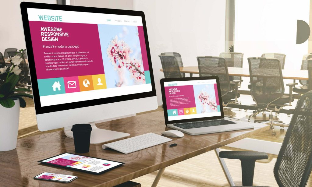
A responsive website maintains the same layout and appearance across all devices, adjusting to fit different screen sizes.
The same HTML is served to all devices. Web developers use CSS so each page of the website will be reformatted based on the user’s device. This means only one codebase will be needed for a responsive site. Breakpoints may be used to instruct the site when to adjust the display to provide the best user experience for different screen sizes.
With responsive design, page elements will reshuffle as the viewport grows or shrinks depending on device type. It’s therefore crucial to prioritise important content on webpages, so even on the smallest devices, what matters most is immediately clear.
What is Adaptive Web Design?
Adaptive web design is a design approach to creating websites that can adapt to different screen sizes and devices. It uses multiple fixed layouts that are designed for typical screen sizes. When a user visits a site, the server will detect the device type and screen size, then will show the appropriate layout.
In adaptive web design, a different website layout is created for each device type’s or screen size’s screen.
Layouts are typically created for 6 common screen widths: 320px, 480px, 760px, 960px, 1200px, and 1600px.
However, this is time-consuming and resource heavy, so if you’re short on time or budget, it may be preferable to refer to analytics to see what device type and screen size access your website the most. Then, designs can be created geared towards the user experience for two to three of those screen sizes.
Key Differences Between Responsive and Adaptive Web Design
The main differences between responsive and adaptive web design are as follows:
- Layout
- Content Adaptation
- Development process: Server-side vs. client side
- Flexibility
- Maintenance
- SEO
| Differences | Responsive | Adaptive |
| Layout | Single fluid layout that adjusts automatically | Multiple fixed, static layouts/Device-specific designs |
| Content | Same content across devices, reformatted | Can serve different content versions for different devices |
| Layout | One flexible layout | Separate layouts for each device/screen side |
| Development | Client-side CSS to adjust | Server-side detection to serve best layout |
| Flexibility | More fluidity in adapting to screen sizes | More control over device user experience |
| Maintenance | Maintenance of single codebase | Maintenance of multiple layouts |
| SEO | Preferred option by search engines like Google due to the single URL structure | Multiple versions of a website can lead to potential SEO issues |
Pros and Cons of Responsive Web Design
Advantages of Responsive Web Design
- Consistent user experience across devices:
- With responsive web design, content, navigation and other elements adapt seamlessly to different screen sizes.
- This creates a unified look across devices.
- Cost effective:
- Responsive web design eliminates the need to separate mobile and desktop versions.
- Responsive sites can be easier to maintain than adaptive sites as updates only need to be made once.
- Preferred choice for SEO:
- Google ranks responsive sites more highly than other types.
- A single URL for all devices rather than multiple URLs helps to support SEO efforts.
- Mobile-first approach:
- Responsive sites prioritise essential features for smaller screens, optimising performance on mobile devices and improving overall usability.
- Approximately half of web traffic is mobile, so optimising for mobile is increasingly important.
- Faster loading times:
- Responsive web design optimises page elements and layout for different screen sizes using fluid grids and flexible layouts.
- Simplified reporting:
- Responsive design means there is only one version of your website, allowing for reporting and data analysis from a single source.
- Future-proof design:
- Responsive web design eliminates the need for redesigns when technology changes, as it can adapt to new screen sizes and resolutions.
- Marketing campaigns:
- There’s no need for separate marketing campaigns across different devices as pages can adapt seamlessly.
Disadvantages of Responsive Web Design:
- Design Challenges:
- Some design elements may not translate well across devices, for example menus and complex layouts can be difficult to adapt.
- Development challenges:
- Responsive web design may require more testing across devices than adaptive web design.
- Creating a responsive website can be more time-consuming, however, can reduce the need for updates in the long run.
- Content limitations:
- Content cannot be changed based on device type which could reduce control over the user experience.
Pros and Cons of Adaptive Web Design
Advantages of Adaptive Web Design:
- More control over user experience:
- Provides more control over layouts so the user experience can be made more precise.
- Optimisations can be provided depending on device type.
- Redesigns:
- Adaptive web design can be useful for updating existing complex websites.
Disadvantages of Adaptive Web Design:
- Resource level:
- Adaptive web design requires the creation of multiple layouts.
- Adaptive web design may not cater to all device types and screen sizes, updates may be required as technology evolves.
- Implementation:
- Adaptive web design can be more complex and time-consuming to implement due to the multiple static layouts required. It requires increased development effort as each design needs its own HTML and CSS code, and this can lead to maintenance challenges. More upfront work can be required compared to responsive web design, however this can lead to improved device rendering and a more tailored user experience.
When to Use Responsive vs. Adaptive Design?
Responsive Web Design can be useful in the following scenarios:
- You’re designing a website from scratch.
- Your content is relatively simple, and your layout is straightforward.
- You prioritise flexibility.
- If SEO is a primary concern.
You can explore some examples of responsive web design in our web design projects.
Adaptive Web Design can be useful in the following scenarios:
- If you’d like to provide highly optimised experiences for specific devices.
- To improve loading speeds by serving optimised layouts.
- To provide precise control over the user experience provided on different devices.
- To provide improved device rendering.
- To make existing sites mobile-friendly without a complete redesign.
The choice between responsive or adaptive design isn’t an easy one to make, as each approach has advantages and disadvantages. Consider your project requirements, target audience and available resources to help you choose.
Responsive vs. Adaptive Web Design FAQs
Adaptive web design can improve website loading speed by serving optimised layouts tailored to specific devices.
Responsive web design can have positive and negative effects on website loading speed. It provides optimised content delivery by serving optimised content for different devices, especially on mobile. Responsive design can result in reduced bandwidth usage, by decreasing data consumption through delivering device-appropriate content. However, responsive design typically requires more advanced CSS and JavaScript which could increase load times if these are not optimised. Some responsive sites may load assets for all device sizes, potentially slowing down web pages with unnecessary assets.
Responsive design is currently the preferred choice for SEO. Responsive sites are favoured by search engines like Google and tend to be given higher rankings.
Responsive design is easier and faster for search engines to index because the same HTML code is used for all devices.
Google prefers sites that are optimised for mobile, and recommends responsive design to achieve this.
Adaptive web design handles different screen sizes by using different layouts optimised for specific device widths.
Responsive web design handles different screen sizes through use of fluid grids and layouts, using percentages or relative units like %, em or rem instead of pixel widths. Responsive design uses flexible images and media using set max-width, this allows images to scale down on smaller screens while maintaining aspect ratio.
Partner with Yellowball
Yellowball has an expert team of website designers to get your ideal website up and running. Visit our portfolio to see some of the amazing things we’ve been able to achieve. Have a vision for your website? Talk to us! We’ll make it a reality.