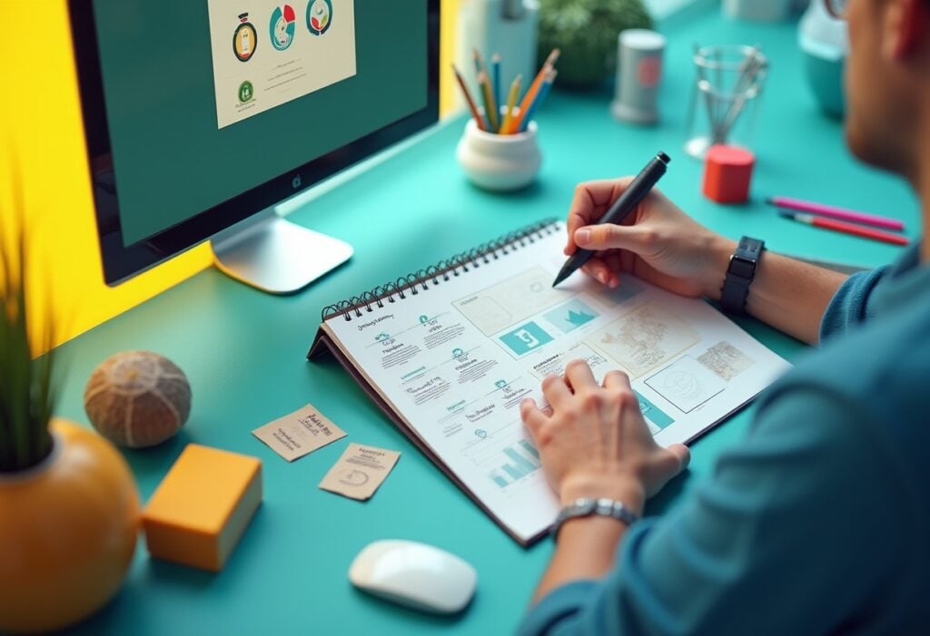
User experience (UX) in website design is more than just aesthetics—it’s about creating intuitive, seamless interactions that keep users engaged and drive results. A well-designed user experience ensures your website isn’t just visited but remembered, revisited, and recommended, so it deserves exceptional attention when you want a stand-out business website.
This guide will break down UX fundamentals, offering actionable tips and insights to help you create a website that truly resonates with your audience.
What Is UX in Website Design and Development?
UX design focuses on the user’s journey through your website. It’s about ensuring every touchpoint—from landing pages to checkout—is intuitive, efficient, and enjoyable. UX blends research, design principles, and technology to create exceptional customer experiences that meet user needs and business objectives. A website with great UX feels effortless to navigate, making users more likely to stay, engage, and convert.
What is the Difference Between UX and UI in Website Design?
While often used interchangeably, UX (User Experience) and UI (User Interface) are distinct yet complementary aspects of website design. Understanding the difference between the two is critical to creating a website that is not only visually appealing but also functional and user-friendly.
User Experience (UX) focuses on the overall feel and functionality of a website. It’s about creating a seamless journey for the user, ensuring every interaction—from navigation to completing a purchase—is intuitive, efficient, and enjoyable. UX encompasses elements like site structure, user flows, navigation design, and usability testing. For example, UX determines whether a user can easily find the “Contact Us” page or complete a checkout process without confusion.
User Interface (UI), on the other hand, is about the look and feel of the website. It’s concerned with the visual elements that users interact with, such as buttons, typography, colour schemes, and animations. UI ensures the website is visually engaging and aligns with the brand’s identity. For instance, UI design would dictate the style of a button, ensuring it’s visually distinct, consistent, and inviting.
The key difference lies in their focus: UX is about solving problems and meeting user needs, while UI focuses on aesthetics and interaction details. A website can have a beautiful UI but fail in UX if users struggle to navigate or achieve their goals. Conversely, a well-structured UX with a poor UI can leave users underwhelmed.
Why Is UX Important in Website Design?
UX plays a pivotal role in website design by shaping user interactions, building trust, and converting casual visitors into loyal customers. Here’s how it impacts your business website and helps grow ecommerce websites:
- Improves Engagement
Users are more likely to stay on a website that’s easy to navigate and visually appealing. A seamless UX design increases time-on-site, improves ecommerce conversion rates, and reduces bounce rates.
- Boosts Conversions
A well-optimised UX removes friction points, guiding users smoothly through their journey—whether that’s making a purchase, filling out a form, or subscribing to a newsletter.
- Builds Brand Loyalty
Consistent, user-friendly experiences create trust and encourage repeat visits, turning first-time users into long-term advocates.
- Enhances Accessibility
UX design ensures websites are accessible to all users, including those with disabilities, by incorporating best practices in layout, navigation, and readability.
- Drives SEO Performance
Search engines prioritise websites with great user experiences. Faster load times, mobile responsiveness, and easy navigation all contribute to better rankings.
Core Principles of UX in Website Design
Creating a website that truly resonates with users starts with mastering the core principles of UX web design. These foundational guidelines ensure your site is intuitive, engaging, and optimised to meet both user needs and business goals.
1. User-Centric Design
The user is at the heart of UX. A user-centric approach involves understanding your audience’s needs, behaviours, and pain points. This can be achieved through:
- User Personas: Create detailed profiles of your ideal users to guide design decisions.
- Usability Testing: Observe real users interacting with your site to uncover issues and opportunities.
2. Intuitive Navigation
A website’s navigation should guide users effortlessly. Keep it simple, consistent, and logical. Best practices include:
- Clear Menu Structure: Organise your navigation bar with intuitive labels like “About Us,” “Services,” and “Contact.”
- Breadcrumbs: Provide users with a visual trail of where they are within the site.
- Search Functionality: Include a search bar for complex sites to help users find what they need quickly.
3. Mobile-First Design
With over half of web traffic coming from mobile devices, responsive design is non-negotiable. A mobile-first approach ensures your website looks and functions perfectly on all screen sizes.
4. Fast Load Times
Slow websites lose users. Optimising performance is key to maintaining engagement. Steps include:
- Compress Images: Use tools like TinyPNG or Squoosh to reduce image file sizes.
- Minimise HTTP Requests: Combine files where possible to reduce server requests.
- Leverage Caching: Enable browser caching for faster repeat visits.
5. Visual Hierarchy
Guide users’ attention with a clear visual hierarchy. Use contrast, spacing, and typography to highlight key information.
Practical Tips:
- Use larger fonts for headings and key points.
- Incorporate whitespace to reduce clutter and enhance readability.
- Apply consistent branding, including colours, logos, and imagery.
6. Accessible and Inclusive Design
Accessible design benefits all users. Follow guidelines such as the Web Content Accessibility Guidelines (WCAG) to make your website inclusive. Key considerations include:
- Alt Text for Images: Describe images for screen readers.
- Keyboard Navigation: Ensure users can navigate without a mouse.
- High Contrast: Improve readability for visually impaired users.
7. Consistent Branding
Consistency in your branding builds trust. Align your website’s design elements with your overall brand identity. This includes:
- Colours and typography.
- Tone of voice in content.
- Use of logos and imagery.
The UX Design Process: From Concept to Completion
Crafting a seamless user experience involves a structured, iterative process that bridges research, design, testing, development, and optimisation. Each step builds on the previous one, ensuring a user-centred approach from start to finish. Below is an in-depth look at each phase of the UX design process, complete with practical tips and actionable insights.
Step 1: Research
Research is the foundation of UX design. Without understanding user needs, behaviours, and pain points, it’s impossible to create a meaningful experience.
- Identify Your Audience: Create detailed user personas based on demographic data, behaviours, goals, and challenges. Use surveys, interviews, and customer feedback to gather these insights.
- Analyse Existing Data: Review website analytics to identify high-traffic areas, bounce rates, and drop-off points. Tools like Google Analytics and Hotjar can help uncover patterns in user behaviour.
- Competitor Analysis: Study competitors to understand industry standards and identify gaps you can fill to create a unique user experience.
- Map User Journeys: Visualise how users interact with your product from entry to conversion. Understanding these touchpoints helps you prioritise design elements.
Pro Tip: Collaborate with stakeholders to align research findings with business goals. At Yellowball, we ensure our research phase creates a shared vision for success.
Step 2: Wireframing and Prototyping
Once research is complete, the next step is to translate insights into tangible designs through wireframes and prototypes.
- Wireframing: Start with low-fidelity wireframes to outline the structure and hierarchy of your website. These are rough sketches that focus on layout, navigation, and content placement without visual details.
- Prototyping: Move to high-fidelity prototypes as the design evolves. These interactive models mimic the final product, incorporating design elements like colour schemes, typography, and animations.
- Tools to Use: Platforms like Figma, Sketch, and Adobe XD streamline the process, offering collaborative features to involve your team in real-time adjustments.
Pro Tip: Focus on user flows during this stage. Ensure every prototype supports the key journeys identified during research, such as signing up, purchasing, or navigating to information.
Step 3: User Testing
User testing is where designs are validated and refined. Testing ensures your website meets user expectations and identifies potential pain points before development begins.
- Recruit the Right Participants: Select users who match your target audience to ensure accurate and actionable insights.
- Test Scenarios: Provide participants with specific tasks, such as finding a product, completing a form, or navigating to a particular page.
- Collect Feedback: Observe user interactions, noting where they struggle or hesitate. Tools like UserTesting and Lookback can record sessions for in-depth analysis.
- Analyse Results: Categorise findings into usability issues, design flaws, or feature requests. Prioritise changes based on their impact on the user experience.
Pro Tip: Involve stakeholders in testing sessions to foster empathy for user challenges and build consensus on necessary changes.
Step 4: Development
The development phase brings the finalised design to life. Collaboration between designers and developers is critical to maintaining the integrity of the UX vision.
- Collaborative Handoff: Use tools like Zeplin or Figma’s developer mode to provide clear documentation, including design specifications, CSS snippets, and interaction details.
- Technical Feasibility: Work closely with developers to address potential technical constraints without compromising user experience.
- Platform Expertise: At Yellowball, we excel in development using platforms like Laravel, WordPress, and WooCommerce, ensuring the final product is both functional and scalable.
- Quality Assurance (QA): Test the developed site rigorously to identify bugs, inconsistencies, or performance issues.
Pro Tip: Maintain open communication between designers and developers throughout this phase to ensure alignment and address challenges promptly.
Step 5: Launch and Optimise
Launching a website is not the end of the UX process—it’s the beginning of ongoing optimisation.
- Soft Launch: Consider a phased launch, starting with a small segment of your audience to gather feedback and identify issues before a full rollout.
- Monitor Metrics: Use analytics tools to track performance indicators such as bounce rates, conversion rates, and session durations. Platforms like Google Analytics, Crazy Egg, and Hotjar provide valuable insights.
- Gather Post-Launch Feedback: Encourage users to share their experiences through surveys or feedback forms.
- Continuous Optimisation: Regularly update content, improve load times, and refine user flows based on data-driven insights.
- A/B Testing: Experiment with different design elements, such as CTAs, colours, or layouts, to optimise performance.
Pro Tip: Schedule periodic UX audits to ensure your site continues to meet evolving user expectations and industry trends.
Common UX Mistakes to Avoid
Designing a website with optimal user experience requires careful planning and attention to detail. Mistakes in UX design can lead to frustrated users, high bounce rates, and lost conversions. Below are some of the most common UX errors and actionable solutions to address them:
1. Cluttered Website Design
The Issue: Overloading your website with too much information, imagery, or features can confuse users and detract from your core message.
What to Do:
- Adopt a minimalist design approach, focusing on key content and functionality.
- Use white space effectively to separate elements and reduce visual noise.
- Prioritise content hierarchy by using bold headings, clear subheadings, and concise text.
- Test different layouts with users to identify the most effective balance of content and design elements.
2. Ignoring Mobile Users
The Issue: With over 50% of web traffic coming from mobile devices, neglecting mobile optimisation alienates a significant portion of your audience.
What to Do:
- Implement responsive design to ensure your website adapts seamlessly to various screen sizes.
- Test your site across multiple devices to identify issues in navigation, load times, or usability.
- Use mobile-friendly features such as touch-optimised buttons, collapsible menus, and simplified forms.
- Continuously monitor mobile analytics to track user behaviour and refine the mobile experience.
3. Poor Call-to-Actions (CTAs)
The Issue: Vague, hidden, or overly generic CTAs can fail to guide users toward the actions you want them to take.
What to Do:
- Make CTAs clear and specific by using actionable phrases like “Sign Up Now,” “Learn More,” or “Get Started.”
- Ensure CTAs are prominent with contrasting colours, larger fonts, or button designs that draw attention.
- Place CTAs strategically where users naturally look, such as at the end of sections or above the fold.
- A/B test different CTA designs and placements to determine which drives the most conversions.
4. Overlooking Accessibility
The Issue: Websites that don’t meet accessibility standards exclude users with disabilities, limiting engagement and exposing the site to potential legal risks.
What to Do:
- Follow WCAG (Web Content Accessibility Guidelines) to ensure inclusivity.
- Add alt text to images for users relying on screen readers.
- Use high-contrast colour schemes to improve readability for visually impaired users.
- Make all interactive elements, like buttons and forms, keyboard navigable.
- Regularly test accessibility using tools like Wave or Lighthouse to identify and address issues.
5. Neglecting Analytics
The Issue: Ignoring user data means missed opportunities to improve the user experience and address pain points.
What to Do:
- Use tools like Google Analytics, Hotjar, or Crazy Egg to track user behaviour, such as click patterns and session durations.
- Regularly review heatmaps and scroll maps to understand how users engage with your site.
- Analyse bounce rates, exit pages, and drop-offs to identify friction points.
- Use data-driven insights to inform decisions about layout, navigation, or content updates.
6. Slow Load Times
The Issue: Users abandon sites that take too long to load, resulting in lost engagement and higher bounce rates.
What to Do:
- Optimise images by compressing files and using modern formats like WebP.
- Minify CSS, JavaScript, and HTML to reduce file sizes.
- Enable browser caching and use a Content Delivery Network (CDN) to improve speed for global users.
- Continuously monitor site performance using tools like Google PageSpeed Insights and GTmetrix.
7. Lack of Visual Hierarchy
The Issue: Without a clear visual structure, users may struggle to find important information or understand your site’s purpose.
What to Do:
- Design pages with a clear hierarchy, using larger fonts and bold colours for headings and CTAs.
- Guide users’ attention with visual cues like contrast, spacing, and alignment.
- Avoid overcrowding pages and focus on a single goal or message per section.
- Test designs with real users to confirm that the most important elements are easily noticed.
8. Overcomplicating Navigation
The Issue: Confusing menus or excessive options can overwhelm users and make it difficult to find what they’re looking for.
What to Do:
- Limit the number of navigation options to reduce cognitive load.
- Use descriptive labels for menu items, avoiding jargon or overly generic terms.
- Implement breadcrumbs to help users track their journey on the site.
- Test your navigation structure with usability studies to identify and fix problem areas.
9. Failing to Optimise Forms
The Issue: Long, complicated forms frustrate users and lead to higher abandonment rates.
What to Do:
- Simplify forms by asking for only essential information.
- Use auto-fill and validation messages to improve the user experience.
- Break long forms into multiple steps with clear progress indicators.
- Test forms on mobile devices to ensure they’re easy to use on smaller screens.
10. Ignoring Feedback
The Issue: Not listening to user feedback prevents you from addressing recurring issues and improving the user experience.
What to Do:
- Encourage users to leave feedback through surveys, polls, or live chat tools.
- Actively monitor customer reviews, comments, and support inquiries for common pain points.
- Create a feedback loop by implementing changes and informing users of improvements based on their input.
- Use usability testing to validate whether changes have resolved issues.
UX Fundamentals FAQs
UX design focuses on creating seamless and enjoyable user experiences by understanding user needs and behaviours. It’s essential for websites because it enhances engagement, reduces bounce rates, and drives conversions.
We use industry-leading tools like Figma, Sketch, and Adobe XD for wireframing and prototyping. For analytics and user testing, we rely on platforms like Google Analytics and Hotjar.
Mobile-first design ensures your website performs seamlessly on all devices, improving user experience and search engine rankings.
UX design directly influences how users interact with your website and whether they take desired actions, such as making a purchase or filling out a form. A user-friendly design reduces friction, makes navigation intuitive, and ensures CTAs are clear and actionable, leading to higher conversion rates.
While it’s possible to have a well-structured and functional website (good UX) without visually stunning elements (good UI), the lack of engaging design can leave users unimpressed. Conversely, a beautiful UI without strong UX can frustrate users. The best websites strike a balance between the two.
Absolutely! Yellowball is a trusted partner for agencies worldwide, offering white-label web design services. From UX strategy to development, we deliver projects on platforms like WordPress, WooCommerce (ecommerce), and the high-performance Laravel platform. Our expertise in web development as well as branding ensures agencies can provide their clients with top-tier websites while meeting deadlines and maintaining quality.
Partner with Yellowball for Exceptional UX Design
UX design is the foundation of an effective website. By prioritising user needs, intuitive navigation, and accessible design, you can create experiences that not only engage but also convert.
At Yellowball, we bring unmatched expertise in UX website development to every project, blending creative design with technical precision.
Our expertise in Laravel, WordPress web development, and WooCommerce for ecommerce websites as well as branding and graphic design services ensures we deliver UX-optimised websites that help businesses thrive. With over 150 successful projects and glowing testimonials, we’re leaders in crafting user-centric designs. Contact us today and let’s ensure your website delivers the highest ROI.