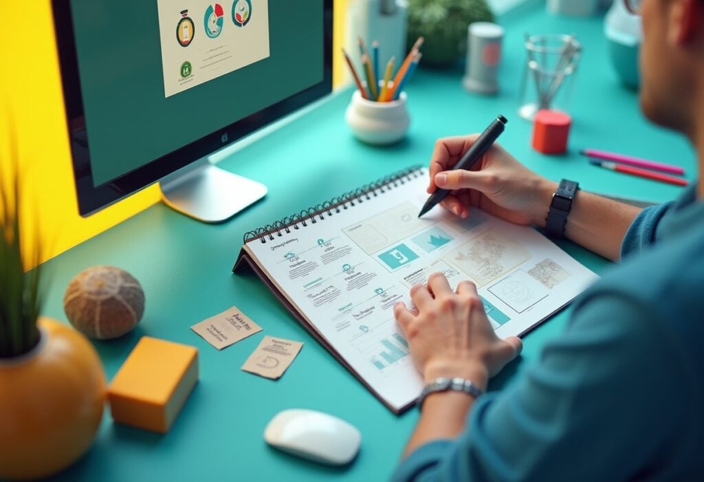
If you’re about to design and launch your own website for the first time or are hoping to create an updated version that matches the best in modern website design, you’ll be looking out for website design ideas. You’d like your website to be unique, but there are many design pitfalls lurking in wait for the unwary. These website design tips cover general principles that every website designer should apply. Use them to guide your decision-making as you work towards creating a website that matches the needs of the most important stakeholders of all: your clients and visitors.
Website Design Tips:
- Avoid Clutter – Especially on Your Home Page
- Apply Visual Hierarchy Principles
- Create Readable and Impactful Content
- Keep It User-Friendly
- It’s Not About You
- Align Your Design With Your Brand
- Images and Icons are Important
- Show Users What to Do Next
1. Avoid Clutter – Especially on Your Home Page
If website users have to look twice to see what your business does and how it works, their interest in your company will die before it was ever properly awakened. Keep designs crisp and clean. More visual and textual information competing for attention is not better. You can always create additional pages to showcase extra details that may interest your visitors.
2. Apply Visual Hierarchy Principles
A website that looks attractive is good to have – but it’s important to remember that some information is extremely important while other elements have lesser importance. Visual hierarchy is a principle to apply so that your website visitors always see the most important things first. From there, the eye is guided to supporting information until the viewer has grasped the entire message the page is meant to convey.
Aesthetics help you to achieve this, with colours, the scale of individual elements, their proximity to one another, and their alignment helping to deliver the intended results.
3. Create Readable and Impactful Content
Make things easy for your visitors by using simple, straightforward language that’s easy to read and understand. Avoid technical terminology that your prospective customers may not be familiar with. Keep sentences short. Use white space to break up texts so that they’re easier on the eye.
Stick to the things that are most important to your customers and avoid text-heavy designs that look like hard work to read. You can provide more detailed supporting information in your resource centre or blog.
4. Keep It User-Friendly
Navigability is very important indeed. Website visitors want to be able to find the information they’re looking for fast. If they can get there in one click, don’t make it necessary to click through two pages – and make the route clear. The way you organise your site menus will make a difference, and you can use clickable buttons to allow users to navigate to related information easily. Most important of all, make it easy for them to get in touch if they want to contact you. One of the most important tips for website design? Make sure your site looks awesome and works well regardless of what type of device is used to access it. Apart from helping your users, you’ll avoid search engine penalties!
5. It’s Not About You
When it comes to website design, it’s definitely not all about you. Instead, it’s about helping your users to find the information they need. While you’ll want to tell them about the benefits they can realise by choosing your business, keep it meaningful. People want to know about what you can do for them – and the things that matter to your customers may not include some of the things you think will impress them. Try to keep their perspective in mind at all times.
6. Align Your Design With Your Brand
Your brand consists of elements that make your business unique. Apart from that all-important logo, your brand colours help to reinforce your unique brand identity, helping you to stand out from the crowd and create a memorable impression. Use them as the palette for your website. If they heard it from you, don’t let them forget it was you!
7. Images and Icons are Important
A picture paints a thousand words, and all it takes to get the message is one quick glance. Apart from helping to break up text and looking attractive, the images and icons you choose say more to your users than you (or they) may have realised. Choose wisely and well! Every image should contribute to the message you want to convey.
8. Show Users What to Do Next
You’ve done everything just right. Users are interested in what you do – but what should they do next? It’s up to you to tell them and make the next step easy. A call to action may seem like a very simplistic thing to use, but it prompts your users to follow through. Provide high-visibility buttons that lead them to the next step. Should they get a quote, call you, make an appointment, or visit your products page to start shopping? Don’t make them scroll or search. Take them there!
Looking for Some Examples of Great Websites That Apply These Principles?
If you’re hoping to see some great website layout ideas in action, you’ll see all the principles we just discussed at work in our award-winning portfolio. We’re proud of our web design team and the results they achieve, and through the years, we’ve helped our clients to become the owners of websites that inform, entice, and convert. Whether your website idea is simple or complex and whether it’s an all-new website or an updated design, choose Yellowball, web design agency based in London to help you turn your concept into a reality. Get in touch today!


