

When users land on your website, they make snap decisions in seconds. Where do they look first? What draws their eye? What makes them click, scroll, or bounce? The answer lies in visual hierarchy – a key component of website design, as well as UX and UI design.
Visual hierarchy is how design guides attention. It’s about structure, flow, and making sure your most important message doesn’t get buried. Without it, your beautifully crafted site could fall flat.
In this guide, we’ll explore how to use visual hierarchy to shape a better user experience, showcase examples from recent Yellowball projects, and share practical tips you can apply to your own website. Whether you’re building a bespoke site or rethinking your homepage, this is essential reading.
What Is Visual Hierarchy?
Visual hierarchy refers to the arrangement and design of elements to signal importance. Done right, it creates a natural path for the eye to follow – leading users from headline to CTA to conversion without friction.
This is all about psychology and behaviour. Good hierarchy aligns design with how people scan pages. Big, bold, high-contrast elements rise to the top. Subtle, secondary information stays in the background until it’s needed.
Visual Hierarchy Meaning and Its Role in Effective Communication
Understanding the visual hierarchy meaning is key to crafting intuitive, results-driven designs. At its core, visual hierarchy is about order—arranging elements so that the most important content gets seen first. Whether you’re designing a website, brochure or campaign landing page, hierarchy ensures your audience isn’t overwhelmed, but instead guided. It’s not just how it looks—it’s how it works.
What Is Visual Hierarchy in Graphic Design?
In graphic design, visual hierarchy is the method of organising text, images, and design elements to guide the viewer’s eye and communicate a clear message. Whether it’s a brochure, ad, or infographic, hierarchy ensures the audience sees the right thing, in the right order. It’s not about shouting the loudest, but saying the right thing. Good hierarchy balances form and function, shaping meaning through visual cues.
How Is Hierarchy Achieved in Design Principles?
Hierarchy in design is created by controlling variables like size, weight, colour, contrast, placement, and proximity. A large, bold headline commands attention. Grouped elements show relationships. Whitespace separates. Positioning aligns with reading patterns. All of this creates a visual order that mirrors importance. At Yellowball, we use these techniques to ensure every design—whether for print or web—communicates clearly, intentionally, and beautifully.
Want a broader look at good design principles? Read our guide to what makes a good website.
Why is Visual Hierarchy Important?
If you’re building a site or crafting a graphic layout, you may ask: Why should you use hierarchy in design? The answer lies in how people process information. When your design reflects the hierarchy meaning in graphic design, users instinctively grasp your message. They stay longer, interact more, and convert faster. Hierarchy is one of the most effective tools for turning attention into action.
- First impressions: Users form opinions in milliseconds. Strong hierarchy creates instant clarity.
- Improved UX: It helps people find what they need faster, without confusion or frustration.
- Higher conversions: When the journey is clear, people are more likely to act.
- SEO benefits: Structured content and clear headings also help search engines understand your site.
The 8 Key Elements of Visual Hierarchy
Here’s how to make hierarchy work harder for you:
1. Size
Big elements shout. Small elements whisper. Use size to prioritise your messaging.
On the Vending Sense website, we designed the homepage hero with a commanding headline and supporting text below – both optimised for readability and impact.
2. Colour and Contrast
Contrast draws the eye. Bright colours, dark text on light backgrounds, or vice versa – they all create visual hotspots.
We often use a restrained palette with strategic pops of colour to highlight CTAs and key messages. Our guide to web design ideas and tips explains how colour can influence behaviour.
3. Typography
Typography hierarchy is defined as structuring type so users understand what’s most important at a glance. It’s not just about heading sizes—it’s about how font weight, style, spacing, and placement come together to create meaning. A strong typographic hierarchy, like the one used in the AEM website, helps readers scan content, digest key messages, and enjoy a smoother experience. It’s essential for both web and graphic design—done well, it becomes invisible but powerful.
Use no more than 2-3 font styles. Emphasise important text with weight, spacing, or case.
4. Whitespace
Crowded content overwhelms. Whitespace gives breathing room and allows key elements to stand out.
What’s not there — the whitespace — matters just as much as what is. Notice how the SMMT site balances information and whitespace to avoid clutter while staying content-rich.
5. Layout and Positioning
People read in patterns. The “F” and “Z” shapes are common scanning paths. Place high-value content where the eye naturally goes.
Grids, alignment, and consistent margins all help build a clean, easy-to-follow web design layout.
6. Imagery
Photography and icons draw attention faster than text. But without purpose, they become visual noise.
Choose imagery that supports your message. On the Faith Ibiza site, bold visuals set the tone, with the layout pulling attention straight to key info.
7. Motion and Interaction
Micro-interactions, hover states, and subtle animations can guide attention and signal what’s clickable.
Just don’t overdo it. Motion should clarify, not distract. Take a look at the Kemexon website for inspiration!
8. Content Order
This one’s often overlooked. The order in which content appears on the page plays a huge role in user flow.
Our article on why you should put content first dives deeper into this. TL;DR: Don’t let copy be an afterthought.
How We Apply Visual Hierarchy at Yellowball
Every web design project we take on – from Ballet with Isabella to AirX – starts with user experience. That means mapping journeys, defining key actions, and structuring hierarchy around what matters most to the visitor.
Our UX and UI design services focus on balancing brand identity with functional flow. From complex navigation structures to sleek, single-page site, we make sure users never feel lost.
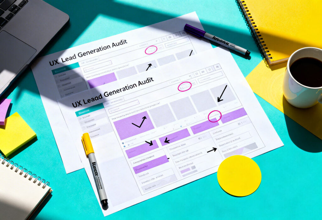
Looking for inspiration? Explore more of our web design projects and see how we bring structure and story together, or ask us about our website UX audit services.
Try to Avoid These Common Mistakes
- Too many focal points: If everything’s bold, nothing stands out.
- Poor mobile hierarchy: Desktop hierarchy doesn’t always translate. Test, adapt, simplify.
- Overuse of colour and fonts: More variety doesn’t mean more impact. Be consistent.
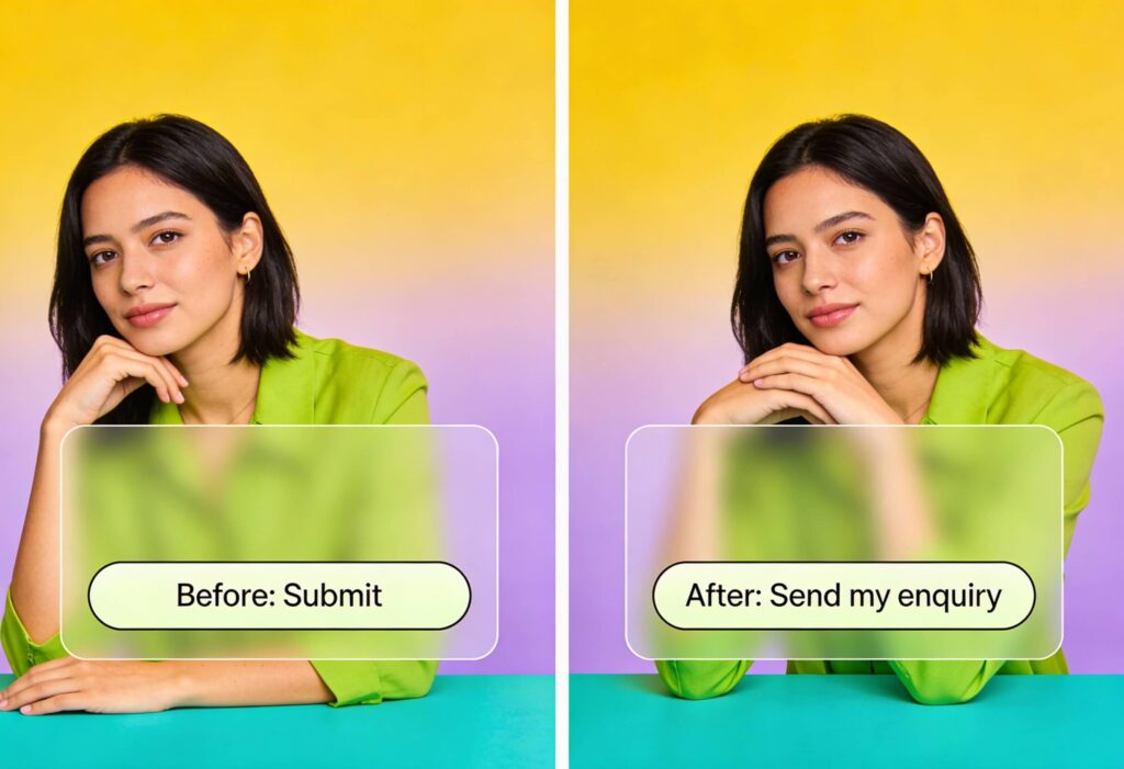
- Lack of clear CTAs: People need a next step. Make it obvious, and repeat it where relevant.
Applying Visual Hierarchy to Your Own Website
Want to improve your site? Here are a few practical steps:
- Audit your pages: Open each key page and scan it quickly. What grabs your attention first? Is it the element you want users to see? If not, you may need to adjust size, colour, or placement.
- Map user journeys: Consider how someone lands on your site and what they’re trying to achieve. Break it down by intent: new visitor, returning customer, someone researching vs. someone ready to buy. Structure the hierarchy to match those goals.
- Prioritise content: Rank your messaging. What’s essential, what’s supportive, and what’s nice to have? Arrange each section by importance—not internal preferences. Use content design techniques to ensure clarity and flow.
- Refine your typography: Review your fonts across the site. Are your headings consistent in size and style? Are they doing the heavy lifting of guiding readers? Reorganise and refine to support visual hierarchy and improve accessibility.
- Test and tweak: Use heatmaps, scroll data, or simple A/B testing to see where people look and click. Small changes in layout, headline size, spacing, or colour often produce noticeable improvements in engagement and conversion.
If you’re working with WordPress or WooCommerce, structure is even more critical. Explore our WordPress website services and WooCommerce website design to see how we craft intuitive, high-converting experiences.
It’s Time to Design with Intention
Visual hierarchy is a fundamental of web design that impacts every interaction. Done well, it helps your site speak clearly, guide users effortlessly, and convert more effectively.Looking for some expert help to guide your website design? Get in touch to chat about your project and get the ball rolling.