Typography does a lot more than make words look pretty on a screen. It’s an essential element of branding and graphic design that shapes how people feel when they visit your website, how easily they absorb information, and ultimately whether they take action. A clean, thoughtful type system is a key difference between a visitor to your website who leaves after a few seconds and one who makes a purchase.
So, here’s our expert take on how typography influences behaviour, why small design choices matter, and what you can do to make your text more readable, engaging, and persuasive.
Why Typography Impacts Conversions
Typography sits at the heart of good design. It helps people trust your message, understand what you’re saying, and feel confident about taking the next step. When the type is off, the whole experience feels harder to follow, even if users can’t pinpoint why.
First Impressions and Cognitive Load
A visitor decides whether to stay on your page within seconds. Fonts, spacing, and alignment quietly shape that decision. If your text feels cluttered or awkward, people have to work harder to make sense of it. That extra effort is known as cognitive load, and the more energy someone spends decoding your words, the less likely they are to keep reading.
Readable typography removes those barriers. Serif fonts often help guide the eye along a line of text, while sans serif fonts work well for short, bold statements. When used with care, type builds familiarity and professionalism. For brands developing their own style, our article on brand guidelines explains how to keep visual consistency across every touchpoint.
The Connection Between Readability and Action
Eye-tracking studies show that users don’t read in straight lines. They scan pages in predictable shapes, like the F or Z pattern. Your typography should support that flow by making it easy for the eye to move from one section to the next.
When headings, subheadings, and body text are clearly defined, readers can quickly find what they need. That clarity builds trust and helps people spot the call to action text without hesitation. Strong type systems make information digestible, so the focus stays on what matters most. You can learn more about structuring digital layouts in our web design best practices guide.
Building Readable Typography Systems
Good typography feels natural and flowing, so readers focus on the message rather than the effort of reading, making your content easier to digest.
Font Pairing That Supports Clarity
Good typography hits a balance between variety and subtlety. For example, pairing a structured sans serif with a characterful serif gives your layout both clarity and warmth.
Rather than crowding the page with too many fonts, choose one or two families that perform well across all screens. Look for typefaces with several weights and styles so you can build a harmonious hierarchy that makes your message clear, readable, and cohesive.
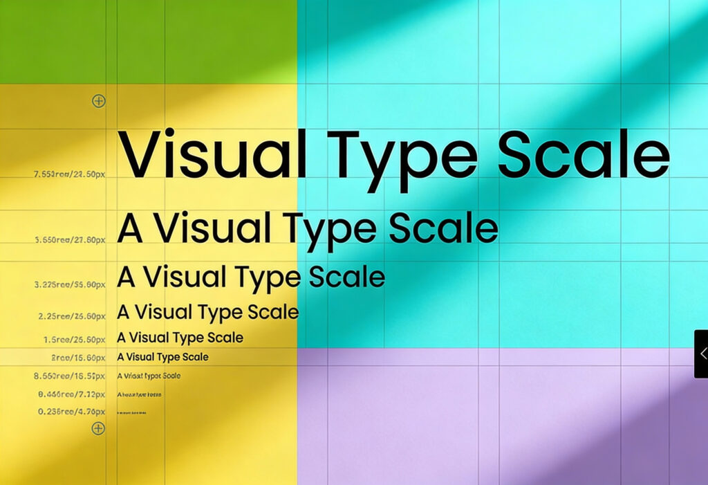
Type Scales for Screens
Font sizes should relate to one another to create a sense of order. On wider screens, use comfortable spacing to keep reading light and easy; on smaller devices, tighten it just enough to hold the lines together.
Recommended line-height ratios are between 1.2 and 1.4, and testing on different screens helps refine the result, as a layout that feels balanced on one device can read very differently on another.
Optimal Line Length and Contrast
The best line lengths sit somewhere between too wide and too narrow, around 45 to 75 characters per line. Lines that stretch too far can strain the eyes, while short ones can disrupt the rhythm. On mobile screens, tighter columns and gentle spacing adjustments create a more natural reading flow.
Colour contrast is another essential factor. Text must stand out clearly against its background without feeling harsh or in-your-face. Dark grey on off-white often reads better than pure black on pure white. If accessibility is a priority, our guide to web design accessibility explains how to make your site inclusive for all users.
Hierarchy and Visual Flow
Every page needs rhythm and balance, which hierarchy and visual flow create. This guides the eye from headline to detail and calls to action in a way that feels natural and easy to follow.
Using Weight, Spacing, and Colour to Guide the Eye
Visual hierarchy shapes the journey through your page. Bold weights grab attention, lighter weights help the reader skim, and spacing creates breathing room. When colour is used thoughtfully, it draws attention to the right places, especially key actions or offers.
A simple rule is to highlight what matters most and let the rest quietly support it, avoiding too many bright colours or heavy fonts as these can be confusing and overwhelming for visitors.
Creating a Logical Reading Path
Every piece of text should flow naturally into the next, feeling smooth and intuitive. When hierarchy is clear, users spend less time figuring out where to go and more time engaging with the message.
The Role of White Space in Readability
White space gives design structure, separating content blocks, adding balance, and giving your eye a rest between sections. When pages feel dense, people tend to skim or abandon them. A touch of white space can make even long content feel light and easy to follow.
Typography in Conversion Elements
When it comes to encouraging conversions, words and design need to work in partnership. Clear, readable typography helps people understand what to do next and take each step with confidence.
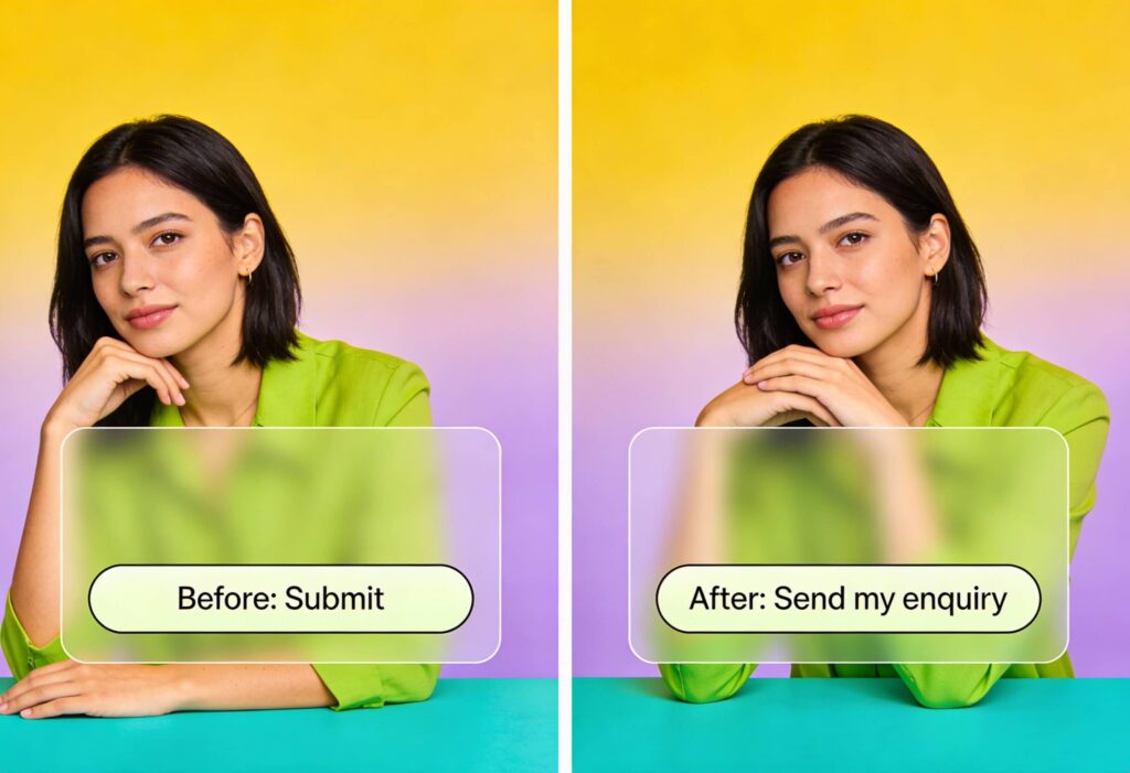
Designing High-Impact CTA Text
Your call-to-action text is where all the effort pays off. Your language and tone should be simple, direct, and clear. Phrases like “Start your free trial,” “Get a quote,” or “Book a consultation” use action verbs that move people forward.
Typography supports these messages by making CTAs visually distinct. Strong contrast, ample padding, and a font that matches the brand’s tone all help the call to action feel inviting rather than forced. For examples of effective, conversion-friendly design, explore our web design services.
Crafting Microcopy That Builds Confidence
Microcopy design covers the small bits of text that help people complete an action, such as form labels, tooltips, and confirmation messages. It’s often overlooked, yet it can make or break the user experience.
Reassuring language like “Your payment details are secure” or “We’ll get back to you within 24 hours” helps to prevent hesitation and keep your reader moving forward towards a conversion. Keep in mind that the best microcopy sounds human and supportive, not robotic, sales-driven, or pushy.
Technical Foundations
Smart technical choices also matter. By focusing on performance, compatibility, and readability, you can create a system that loads quickly, scales smoothly, and works flawlessly for every user.
Variable Fonts and Performance
Variable fonts are a clever evolution in digital typography. Instead of loading separate files for every weight or style, a single variable font file contains them all. That reduces page weight and improves performance, which can directly influence conversions.
Websites that load quickly create smoother experiences, especially on mobile. Before rolling out variable fonts, test them across browsers to ensure consistent rendering and stability.
Choosing Web-Safe Fallbacks
No font is fail-proof, so it’s always best to plan for the unexpected. In typography, a well-matched fallback can save you if a custom font doesn’t load, keeping your design intact and your text readable.
Testing Readability Across Devices
Readability testing is the only way to know how your typography truly performs, so you need to test it across different devices, browsers, and screen sizes. What looks perfect on a high-resolution monitor might blur on an older phone.
Analytics tools are also vital for measuring engagement metrics like reading time and bounce rate. Combined with accessibility tests, these insights help refine your type system until it feels seamless everywhere.
Bringing It All Together – Real Examples of High-Converting Type Systems
You can see the impact of thoughtful typography throughout our own projects. On Ballet With Isabella, the typography reflects the poise and discipline of classical dance. Refined serif headings flow into airy, open body text, creating a sense of rhythm and movement. The result feels elegant yet practical, guiding users effortlessly from exploring classes to joining online courses.
When working on Pure Sports Medicine, we focused on making clarity and trust the centre of the experience. The typography uses a modern sans serif with balanced spacing and consistent structure, giving medical content a calm, professional tone. The hierarchy naturally leads users to the next step, whether that’s exploring services or booking an appointment.
For Forj, the challenge was to balance creativity with clarity. The bold geometric typography supports a future-facing identity, while careful spacing and scalable headings keep the digital experience cohesive across platforms. The design feels contemporary, human, and distinctly Forj.
How to Audit Your Own Site’s Typography
Start by checking the basics: Are your headings distinct? Is the body text comfortable to read? Does your line length stay within the recommended range? Then look at how your fonts perform across devices.
Pay close attention to CTAs and microcopy. Do they stand out? Do they sound natural? Finally, test with real users or through readability testing tools to see where adjustments could improve flow or reduce friction. Small changes can make a surprising difference.
If you’d like more structured advice, our web design guide offers a detailed look at how type fits within a broader design strategy.
Typography That Converts. Design That Performs.
Typography for conversion is about guiding attention, building trust, and helping users take the next step without friction. It’s part psychology, part design, and part technical know-how.
Readable typography, well-balanced visual hierarchy, and clear call-to-action text all work together to turn visitors into customers. When every letter feels intentional, your message lands cleanly and confidently.
If you’d like expert help creating typography that looks great and performs even better, we’d love to collaborate.
Need help creating readable, high-impact typography? Contact us today to get the ball rolling!