Most e-commerce brands put a lot of effort into ads, SEO, and social media campaigns to attract visitors. But once people land on your e-commerce store website, the real work begins. The product detail page is where shoppers decide whether to buy. A well-designed page isn’t just great pictures and a buy button; it should anticipate questions, remove hesitation, and make the buying journey feel easy. When the layout is clean, the copy is clear, and the trust signals are visible, customers feel confident enough to complete their purchase. The result is better conversion rates, fewer returns, and a stronger brand reputation built on reliability.
So, let’s explore how to turn an average product page into a high-performance one, focusing on what will help your products stand out, inspire confidence, and sell more effectively.
Why Product Detail Pages Matter More Than You Think
A well-designed PDP can turn passive browsing into a purchase, but only when every detail works together to reduce friction and uncertainty.
The PDP as a Decision Engine
Your PDP should act as a guide that removes uncertainty from the buying process. It needs to give clear answers to the questions customers are already thinking about, so focus on value, simplicity, and reassurance.
Visitors need to easily find product options, delivery timelines, and return policies, with visuals that bring the product to life. Every section must play a clear role in removing friction, so start with key information (price, stock levels, and size options), then layer in technical specifications, user reviews, and FAQs as the shopper scrolls.
Common Conversion Killers
Small missteps can quietly harm conversion rates. Here are a few of the biggest culprits:
- Visual overload. Too many banners or design elements distract from the product itself.
- Hidden fees. Delivery and returns information buried in fine print creates distrust.
- Weak or unclear calls to action. A bland or misplaced CTA button delays decisions.
- Slow images. Poor optimisation breaks momentum, particularly on mobile.
Crafting Clear and Compelling Value Messaging
Within seconds, shoppers should understand what the product does and why they should buy it.
First Impressions Above the Fold
Above the fold, every element should support a single goal: clarity. At a glance, shoppers should see the product name, price, key benefits, and a primary action, such as “Add to Cart” or “Buy Now.” Supporting visuals should reinforce that message rather than compete with it.
Prominent badges such as Free Shipping or 30-Day Returns build trust before hesitation sets in. Use colour contrast to make your CTA design stand out. Testing different button labels, such as “Get Yours Today” or “Add to Bag,” can reveal which motivates your audience the most.
How to Write for Decision Speed
Most shoppers don’t want to wade through dense paragraphs when looking for information. Make it easy by presenting details in short bursts of text or bullet points.
Each sentence should focus on one clear benefit of the product. For example, “Breathable mesh panels improve airflow during runs” tells users exactly what they gain. Keep your tone simple and approachable, saving technical terms for the product specifications.
Use strong visual hierarchy and clear headings to help readers find what they need fast. Design the page to deliver quick value, just as an efficient lead-capture page does.
Using Proof and Reassurance to Build Trust
Trust drives every purchase, with people becoming more likely to buy when they feel confident about quality, authenticity, and service reliability.
Social Proof That Converts
Customer feedback is one of the most powerful forms of persuasion, so reviews and Q&A sections show how your product performs in the real world, giving shoppers confidence that your claims hold up.
When it comes to reviews on your product page, aim for a mix of quality and quantity. Add verified purchase labels, dates, and user photos to build authenticity, and display a variety of feedback, including constructive comments, to appear genuine and transparent. Add short review highlights next to the price or product name so reassurance appears at the moment of decision. When possible, reference external validation, such as lab testing or industry certifications, to lend extra authority and support your message.
Visual Trust Signals
Trust badges might be small, but they play a big role in how shoppers perceive your brand. Icons showing secure checkout, verified payments, and delivery updates reassure customers that they’re safe to buy from you.
Keep these visuals simple and well-spaced, as overloading the page with too many seals or stickers can backfire, making your design feel untrustworthy. Focus on relevance and timing, and position key badges near your call-to-action or payment area to provide the right confidence boost at the exact moment someone is deciding to buy.
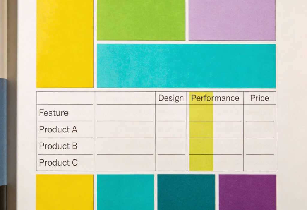
Comparison Tables That Empower Choice
Comparison tables make decision-making effortless. Instead of asking shoppers to jump between tabs or pages, give them a single view that lines up each product’s features, specifications, and pricing.
Here, simplicity is key, so use a consistent layout, plain language, and clear highlighting to show how each option differs. This format helps people evaluate faster, reduces hesitation, and reduces abandoned carts. As an added benefit, comparison tables strengthen your SEO by creating structured content that keeps users on your page longer.
Designing for Choice: Variations and Fit
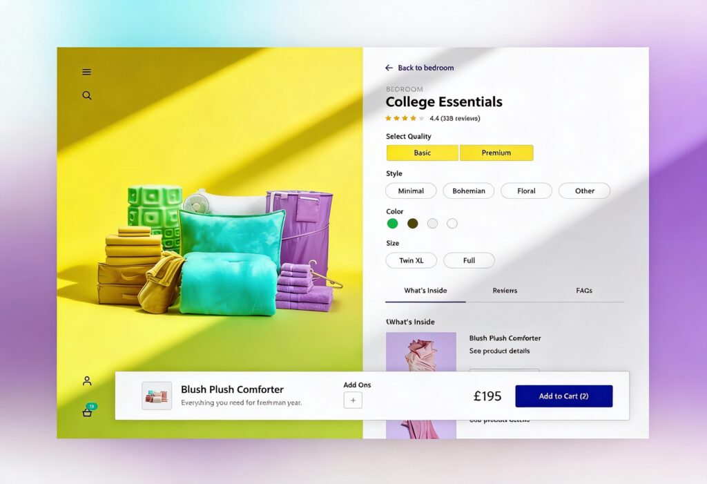
Every shopper has a slightly different set of preferences, from size and colour to technical specifications. Your product page design should handle these variations smoothly without overwhelming the user.
Simple Option Selection
Option selectors should be easy to scan and tap. Use descriptive labels instead of abbreviations. For colour choices, swatches or thumbnails work better than drop-down menus. For quantities or bundles, keep the default value clear and allow instant updates.
When stock syncs automatically through ERP or POS systems using webhooks or message queues, users always see accurate availability. This prevents frustration when items go out of stock mid-purchase.
Size and Fit Guides and Helpers
For fashion, furniture, and technical goods, fit guidance prevents costly returns. Use tools such as size charts, visual guides, and “Find My Fit” quizzes to support decisions. Show model or reference data in product photos, including height, weight, or dimensions, so buyers can visualise the product in their own context.
Optimising Media for Confidence
Images and video provide the tactile experience that online shopping lacks. Done right, they reassure users and make the product feel tangible.
Product Galleries and Video
Your product gallery should guide customers through a visual story. Begin with aspirational lifestyle images that highlight the product’s purpose, then include precise close-ups to show material and finish. Balance these with plain background shots to illustrate size and shape. Short videos or 360-degree tools can help users explore movement, fit, and usability.
Finally, invite your community to play a part. Featuring customer photos or tagged posts alongside professional imagery shows your product in genuine use, proving its value and enhancing social proof.
Image Performance
Fast-loading images are essential for keeping visitors engaged. Compress and optimise images without losing quality. Lazy loading can improve perceived speed, while responsive design ensures visual consistency across devices.
According to UX research, a delay of just a few seconds can cause noticeable drops in conversion rate. Regularly testing load times helps maintain performance during high-traffic periods. This becomes especially important when preparing for promotions or large campaigns, where spikes in visitors can strain your infrastructure.
Testing and Iterating for Better Conversions
No product page stays perfect forever. Continuous testing keeps it aligned with customer expectations and business goals.
A/B Testing CTAs and Badge Placement
A high-performing page often comes down to the small details. Try testing different button labels or colours to find the combination that naturally attracts attention. Experiment with where you place key reassurance elements, such as free delivery notices or secure checkout badges. The key is to change one thing at a time so you can track cause and effect.
Behaviour Analytics and Heatmaps
Tools such as heatmaps, session replays, and click tracking reveal how users interact with your PDP. You can see where attention drops or where confusion occurs. These patterns often point to unclear layouts, weak hierarchy, or distracting elements.
Data-driven improvements not only enhance usability but also support conversion rate optimisation. Understanding how people navigate helps refine the flow and boost purchase intent.
Using Data to Refine Messaging and Layout
Combine behavioural insights with qualitative feedback. Ask returning customers what made their purchase decision easier. Run surveys to uncover what nearly stopped them from buying. Over time, you’ll build a feedback loop that continually strengthens both the visual and verbal design.
Tracking performance across campaigns can also reveal how different traffic sources respond. For instance, Performance Max campaigns can drive diverse user intent, so tailoring PDP layouts for these audiences can improve efficiency. Explore the benefits of Performance Max to see how smarter targeting supports your wider ecommerce goals.
Your Product Pages Deserve Better!
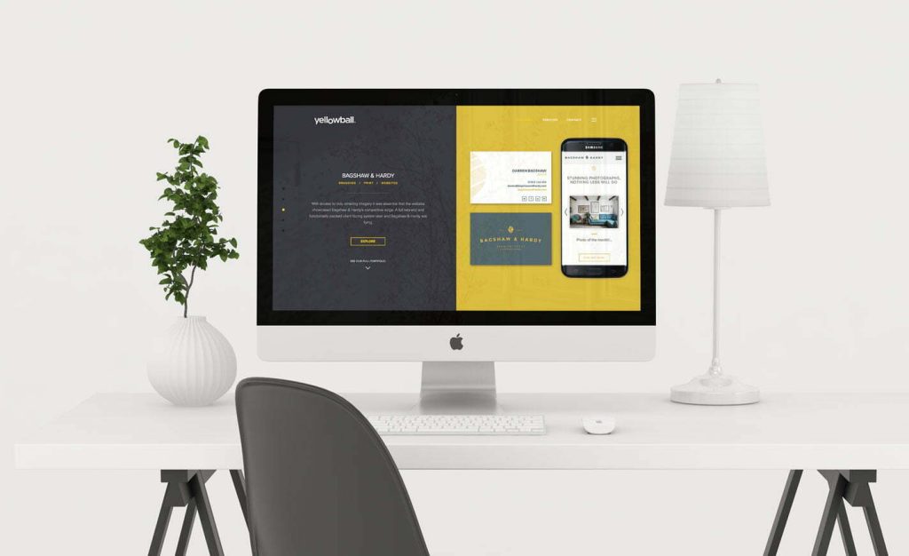
At Yellowball, our ecommerce work speaks for itself. We helped Ballet With Isabella grow memberships by over 45% with a restructured product architecture and lightning-fast performance. Tomatin, a heritage whisky brand, saw its average order value grow significantly after we created a seamless shop experience tailored for both D2C and partner-led conversion.
Discover how better UX, cleaner structure, and smarter messaging can make your e-commerce store more functional, more profitable, and more rewarding to run. Get the ball rolling with Yellowball and build product detail pages that truly sell!