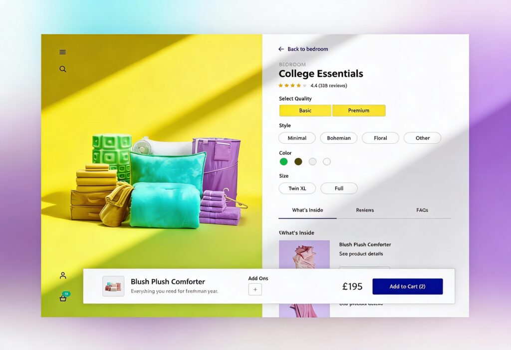
Every visitor comparing your products or services is trying to answer one simple question: which option is best for me? A well-crafted comparison table helps them find that answer quickly. It gives structure to information that might otherwise feel overwhelming. When your table has clear column labels, easy-to-read text, and a logical layout, customers can quickly make sense of complex data and make a decision. Clarity looks good, and it directly drives conversions, so here’s how to make the most of this essential element of UX web design!
Why Comparison Tables Matter for Decision Support
Good comparison tables make it easy to choose and buy. When features and pricing appear together, users don’t have to think twice. They can see, compare, and buy effortlessly and quickly.
Turning Data into Decisions
When users reach a pricing or comparison page, they are no longer browsing. They are evaluating. The best tables help them decide.
When data is presented well, it tells a story users can follow. Good spacing, simple labels, and consistent formatting keep everything easy on the eye. By calling out key differences (such as improved performance or added value), you help users see what matters most. This transparency builds trust and encourages conversions because users feel informed rather than sold to.
The Role of Scannability and Trust
Scannability is one of the most important elements in comparison UX. When information is clean and easy to read, users feel confident in their understanding. Good design supports this through spacing, consistent alignment, and legible typography.
Techniques like zebra striping and fixed headers guide the eye and make long tables easier to read. Icons next to text improve scanning speed, helping users find what they need faster. When a layout feels tidy and authentic, users trust what they see. You can explore more about how design clarity builds confidence in our guide on understanding user behaviour on websites.
Core Design Principles for Comparison Tables
The most effective comparison tables share the same foundation: structure, clarity, and consistency. Every decision affects how easily users can process information and move forward with their purchase.
Table Structures That Make Sense
A comparison table should be simple enough for anyone to understand at a glance. Group features logically and keep the most important attributes (price, availability, and main features) at the top to align with how users naturally read from left to right and top to bottom.
Also, it’s important to have plenty of white space between rows and columns to avoid visual clutter and help users focus. A cramped table can make even simple comparisons feel confusing.
Highlighting Key Differences
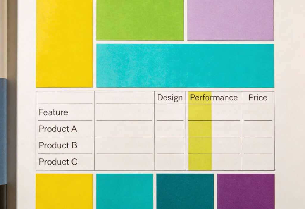
The purpose of a comparison table is not to show everything but to show what matters. Use subtle colour, bold text, or icons to highlight differences between options. If one plan offers a standout feature, make that clear.
This is where visual hierarchy plays an essential role. You can learn more about directing focus in our guide on visual hierarchy. Keep your emphasis natural and avoid heavy contrast that distracts from the overall message.
Pairing Text and Icons
Text conveys detail, but icons communicate quickly. Pairing the two helps users process information faster, especially on mobile. Use icons to support repeated features such as security, delivery, or integrations.
Keep icon style, size, and colour consistent across the table. Inconsistent visuals break rhythm and draw attention away from the content. Icons should enhance clarity, not compete with it.
Designing for Mobile and Responsiveness
Mobile browsing now dominates web traffic, so your comparison tables must adapt seamlessly to smaller screens. A static desktop layout can become unreadable on mobile and frustrate users.
Responsive Table Patterns
Design your responsive tables to adapt to different viewports. Stack content vertically, enable horizontal scrolling, or include toggle controls that let users reveal extra columns when needed. This keeps data readable without overwhelming the layout.
Interactive elements such as collapsible rows or sliding cards give users control while maintaining clarity. Balance flexibility with usability and test your patterns across devices to ensure the best experience.
Keeping Context Visible
When users scroll through a large table, they should never lose track of what they are comparing. Sticky headers or fixed columns keep essential information, such as plan names or prices, in view, and use a light background shade for the header and subtle dividing lines between sections to keep things clear and easy to read.
Performance and Accessibility
A high-quality comparison table should be fast and easy to access. Use semantic HTML, compress images and icons, and optimise responsive breakpoints. Ensure text contrast, font size, and keyboard navigation are compliant with accessibility standards.
Accessible design improves user experience for everyone. It shows professionalism and care. You can explore more in our guide on inclusive design and accessibility in UI.
Enhancing Usability with Sorting, Filtering and Export
Comparison tables become much more powerful when users can interact with them. Sorting, filtering, and export options make tables adaptable and useful for different audiences.
Sort by User Intent
Allow users to sort rows or columns based on what matters to them. For example, they might want to sort by price, features, or compatibility. Sorting gives users control and helps them focus on what is most relevant.
Make sure sorting is quick, reversible, and easy to understand by adding visual cues (arrows or highlighted columns) to indicate the active sort.
Filter for Relevance
Filters allow users to remove noise and focus on what fits their needs. A shopper comparing cameras might only want to see models with 4K video or a certain lens type. Smart filtering improves usability and speeds up decision-making.
Filtering also supports decision-making by making complex datasets easier to navigate. The faster users find what they need, the more likely they are to convert.
Export and Share Options
In B2B and high-value ecommerce, users often want to share comparisons with others. Add simple tools that let them export data to PDF or CSV, or share a link to their filtered view.
These small details show users that you value their entire journey, not just the checkout stage. They create a sense of thoughtfulness and trust.
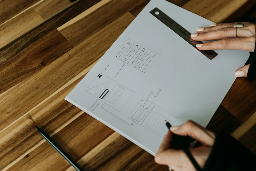
Testing and Validating Table Design
No table design is perfect right away. Testing helps you understand how people interact with your layout and where they might get stuck.
Measure Scannability
Watch how users read and interpret your table. Eye-tracking research shows that people move horizontally to compare options and vertically to review details. If users get lost, adjust alignment, labels, or spacing.
Use heatmaps and scroll maps to see where attention drops. If users lose interest halfway, reorganise or simplify your content.
Run A/B Tests on Highlights and Order
Try testing variations in layout, colour, and column order. Even small changes, such as simplifying feature names or moving pricing information, can improve engagement.
Gather both quantitative and qualitative feedback. Metrics tell you what works, while direct comments tell you why. Over time, these insights will help you refine your design to match real-world behaviour.
Help Users Decide to Buy Faster with Expert Comparison Tables and UX Website Design
A well-designed comparison table helps users and businesses alike. When people can compare confidently, they buy confidently. The secret is in the details: clear structure, accessible design, and responsive performance across devices.
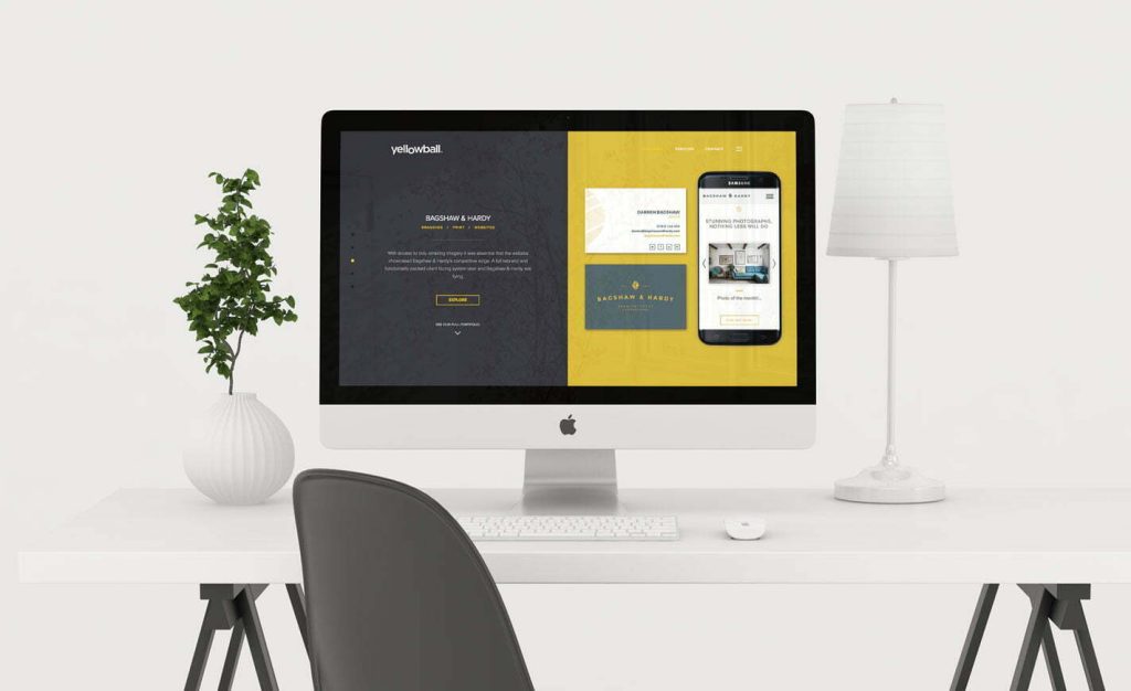
At Yellowball, we design comparison tables and product pages that make decisions simple, trustworthy, and engaging. Our UX and UI specialists use research, testing, and technical expertise to create solutions that look great and perform even better.
If you are ready to simplify your user experience and increase conversions, get the ball rolling with our expert UX design team. Clarity converts, and we can help you achieve it!