

Each colour choice carries responsibility and a profound impact on both website and graphic design. It can guide users forward or quietly push them away. In digital design, colour accessibility sits at the heart of that balance. It affects readability, comprehension, and confidence. Poor contrast slows people down, but clear contrast helps them move with ease.
Here’s how designers can meet colour accessibility standards while preserving brand character, using contrast ratios, palette structure, and real-world checks that reflect how people actually use screens.
What Accessibility Means for Colour in Digital Design
Colour accessibility is about visibility and understanding. It looks at whether text stands out, controls are recognisable, and information remains clear for users with varying levels of vision and in less-than-ideal viewing conditions, making it fundamental to inclusive web and graphic design.
Why Colour Matters for Users with Visual Impairments
Visual impairment covers a wide spectrum. It includes people with low vision, colour vision deficiency, age-related sight changes, eye strain, or temporary limitations such as glare or fatigue. Many users do not identify as having a disability, yet still struggle with poor colour contrast or subtle visual cues.
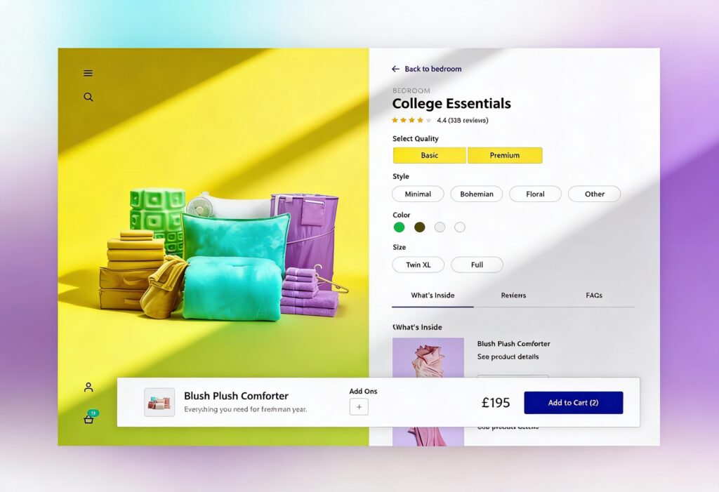
Relying on colour alone to convey meaning causes problems fast. For example, error messages shown only in red, active states only identifiable by hue, or low-contrast body text placed over textured backgrounds. These patterns force users to work harder or abandon the experience altogether.
Strong colour accessibility improves clarity and user experience for everyone. Clear contrast helps users read faster, and well-defined palettes reduce cognitive load. Mindful colour use supports the broader goals of usability and trust, which are central to effective user experience in graphic design.
Key Legal and Standards-Based Considerations (WCAG, etc.)
The Web Content Accessibility Guidelines provide the reference point most teams work from when assessing colour contrast. They outline how much separation is needed between text and backgrounds so that the content remains readable.
For normal body text, the minimum contrast ratio is 4.5 to 1. For large text, such as headings or bold copy over a certain size, the requirement drops to 3 to 1. User interface elements and icons also have defined contrast expectations.
These standards appear across accessibility legislation and organisational policies worldwide. They give designers a clear reference point, even when formal compliance is not required. Colour accessibility belongs in the same category as site speed, security, and readable content. It underpins quality rather than sitting on the sidelines.
Building Accessible Colour Palettes
Accessible colour palettes start with structure, not guesswork. Rather than choosing colours in isolation, designers benefit from systems that define roles, relationships, and limits.
Choosing Base Colours and Supporting Hues
Every palette begins with a core set of base colours. These usually include primary brand colours, neutrals, and key functional colours such as success, warning, and error states.
Contrast needs attention at the earliest stage of colour selection. A strong brand colour may perform well in a logo but struggle as body text on light backgrounds. That does not make it unusable. It often signals that the colour suits accents or surface areas rather than typography. Supporting colours then help expand the palette, adding range without sacrificing clarity. Small changes in brightness or saturation usually create clearer separation than switching hues.
Accessible design principles favour consistency. When users learn that a certain colour signals a specific action or state, that meaning should remain stable across the interface.
Establishing Contrast Ratios for Text, Icons and UI Elements
Contrast should be measured, not guessed. Visual judgement alone is unreliable, especially when working across screens and environments. This is where a colour contrast checker or colour accessibility checker becomes essential.
Contrast checks should cover all text sizes, iconography, form elements, and interactive components. Placeholder text, disabled states, and secondary labels are often overlooked, yet they still need to remain readable.
Good practice involves defining contrast-safe pairings within the design system. For example, specifying which text colours are approved on which background colours. This reduces risk and speeds up design decisions.
Light Mode vs Dark Mode Considerations
Dark mode adds an extra layer of complexity to colour accessibility. Light text on dark backgrounds can technically meet contrast requirements while still causing eye strain if brightness levels are poorly balanced. Pure white text on a black background often feels harsh over time. Using slightly off-white text on deep charcoal surfaces usually improves comfort while still meeting WCAG colour contrast standards.
Colour behaviour also shifts in dark interfaces. Saturated tones tend to appear stronger against darker surfaces, which can affect readability and visual hierarchy if not carefully controlled. Testing both light and dark modes with the same level of attention helps ensure colour choices remain clear, comfortable, and consistent across environments.
Real-World Contrast Checks and Testing
Meeting contrast ratios on paper is only part of the job. Real users view designs in imperfect conditions. Phones in sunlight. Laptops with low brightness. Older monitors with faded colour accuracy.
Tools and Techniques for Contrast Verification
Automated tools play a valuable role in early checks. A colour contrast checker allows quick validation of text and background combinations. A colour accessibility checker can highlight problem areas across entire pages or components.
Design tools often include built-in contrast indicators, but these should be treated as a starting point rather than a final verdict. Browser-based testing, accessibility audits, and manual reviews all add depth.
Checking contrast at different zoom levels is also important. Many users increase text size or browser zoom, which can change layout density and visual relationships.
User Testing and Contextual Verification (Screen Size, Ambient Light)
Nothing replaces real-world observation. Testing designs on multiple devices reveals issues that static reviews miss. A button that looks clear on a large monitor may fade into the background on a small phone.
Ambient light plays a major role. Low contrast designs struggle outdoors or in bright offices. Asking testers to use designs in varied lighting conditions often exposes weak colour choices quickly.
User testing does not need to be complex. Even informal reviews with colleagues or clients can surface contrast problems when guided by specific questions about readability and clarity.
Case Studies: Good vs Problematic Colour Combinations
Consider dark grey text on a light grey background. On a calibrated screen, it may appear refined and minimal. In practice, many users find it tiring to read, especially over long passages.
By contrast, a slightly darker text colour paired with a cleaner background improves comfort without changing the overall aesthetic. The difference can feel small visually, yet significant in usability.
Another common issue appears in call-to-action buttons. Bright brand colours paired with white text sometimes fail contrast checks. Adjusting the text colour or darkening the button shade often resolves the issue without compromising brand presence.
Integrating Accessible Colour into Design Workflows
Accessibility works best when it is embedded into the process, not added at the end.
Design System Incorporation and Documentation
Design systems provide the ideal framework for colour accessibility. By documenting approved colour combinations, contrast ratios, and usage rules, teams create shared understanding.
Tokens or variables can encode accessibility directly into design tools and codebases. For example, defining semantic colour roles such as primary text, secondary text, surface background, and accent rather than relying on raw colour values.
Clear documentation reduces friction. Designers move faster when they know which options are safe. Developers implement with confidence when specifications are precise.
Communicating with Stakeholders and Ensuring Compliance
Accessibility decisions often require explanation. Stakeholders may question why certain colours cannot be used for specific purposes. Framing the conversation around usability, inclusivity, and long-term quality helps build support.
Linking colour accessibility back to broader business goals also helps. Clearer interfaces reduce support requests. Accessible designs reach wider audiences. Compliance reduces risk.
Yellowball’s guide to inclusive design and accessibility in UI offers practical advice on aligning teams around these goals without overwhelming them with technical language.
More Impressive Creatives for More Customers
Accessible colour design does not limit creativity. It sharpens it. Constraints push designers to think more carefully about hierarchy, clarity, and intent. The result is work that feels thoughtful rather than restrictive.
Contrast standards, accessible colour palettes, and real-world testing form a practical foundation. When applied consistently, they improve usability for all users, not just those with recognised impairments.
Checklist for Accessible Colour Implementation
- Check all text and UI elements against WCAG colour contrast guidelines
Review every instance of text, icons, and interactive components against WCAG contrast thresholds. Body text should meet a minimum contrast ratio of 4.5 to 1, while large text and bold headings may meet a 3 to 1 ratio. Do not overlook secondary content such as form labels, placeholder text, helper copy, disabled states, and iconography, as these frequently fall below acceptable contrast levels. - Avoid using colour as the sole indicator of meaning
Colour alone should never carry critical information. Error messages, alerts, required fields, and status changes must include additional cues such as text labels, icons, patterns, or positioning. This ensures meaning remains clear for users with colour vision deficiency and in environments where colour perception is reduced. - Define contrast-safe colour pairings in your design system
Document approved foreground and background colour combinations within your design system. Assign semantic roles such as primary text, secondary text, surface backgrounds, and interactive states rather than relying on raw colour values. This approach helps designers and developers select colours confidently while maintaining consistent colour contrast accessibility across the product. - Test designs in light and dark modes
Assess contrast and legibility separately in both themes. Colours that perform well in light mode can behave differently in dark environments due to increased saturation and brightness perception. Use off-white text on dark grey surfaces where possible to reduce eye strain while still meeting contrast requirements. - Review designs across devices, screen sizes, and lighting conditions
Test designs on mobile, tablet, and desktop devices, and across different screen resolutions and brightness settings. View interfaces in varied lighting conditions, including bright daylight and low-light conditions. These checks reveal contrast issues that may not be obvious during design reviews on calibrated displays. - Validate choices with a colour contrast checker and real user feedback
Use a reliable colour contrast checker or colour accessibility checker to confirm compliance at the component and page level. Pair automated checks with real user feedback wherever possible. Observing how people read and interact with content often highlights contrast issues that tools alone cannot detect.
Further Learning and Resources
Accessibility is an ongoing practice, not a one-off task. Continuing to learn from standards bodies, academic research, and lived user experience keeps design work relevant and responsible.
If you are planning a new website, refreshing an existing platform, or unsure whether your current colour system meets accessibility standards, now is the right time to review it with our web design and graphic design teams.
For teams ready to improve website accessibility and performance, get in touch with Yellowball to discuss your project and let’s get the ball rolling!