
Strong digital branding is founded on structure and intention, and a web-ready brand kit provides this through a clear framework for consistent, high-performing design. Every choice, from typography to colour palette, should enhance both aesthetics and usability. When you plan your assets with care, your brand stays sharp and recognisable across every digital platform. This guide shows how to achieve that balance.
What “Web-Ready” Really Means
A web-ready brand kit is a performance-driven foundation for every user interaction with your business online. Every single brand asset, whether it’s your logo, font, or colour, should be designed first for digital use.
Beyond Aesthetics: Think Performance and Accessibility
Load speed is also important for both SEO and user experience. Oversized images, unoptimised fonts, and redundant assets are often the reason behind sluggish websites, so each file should be web-optimised, streamlined, and compressed to maintain sharp visuals without sacrificing speed.
Another important factor is how usable your website is for people with visual impairments or cognitive differences. Following accessibility and inclusivity guidelines will make your digital environments more user-friendly by ensuring that elements such as font weight, colour contrast, and spacing meet recognised standards.
File Formats and Responsive Readiness
Use adaptable vector formats like SVG to keep icons and logos crisp on any device without slowing your website down with large file sizes.
Web fonts, particularly variable fonts, allow responsive scaling without requiring multiple font files. This flexibility ensures your site remains fast and consistent whether it is viewed on a mobile phone or an ultra-wide desktop display.
Building a Tokenised Colour Palette
Your colour palette is the backbone of your brand identity, but online, it must also function within a coded design system. Tokenisation breaks colours down into named variables, supporting scalability and consistency across all your digital products.
Colour Tokens and System Naming Conventions
Start by creating a consistent naming system for your colour tokens. You can group each colour into tiers, such as primary-100 to primary-900 or neutral-50 to neutral-900. This structure keeps gradients organised, makes collaboration easier, and allows both designers and developers to update colours without confusion.
Designing for Light and Dark Mode
Light and dark themes are commonly used today across browsers, websites, and devices, so it’s important to provide this option. Your colour palette must include complementary tones that maintain readability and aesthetic balance in both of these modes, so colours adapt naturally and preserve the visual consistency of the web design without harsh contrasts or dull tones.
Accessibility and Contrast Ratios
The Web Content Accessibility Guidelines (WCAG) recommend a minimum contrast ratio of 4.5:1 for body text and 3:1 for larger text. Tools such as Contrast Checker and Stark (available in Figma) can help verify the compliance of your design.
Defining Web Typography That Scales
Typography is one of the key ways your brand identity is expressed online, and a well-designed type system improves readability, builds hierarchy, and keeps everything consistent across devices. This helps users navigate your content easily while reinforcing your brand’s personality.
Choosing Variable Fonts for Performance and Flexibility
Modern web design relies heavily on variable fonts for both style and performance. With a single file, you can include every weight and style variation your brand needs. This reduces loading time and gives you full control over how text behaves across devices.
Always plan a fallback stack. When your primary font is unavailable, your backup fonts should match its overall proportions and rhythm to maintain a consistent reading experience.
Setting Responsive Type Systems
CSS functions such as clamp() let you set responsive font sizes that scale smoothly across different screen widths, so headlines, subheadings, and body copy maintain a balanced hierarchy across devices. Figma’s auto styles can mirror this responsiveness visually during design, making it easier to maintain consistency during development.
Packaging Brand Assets That Load Fast
A modern web-ready brand kit focuses as much on efficiency as it does on aesthetics. Every file should be optimised for delivery on different networks and devices.
SVG-First Workflow for Logos and Icons
SVG files are ideal for logos, icons, and simple illustrations because they are lightweight, resolution-independent, and editable at the code level. This makes them great for removing unnecessary metadata, minimising paths, and logically grouping layers.
Social Cards and Imagery Compression
Every image your brand shares contributes to its overall impression. Make sure social graphics, ad banners, and website previews share the same colour, tone, and proportions. Ratios like 1.91:1 for Open Graph and 1:1 for Instagram help create a cohesive look. Before uploading, compress each file with TinyPNG or Squoosh to maintain high visual quality while keeping load times short.
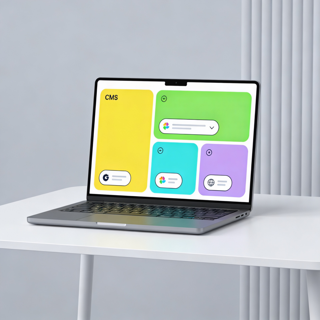
Creating a Starter Component Set
A good brand kit also defines UI components that bring your visual identity to life online. Reusable design elements speed up workflows and reinforce brand consistency.
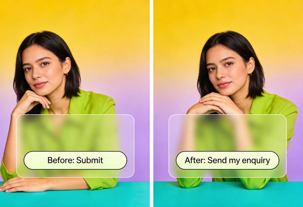
Buttons, Headers, and Patterns That Reflect the Brand
Core interface components such as buttons, headers, and form fields should reflect your colour palette and typography choices. These elements guide user behaviour while maintaining visual unity. Reusable components simplify design updates and improve collaboration between designers and developers.
To understand how structured systems like this feed into full-scale website builds, explore The Ultimate Web Design Process in 7 Simple Steps.
Handing Over a Polished Figma Library
Your Figma brand library is the central hub for everything related to your visual identity. It helps teams collaborate smoothly, reduces confusion, and keeps every piece of content following the same design standards, no matter where it appears.
Structuring the Library for Clarity and Speed
Create well-organised folders for Colour Tokens, Typography, Components, and Icons. Within each folder, apply clear naming conventions such as:
- Buttons / Primary / Default
- Typography / H1 / Desktop
- Colour / Primary / 500
A structured approach makes assets easy to find and keeps your system scalable. Link reusable styles to shared variables so updates automatically apply across every design.
Exporting Optimised Assets
When exporting files, apply best practices for asset optimisation.
- Use SVGs for logos and icons.
- Create export presets for WebP, PNG, and JPG formats.
- Minimise layers to keep files lightweight.
- Use names that align with your development environment, such as btn-primary.svg or logo-horizontal.svg.
Maintaining Consistency with Design Tokens
Use design tokens to define your colours, typography, and spacing consistently. We recommend tools like Figma Tokens or Style Dictionary, which can automatically translate these settings into code, helping designers and developers stay aligned throughout a project.
Creating Usage Documentation and Training
Document how each component should be used to keep your design system easy to follow. Add short notes on placement, sizing, and accessibility for clarity, and create a companion brand guide that explains export settings and shows examples of correct and incorrect use. With these resources in place, both in-house teams and other partners can work efficiently with your brand.
Version Control and Collaboration
Document each version of your design files to maintain a clear project history. Ask your team to label updates, retire old components, and check the library regularly for accuracy. These small habits prevent confusion and keep your design system in order.
A tidy, versioned Figma library boosts efficiency and helps every department stay aligned. To dive deeper into best practices for organised design documentation, visit What Are Brand Guidelines?.
Extending Your Web-Ready Brand Kit Across Social and Advertising Platforms
Your brand should transition smoothly between different digital spaces, from your homepage to campaign banners and social media posts. An effective web-ready brand kit ensures your visuals adapt effortlessly across platforms while staying sharp and consistent.
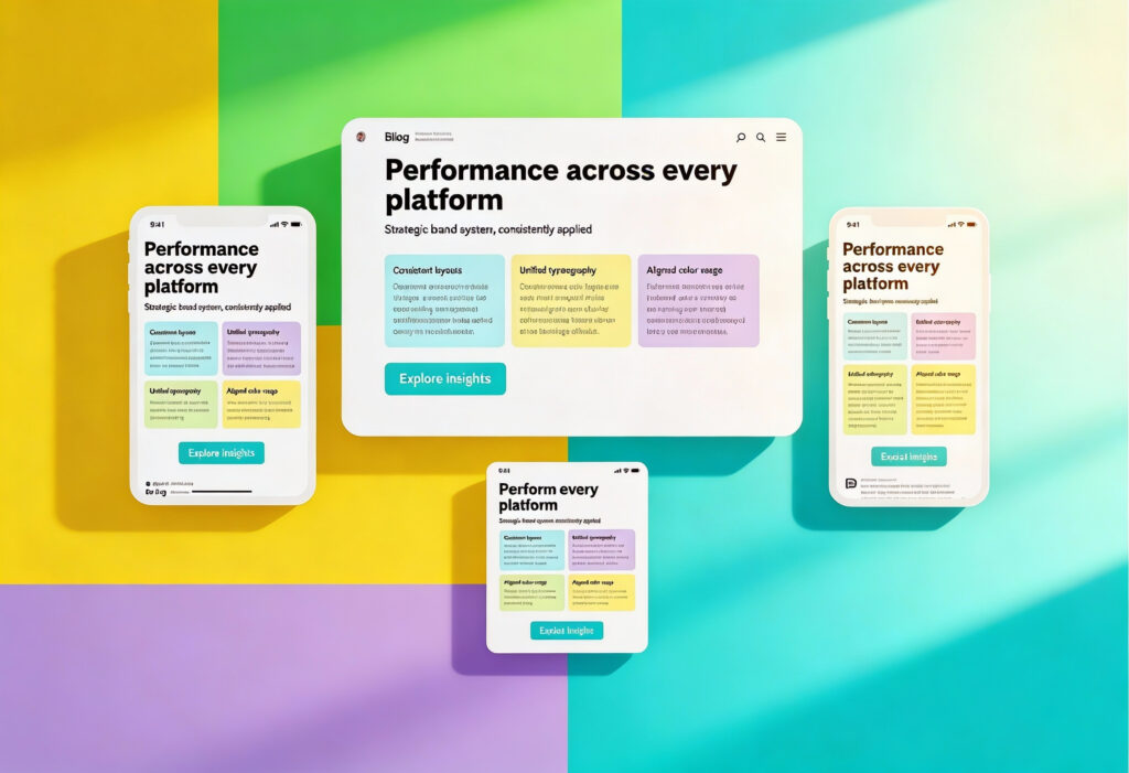
Designing for Multiple Ratios and Contexts
Every digital platform treats visuals a little differently. Image sizes, layouts, and ratios all vary, which means your design system needs room to adapt. A logo that feels perfectly balanced on your website might look cramped in a social media profile or stretched in a banner ad. Creating alternate layouts early helps your brand stay clear, polished, and consistent wherever it appears.
Creating Reusable Templates in Figma
Your Figma brand library can also work well as a foundation for marketing materials, so use it to set up shared templates for social posts, banners, and ad creatives that reference your existing colour tokens and typography styles. This helps keep everything consistent and saves teams time when producing content. By systematising layouts, teams can quickly create campaign-ready graphics that stay true to your core visual identity.
Optimising Assets for Ads and Social Media
Digital advertising platforms compress and resize files differently, which can distort images or blur logos. Always export assets in multiple sizes and use the smallest file size possible without noticeable quality loss. Vector-based SVGs work well for icons and logos, while compressed PNGs or WebP formats work well for larger visuals.
Ensure colour accuracy across environments by checking how your chosen tones look on both mobile and desktop devices. Small adjustments to saturation or brightness can make a significant difference in perceived quality once an image is uploaded.
Final Checks Before Launch
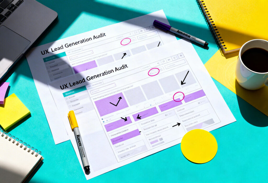
Before putting your new brand kit in action, a comprehensive audit is needed to ensure that performance, accessibility, and consistency align with your digital goals.
Performance, Accessibility, and Brand Consistency Audit
Test how quickly your assets load, whether typography and colour maintain readability, and if all design elements meet accessibility standards. Review your Figma brand library for naming consistency and redundant components.
Cross-device testing is essential, so always review how assets render across iOS, Android, and desktop browsers to catch any scaling or alignment issues. Also, it’s worthwhile to make sure that your SVG workflow, colour tokens, and variable fonts are all working as intended.
Bring Your Brand to Life Across Every Screen
An effective web-ready brand kit is not about complexity; it is about clarity. It ensures that everyone, from designers to developers, has the tools to maintain brand consistency and high performance. With a well-organised colour palette, responsive typography, and optimised assets, your brand will look and function beautifully on every screen.
If you are ready to create a digital identity that performs as beautifully as it looks, the team at Yellowball can help. Our graphics and design team combine strategy, technical expertise, and creative precision to build design systems that truly deliver. Ready to build your web-ready brand kit? Contact us today to get the ball rolling!