A website without effective calls to action is like a shop with no checkout counter. You might attract plenty of visitors, but few will take the next step. The call to action (CTA) is what guides users from curiosity to commitment. Whether it’s “Book a consultation,” “Download the guide,” or “Add to cart,” the quality of your CTA can make or break conversion rates.
If you’re a business owner, marketing manager, or product specialist trying to improve website conversions, this guide explains how to write call to actions that convert. It combines practical UX principles, marketing psychology, and proven strategies to help you craft CTAs that inspire real action.
What Is a Call to Action Button on a Website?
A call to action is any prompt designed to get a user to take a specific step. On a website, this often takes the form of a button, link, or banner that leads the user toward a goal such as filling out a form, booking a demo, or completing a purchase.
CTAs are used throughout the digital journey, not just on product pages. You’ll find them on landing pages, blogs, emails, and even navigation menus. For example:
- “Get your free quote” on a service page
- “Download our SEO checklist” at the end of a blog post
- “Start your trial” on a pricing page
Every effective website design prioritises clear and visually distinct CTAs. The user should never have to guess what action comes next. If you want to explore broader strategies for improving your website performance, read Yellowball’s guide on 10 steps to a reliable website marketing strategy.
Why Call to Action Is Important for Your Business
A call to action is the bridge between attention and action. It signals what happens next and, when designed with care, becomes one of the most powerful drivers of conversion on your website.
1. They Direct User Flow
When a CTA appears at the right moment, it provides momentum through your sales funnel and streamlines the experience for visitors, turning interested visitors into active customers and preventing them from getting confused or even abandoning the page.
2. They Improve Conversion Rates
Research from Unbounce and HubSpot proves that CTAs are powerful levers for performance. Adjusting one element, like phrasing, placement, or design, can trigger noticeable jumps in conversion rates.
3. They Support Marketing Objectives
Whether you are running paid ads, social campaigns, or focusing on organic search rankings, every digital channel has one goal: getting a visitor to take action. CTAs bring all your creative and strategic efforts together to target that one result.
4. They Offer Insight into User Behaviour
By analysing which CTAs get the most clicks, you gain valuable data about your audience’s motivations. This helps refine both your message and your wider user experience.
In short, understanding why call to action is important helps you design not only for aesthetics but for results.
How to Write a Call to Action That Drives Conversions
Writing a CTA that converts means creating an action point with a mix of clarity, psychology, and testing, making it an art as well as a science. Here’s how to do it effectively.
1. Be Clear Rather Than Clever
Always remember that clear, confident CTAs outperform clever ones every time. When a visitor to your website reads “Join our waitlist”, “Buy now” or “Book free call,” they instantly understand the benefit and are more likely to click.
2. Create a Sense of Value
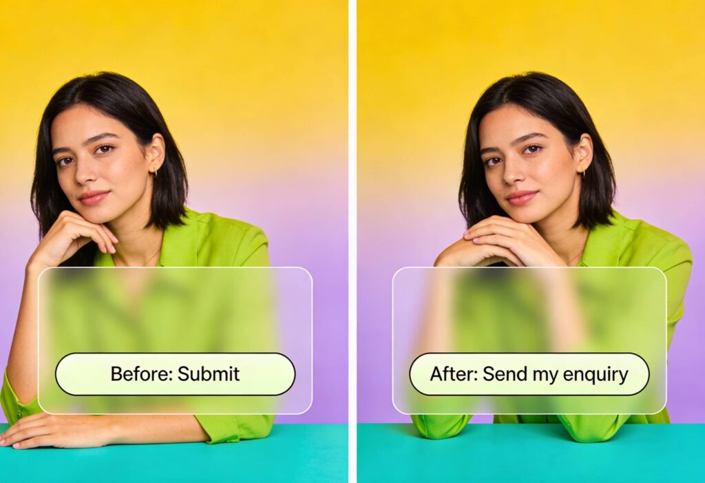
People respond when they see something worth their time. Highlight the benefit behind the action. Instead of “Submit,” use “Book a free consult” or “Download the full guide.” You’re not just asking them to click on a button, you’re offering them something of value in return.
3. Keep It Short
How long should a call to action be? Well, the answer depends on context, but being short and sweet is always a win. Most CTAs work best at between two and five words, because anything longer becomes hard to scan quickly.
4. Match the CTA to the User’s Stage
Tailor CTAs to match intent of visitors at different stages of the funnel, guiding them from interested through to active customer:
- Early stage: “Download our free guide”
- Mid stage: “See our pricing”
- Late stage: “Book your consultation”
This approach ensures your calls to action feel natural rather than intrusive.
5. Use Design to Draw the Eye
Design your CTA so it feels natural to click. Bold contrast, clean spacing, and a clear visual path draw attention without clutter. We recommend that you use contrasting colours, consistent placement on your design, and whitespace to keep it clutter-free. Read Yellowball’s SEO-friendly web design guide for more insights into how design influences engagement.
6. Leverage Action Verbs
Start your CTA with a strong verb. Words like “Start,” “Get,” “Try,” and “Book” create rewarding momentum that gently pushes your visitor to your product or service. Avoid passive phrasing, since active wording drives more intention and action.
7. Test, Measure, and Refine
Even experienced marketers can’t always predict what will work best. Use A/B testing to compare wording, colour, or placement. This continuous optimisation helps improve your cta conversion rate over time.
How Many Call to Actions Should a Landing Page Have?
There’s no universal rule, but clarity always beats quantity. Too many CTAs can confuse users and dilute focus. Most high-performing landing pages follow one of these models:
- Single Goal Model: One core CTA throughout the page, repeated in several places (e.g., top, middle, and bottom). Ideal for product sign-ups or bookings.
- Primary + Secondary Model: One main CTA supported by a softer secondary action such as “Learn more.” This gives hesitant users a gentler next step without distraction.
When deciding how many call to actions on a landing page you need, focus on intent. If the goal is to book a consultation, every CTA should point towards that outcome.
If you want to understand how effective landing page structure boosts click-through rates, explore Yellowball’s guide to increasing CTR from SERPs.
Common CTA Mistakes That Kill Conversions
Even polished websites can miss the mark when their CTAs fail to connect. Before redesigning, check for these common mistakes:
Generic Language
Weak CTAs don’t guide or motivate your visitors, so get rid of bland wording like “Submit” with something meaningful like “Book a consultation” or “See pricing.”
Poor Placement
Buttons buried at the bottom of long pages often go unseen, so be sure to position your CTAs front and centre where visitors are ready to take action.
3. Overwhelming Users with Choices
Too many competing CTAs create confusion and fatigue in website visitors, so rather prioritise the primary goal of each page and use a few CTAs designed for specific serivces, products, or actions.
4. Lack of Continuity
A CTA needs to be fully integrated with the next page’s content, so if a user clicks “Get a quote” and lands on a generic homepage, they’ll lose trust, get frustrated, and leave.
5. Ignoring Mobile Design
Around 67.33% of website traffic in the UK comes from mobile devices, making it clear that most people browse on their phones, not desktops. Tiny buttons or cramped layouts make tapping a challenge and quickly turn interest into irritation. Make sure every CTA feels effortless to use on mobile.
6. Forgetting to Track Performance
Data tells the real story of your CTAs. Track every click, hover, and conversion to identify where improvements can boost performance and refine your overall strategy.
Advanced Techniques for CTA Optimisation
After covering the basics, small but strategic enhancements can transform a CTA’s impact. In high-value markets, audiences expect polish, trust, and intention in every interaction. Whether you are selling custom products, technology solutions, or financial services, these advanced techniques can help your CTAs feel as refined as the experiences you deliver.
Use Personalisation
Personalised CTAs are a great way to increase engagement, especially for businesses that rely on credibility and long-term relationships. To make these work, they need to make users feel recognised and valued.
Examples:
- High-end retail: Returning customers could see “Welcome back, explore our winter collection” or “Reserve your private styling appointment.”
- Technology companies: A returning visitor who has already downloaded a white paper could see “See our latest platform update” or “Book a live product walkthrough.”
- Financial firms: Potential clients might be encouraged to “Schedule your portfolio review” or “Find out how our advisors can protect your assets.”
- Bespoke service providers: Visitors could be invited to “Arrange your design consultation” or “Continue building your custom solution.”
Personalisation should feel natural and relevant, connecting with the user’s context and maintaining the tone of your brand.
Add Urgency Thoughtfully
Urgency can be effective when it feels authentic, honest, and natural. In high-end, luxury and B2B markets, audiences tend to respond best to subtle cues, not hard or high-pressure sells. Rather, gently motivate decisions through exclusivity, limited opportunities, or genuine value.
Examples include:
- “Secure your space at our investor briefing.”
- “Limited bespoke bookings available for December.”
- “Apply for early access to the beta programme.”
- “Register your interest before the next intake closes.”
Each phrase conveys exclusivity and timeliness without feeling like a cheap, high-pressure sales tactic. When used sparingly, urgency creates momentum and reinforces value.
Align with Brand Tone
CTAs work best when they echo your brand’s identity. A luxury retailer, a fintech firm, and a creative agency all speak differently, but each should use wording that feels authentic and true to their character.
Examples:
- Luxury retail: “Book your private fitting” or “Enquire about bespoke options.”
- Technology companies: “Request a tailored demo” or “Explore the platform in action.”
- Financial services: “Speak with a senior advisor” or “Download our market insights report.”
- Consultancies and bespoke providers: “Arrange a discovery meeting” or “Let’s plan your next project together.”
Making your CTA’s link with your users makes them feel confident and respected.
Combine CTAs with Supporting Copy
Supporting text adds the human touch your CTA needs. It reassures visitors, sets expectations, and makes taking action feel simple and risk-free.
Examples:
- “Speak directly with our senior consultant” under a “Book your consultation” button.
- “Confidential discussion, no obligation” under “Request a callback.”
- “Guided by certified cloud specialists” beside “See how our platform works.”
- “Created exclusively for business leaders” under “Download the full report.”
Consider Placement and Visual Hierarchy
In high-end websites, flow matters as much as function. Position CTAs so they appear as the next logical step, helping users move with purpose and ease instead of feeling interrupted.
Best practices include:
- Placing your main CTA above the fold to capture attention early.
- Repeating key CTAs at logical points, such as after testimonials or pricing sections.
- Pairing CTAs with supporting visuals, like charts or client logos, to reinforce trust.
- Using consistent spacing and clean alignment to maintain a calm, organised layout.
For technology and financial companies, subtle visual hierarchy and clarity tend to perform better than heavy design effects.
Experiment with Colour and Contrast
Colour influences perception, and the right palette can increase clicks without compromising your aesthetic.
- Luxury retailers often favour deep or neutral tones paired with subtle highlights such as gold or silver to signal quality.
- Technology brands can use crisp, contrasting colours like white and cobalt or charcoal and bright blue to create focus and energy.
- Financial and B2B firms benefit from subdued colour schemes such as navy, grey, and white, which convey reliability and authority.
Hover effects or slight animations can also attract attention while keeping the experience professional.
Tailor CTAs for Different Devices
Decision-makers and premium buyers often research across several devices. A mobile-first approach ensures that your CTAs remain visible, accessible, and easy to act on.
- Keep language concise, for example, “Book a call” or “Get report.”
- Use sticky buttons or fixed bars for long pages.
- Ensure your buttons are large enough to tap comfortably using your finger on a mobile device.
- Link CTAs to mobile-optimised forms or booking tools.
A consistent experience across devices supports trust and removes barriers to conversion.
Use Sequential CTAs for Complex Journeys
Premium purchases and B2B decisions tend to use multiple touchpoints, so sequential CTAs guide users through smaller, logical steps that build trust over time.
Example sequence:
- “Download our industry report.”
- “Book a consultation.”
- “Start your tailored solution.”
This approach works well for financial services, bespoke design consultancies, and technology providers where users need detailed and more technical information before they will feel confident enough to make a decision.
Test and Analyse Regularly
Continuous testing helps you understand what your audience is most engaged by. Experiment with:
- Button text, such as “Schedule consultation” compared to “Book consultation.”
- Button placement and size.
- Tone, from formal to conversational.
- Supporting text, such as “Talk to an expert” compared to “Speak with our team.”
Keep a close eye on how users interact with your CTAs. Track metrics like clicks, time spent on key pages, and completed forms. These insights reveal what’s working and what needs adjustment. Remember, even the best CTA will struggle if the surrounding experience feels clunky or confusing.
For companies planning redesigns or new digital strategies, Yellowball’s WordPress website design services provide the ideal foundation for implementing conversion-focused strategies that complement your brand’s tone and objectives.
Create CTAs That Drive Real Results
The goal of any website call to action best practice is simple: inspire users to move forward. Whether you run a travel or hospitality business, ecommerce store or a SaaS platform, strong CTAs connect your visitors to your value.
Effective CTAs rely on clarity, consistency, and testing. They align design with intent and tone with audience needs. But beyond the technical details lies strategy and understanding when and how to guide the user through each stage of the journey.
At Yellowball, we combine UX design expertise with conversion-focused strategy. Our team helps businesses design websites where every interaction drives measurable outcomes. From crafting intuitive layouts to developing SEO-friendly structures, we ensure your digital presence performs at its best.
If you’re ready to increase engagement, improve usability, and build CTAs that truly convert, contact us about your project and get the ball rolling.