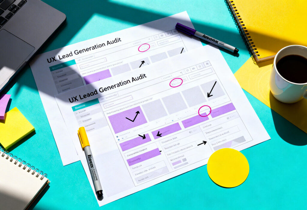
Most people never stop to admire good UX, but they instantly recognise when something slows them down. When pages load cleanly and steps feel obvious, the experience becomes calmer, and decisions are easier to make. It removes unnecessary thinking and helps users glide through each task. This is the heart of zero-decision UX web design.
Zero-decision UX is not about taking control away from users. It is about removing the friction and decisions that they don’t need to make. It recognises that every unnecessary choice adds cognitive load and slows progress. When designers understand this, they can build interfaces that guide people with clarity rather than push them into mental clutter.
For those new to UX concepts, Yellowball’s guides on user experience fundamentals and what is user interface design are excellent starting points. Here, we’ll build on those foundations and explore how zero-decision UX works and why it’s essential to successful web design.
What Zero-Decision UX Really Means
Zero-decision UX website design describes a design approach that reduces the number of choices a user must make to move forward. It does not remove freedom. It simply makes the path clearer.
The Psychology Behind Decision Fatigue
Decision fatigue is a recognised psychological phenomenon. The more decisions someone makes throughout the day, the harder each subsequent decision becomes. This happens even with tiny choices. When a website asks users to choose between ten options, select from three layouts, pick a delivery method, re-enter personal details, or interpret unclear labels, those choices add up.
Digital interfaces create constant micro decisions. Where do I click? What does this word mean? Which version of this option is best? These questions drain attention. When designers understand the user interface as a mental environment, they begin to see that every decision has a cost.
Why Fewer Choices Lead to Faster Actions
When you reduce choices, you remove hesitation. Users feel certain about what to do next. They make progress without stopping to analyse the screen.
This is why simple menus often outperform complex ones. It is also why many modern interfaces rely on defaults and guided flows. Good design creates a path that users follow without effort because it feels obvious.
To explore this concept further, the article 5 UX lessons from a London web design agency provides helpful insight into how clarity shapes user behaviour.
Understanding Cognitive Load in Modern Interfaces
Cognitive load is the mental effort required to complete a task, and understanding these limits helps design pages, sites, and forms that match the natural limits of human attention.
Intrinsic, Extraneous and Germane Load
These three types of cognitive load work together.
- Intrinsic load relates to the difficulty of the task itself. For example, calculating loan repayments is inherently complex.
- Extraneous load is caused by poor design. Confusing layouts, cluttered content, and unnecessary steps all increase extraneous load.
- Germane load supports learning or understanding. A clear label or simple illustration can make a difficult concept easier to grasp.
Zero-decision UX reduces extraneous load. It clears the mental path so users focus only on what actually matters.
For a deeper breakdown of how to organise content to support lower cognitive load, Yellowball’s guide to information architecture is a useful resource.
How Micro-Decisions Slow Users Down
A micro decision seems harmless on its own. It might be choosing between two buttons or figuring out which field to fill first. But when users make dozens of these small choices, their pace slows.
Common sources of micro decisions include:
- Buttons are placed with inconsistent hierarchy
- Forms that ask for information earlier than needed
- Menus with too many similar options
- Pages that mix primary and secondary actions in confusing ways
Once you begin spotting these patterns, you can replace them with clearer experiences.
Design Patterns That Reduce Decision-Making
Zero-decision UX relies on thoughtful choices made by the designer. When teams understand what a UX design pattern is, they can apply consistent solutions that reduce friction.
Smart Defaults and Pre-Filled Options
Defaults are powerful. Most users accept them because they tend to reflect the most common choice. When carefully chosen, defaults reduce decision-making without limiting control.
Examples include:
- Selecting the most common shipping method automatically
- Pre-filling a user’s city based on postcode
- Choosing the right date format based on region
- Remembering a user’s preferred payment method
Smart defaults save time and reduce mental effort. They also prevent errors by guiding users through established patterns.
Progressive Disclosure for Clarity
Progressive disclosure shows the right information at the right moment. It controls complexity by presenting core options first and revealing advanced choices only when needed.
For example:
- Checkout flows that hide discount fields unless clicked
- Account settings that group advanced controls under collapsible sections
- Onboarding that reveals new features step by step
This approach removes noise. It keeps the interface calm and supports users who might otherwise feel overwhelmed.
Predictive and Contextual UI Behaviours
Interfaces can anticipate needs without becoming intrusive. Predictive behaviours help users without forcing them to make choices.
Examples include:
- Predictive search that narrows results as the user types
- Auto-detecting location for store finders
- Date pickers that highlight likely choices, such as tomorrow or next available slot
- Dashboards that show relevant tasks based on recent activity
When done well, predictive patterns feel natural. They help the interface behave like a knowledgeable guide.
Building Interfaces That Guide Without Controlling
A zero-decision approach does not mean taking choices away. It aims to guide users gently so the path feels natural.
Subtle Wayfinding and Context Cues
Wayfinding cues help users understand where they are and what comes next. Designers use:
- Clear headings to anchor the page
- Breadcrumbs for multi-step journeys
- Hover or focus states that show interactivity
- Colour and spacing to establish hierarchy
These cues reduce the need for users to mentally piece together the structure themselves. They also support accessibility by giving clear signposts.
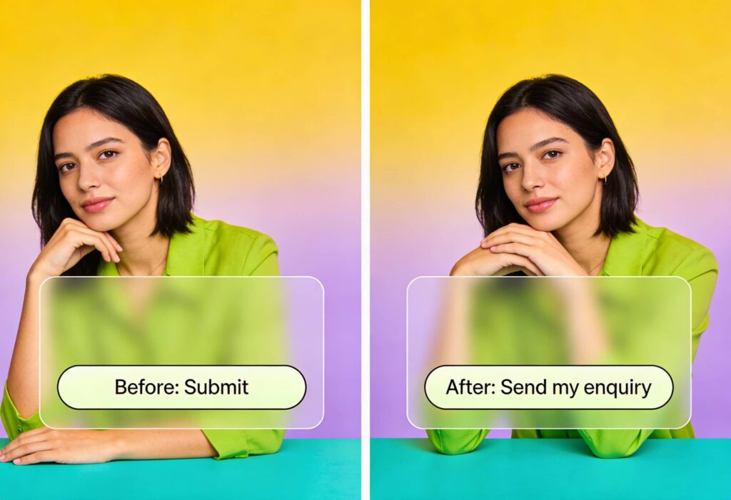
Avoiding Dark Patterns While Providing Guidance
Guidance should never manipulate. Zero-decision UX is not about coercion. It is about clarity.
Avoid patterns such as:
- Pre-checking subscriptions
- Hiding opt-out controls
- Using misleading button labels
These tactics harm trust and increase churn. Helpful guidance, on the other hand, empowers users. It directs attention without forcing a path.
For more on creating ethical and effective experiences, Yellowball’s guide on the importance of user experience in web design explores the topic in depth.
Real-World Examples of Zero-Decision UX
These examples show how small changes remove friction and support faster action.
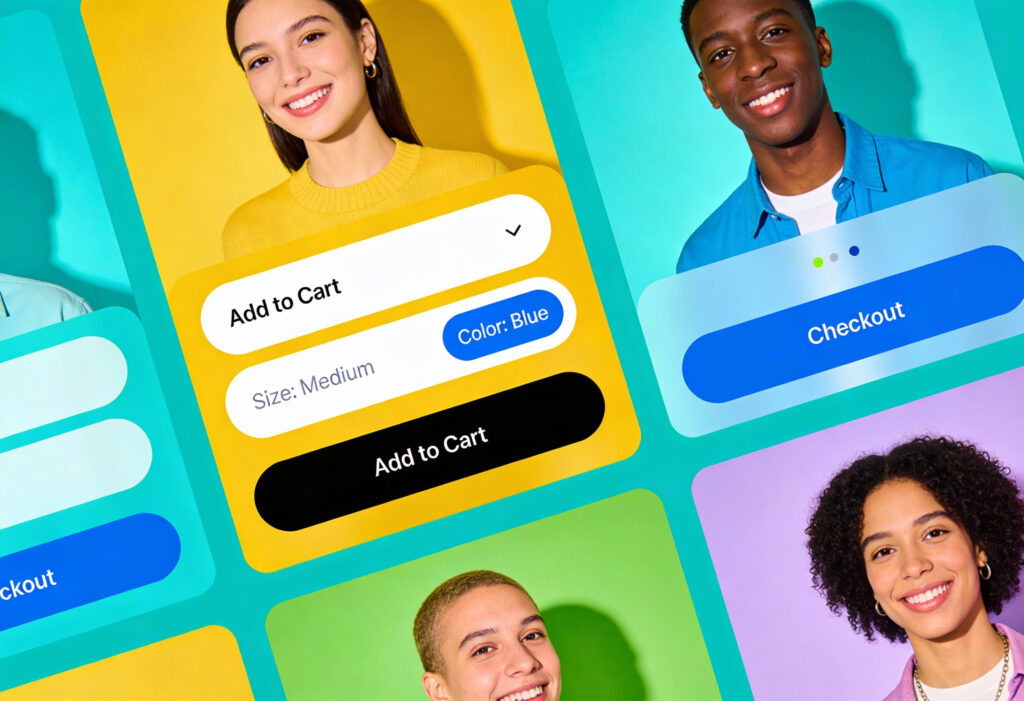
Checkout Flows That Remove Cognitive Barriers
Checkout flows are full of micro decisions. Zero-decision patterns help streamline these steps.
Examples include:
- Address finders that auto-complete with a postcode
- Delivery options sorted by cost or speed, with one clearly recommended
- Pre filled contact details for returning customers
- Inline validation that highlights errors as they occur
Every small improvement reduces the chance of abandonment. It also creates a calmer, more confident experience.
Onboarding That Adapts to User Intent
Onboarding does not need to push every new user through the same path. Adaptive onboarding uses simple logic to tailor the journey.
For example:
- A project management tool might ask one question about team size and then adjust suggested templates
- A fitness app may personalise the first workout based on selected goals
- A banking app might show only the essentials until trust is established
Onboarding becomes more helpful when it respects each user’s intent.
Designing for 2026 UX Expectations
Expectations evolve, and web users now want interfaces that feel thoughtful without feeling intrusive.
AI-Enhanced Adaptation Without Over-Personalisation
AI has introduced new opportunities for adaptive design. The challenge is to personalise without overwhelming or surprising users.
Simple uses include:
- Reordering dashboard items based on frequency
- Suggesting next steps during long processes
- Offering personalised help content
These improvements work best when they feel transparent. Users should not feel that the system is guessing too much.
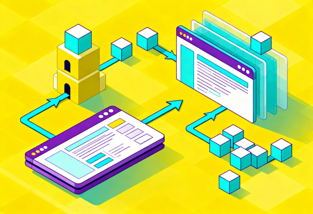
Systems That Scale Across Complex Journeys
Large platforms require UX systems that scale. Designers cannot craft every possible path manually. Instead, they rely on patterns and consistent structures.
Core strategies include:
- Component libraries that match brand and usability standards
- Predictable grid systems that support scanning
- Reusable interaction patterns that reduce learning effort
This creates journeys that feel coherent even when users explore unfamiliar sections of a platform.
For designers building complex ecosystems, our guide on user interface design offers a helpful grounding for scalable systems.
Your Next Step Toward a Smarter, More Effective Digital Experience
At Yellowball, our team has delivered hundreds of successful UX and UI web design projects across a wide range of industries. We combine creative thinking with technical precision, and our 92% client retention rate reflects the trust we build through long-term partnerships.
With more than 100 five-star reviews, we support global brands and fast-growing startups with equal commitment. Our work spans private aviation, healthcare, education, real estate, finance, and more, always grounded in a tailored, results-driven approach. As a certified Google Partner, we apply the latest tools and insights to improve visibility, engagement, and revenue for our clients.
Whether your budget is lean or you are planning a large-scale project, we design and develop digital experiences that look polished, feel intuitive, and convert effectively. Contact our team and let’s get the ball rolling!