

Interested in responsive web design? Let’s begin at the beginning by looking at what responsive web design is before getting into some of the basics you’ll need to achieve a responsive website.
A responsive website is designed to react to a user’s screen size, platform and the orientation of the device being used. The idea is that, no matter what device a user chooses to use when accessing a website, the image sizes, resolution and scripting will automatically adapt to their preferences based on the device’s capabilities and even its chosen settings.
This eliminates the need to have different versions of a website for every type of device that might be used to access it. A single design is sufficient to cater for the user’s preferences.
What is Responsive Web Design?
A responsive website is designed to react to a user’s screen size, platform and the orientation of the device being used. The idea is that, no matter what device a user chooses to use when accessing a website, the image sizes, resolution and scripting will automatically adapt to their preferences based on the device’s capabilities and even its chosen settings.
This eliminates the need to have different versions of a website for every type of device that might be used to access it. A single design is sufficient to cater for the user’s preferences.
Why is Responsive Web Design important in 2024?
A mobile-first responsive website is designed for use on a mobile phone first. However, it will respond to users’ differing needs when it’s accessed from other devices.
Mobile accounts for approximately half of web traffic worldwide! In Q4 of 2023, mobile devices accounted for 58.67% of global web traffic. Find out more about mobile first design in our guide.
A responsive website can adapt to being displayed and used on a mobile device, but a mobile-first design takes the differences between the ways people work on mobile phones as compared to PCs into account. Tapping with a fingertip is different to clicking a cursor with a mouse for example, so buttons have to be bigger – in fact, anything that’s clickable should be easy to select using one’s fingers.
Although buttons should be bigger, some things should be smaller: specifically, the amount of content that can be seen on pages. Content that’s not too bulky to scan on a laptop or PC becomes much bulkier and harder for the eye to scan on mobile phones. This can be off-putting to users who want to glance at web pages and immediately know what’s going on and detracts from the impact of the content. And in much the same vein, fonts may need to change to display well on mobile phones.
What is a Mobile-First Approach?
Mobile First Approach is a web design process where website designers look at how the mobile version of the site will be created, prior to designing the desktop version of the site. This can be done by creating designs for the smallest device types first, then progressing to designing for larger screens.
What is Mobile-First Responsive Web Design?
A responsive website can adapt to being displayed and used on a mobile device, but a mobile-first design takes the differences between the ways people work on mobile phones as compared to PCs into account. Tapping with a fingertip is different to clicking a cursor with a mouse for example, so buttons have to be bigger – in fact, anything that’s clickable should be easy to select using one’s fingers.
Although buttons should be bigger, some things should be smaller: specifically, the amount of content that can be seen on pages. Content that’s not too bulky to scan on a laptop or PC becomes much bulkier and harder for the eye to scan on mobile phones. This can be off-putting to users who want to glance at web pages and immediately know what’s going on and detracts from the impact of the content. And in much the same vein, fonts may need to change to display well on mobile phones.
A mobile-first responsive website is designed for use on a mobile phone first. However, it will respond to users’ differing needs when it’s accessed from other devices.
Benefits of Responsive Web Design
The advantages of Responsive Web Design include:
- Improved User Experience: Responsive design ensures web pages adapt seamlessly to different device types.
- Improved SEO performance: Google favours responsive websites, resulting in higher rankings in search engine results pages.
- Increased Mobile Traffic: Over half of web traffic comes from mobile devices, so in order to engage users, websites must be responsive.
- Faster Loading Times: Responsive websites typically load faster, particularly on mobile devices.
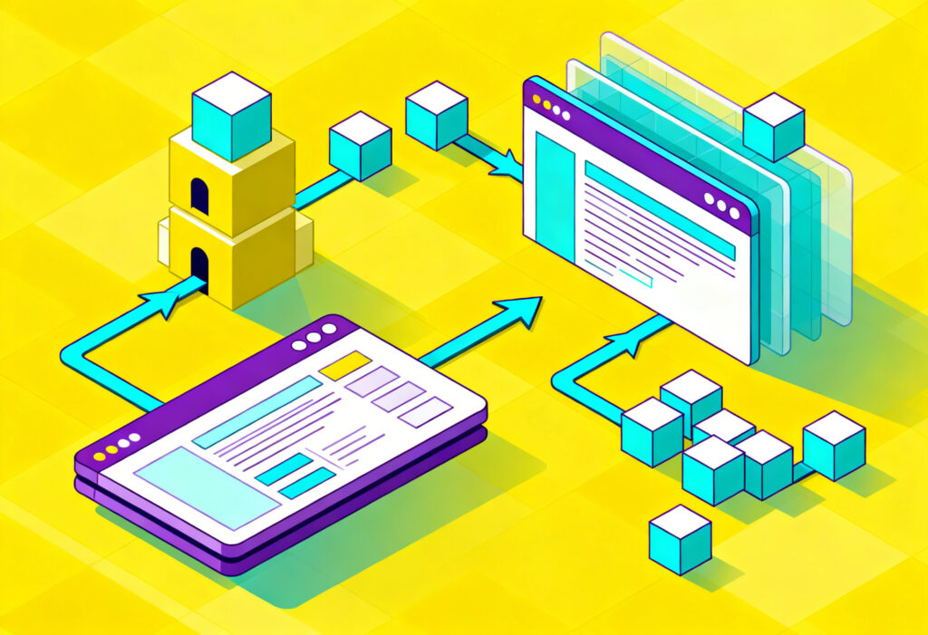
How does Responsive Web Design work?
Responsive Web Design works through use of the following elements:
- Device feature detection: Responsive sites may adapt based not only on screen size, but also touch input or pixel density.
- Fluid Grids: Fluid grids layouts are used in responsive design to adapt to different screen sizes. Instead of fixed pixel values, relative units are used to allow content to resize proportionally.
- Scalable Images and Media: coding can be used to resize images and video within their containing elements, allowing media types to scale up or down in accordance with screen size while maintaining aspect ratios.
- Flexible fonts: Font sizes use relative units such as em or rem to scale across devices.
- Content prioritisation: Content can be hidden, shown or rearranged depending on screen size depending on content priorities on smaller screens.
How to implement Responsive Web Design:
The following 4 elements are the key building blocks of Responsive Web Design:
- Text that reads easily
- Rich visuals vs Visual clutter
- Navigation
- Relative scale
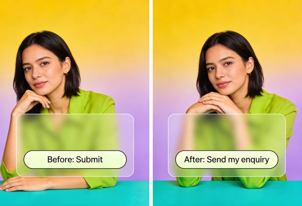
Text That Reads Easily
Several elements of your website must be responsive to the device on which they are to be displayed. Text offers a case in point. Font sizes may need to change so that users don’t have to zoom in on the text or turn their devices around to read it comfortably. The thickness or “weight” of the font is another issue to consider. Thin ones work well on mobile, but on desktop, they may need to be a little thicker – and line heights may also affect readability between different display sizes.
Rich Visuals vs Visual Clutter
On small screens, visual clutter is much more of a problem than it is on larger ones. This challenge may require layouts that respond to what’s needed, displaying a “less-is-more” version when viewed on mobile. For example, you may be able to view many images in a gallery at once on a PC, but the images rearrange into a vertical column for easy-on-the-eyes mobile viewing.
Navigation
Menus can be a huge visual distraction on small screens, and that’s why we see so many sites using the three-line “hamburger” icon to contain all menu options. On a PC, the “hamburger “ represents an extra mouse click – hence more work for your users, but the screen is big enough for menus to display well without having to resort to the “hamburger” icon.
Relative Scale
In a related point, the scale of various elements when compared to one another will also have its share of impact, and what that might be depends on the device being used to view the content. So, a button that looks great on a page viewed via PC may need adjustment to match the scale of other visual elements on the page when it is viewed using a mobile phone.
Of course, these are just the basics of responsive web design with a focus on the results you should aim to achieve. We haven’t gone into the technical details of things like the HTML and CSS coding that make it all possible. But before you assume that you can’t have a responsive website if you can’t code, there’s good news for you.
Some, but not all, WordPress templates are already responsive, and for fairly straightforward websites, there’s no point in reinventing the wheel. They can also be tweaked (this time, you do need to know coding) to make minor adjustments without too much difficulty.
Responsive Web Design Examples
Since responsive website design is among the things we do, we can show you some great examples of responsive websites. You’ll need a PC and a phone or tablet to spot the subtle differences that show their responsiveness.
Tropic Air Kenya
Tropic Air Kenya provides a stunning example of how we created a responsive design for an image and media-rich website. Take a look at details like the menus and arrangement of images. It’s still the same site, regardless of how you view it, but the presentation has significant differences that allow website visitors to enjoy the content without visual overload no matter how they view it.
City & Guilds
Looking for something a little more down-to-earth? The website we created for City & Guilds training courses may not have marvellous images of the African countryside, but it’s still eye-catching. If you view it on mobile and on a PC, you’ll once again spot some important differences.
You may notice that the design of this website responds to the type of display by reducing imagery when responding to visitors using mobile phones. The most important part of this website, the opportunities it offers, remain impactful on either mobile or PC screens. Grab your laptop and your mobile phone and use it to compare more of our websites to see how we made them responsive – we’re proud to showcase our designs.
Responsive Web Design FAQs
Is Responsive Web Design good for SEO?
Yes, Google favours responsive websites, resulting in higher rankings in search engine results pages.
What is the purpose of Responsive Web Design?
Responsive Web Design offers several benefits including adaptation to different screen sizes and devices, improved user experience, mobile-friendliness, improved SEO performance and faster loading times.
However, you may be reading this because you want a website, have a good idea of how you’d like it to look, but aren’t sure that your ideas are compatible with responsive design. In that case, let’s talk about web design in your specific context. Why struggle if Yellowball is ready to help you by designing the responsive website you need? With your ideas and our creativity and expertise, we could be onto another award-winning website design. Contact us today and let’s get started!