When you launched your website, you had big dreams and ideas. Presumably, you didn’t get a website just for the sake of having one. You wanted to use it to persuade visitors to take some kind of action. The percentage of visitors who took that action represents your website conversion rate and it’s much more than just another number. It tells you whether you were successful in achieving the goal you set out to reach.
Once you have a baseline website conversion rate figure, you can work to improve it. But before we explore ways in which you can do this, let’s take a closer look at the metric itself.
How to Calculate Conversion Rate
Formula for Calculating Conversion Rate
Use this simple formula to calculate your current conversion rate:
Conversion Rate = (Total Conversions ÷ Total Visitors) x 100
For example, if your website had a thousand visitors, and fifty of them went on to take the action you wanted them to take, the calculation would look like this:
50 ÷ 1000 x 100 = 5
So, in our example, the website had a five percent conversion rate. Is that good or bad? Actually, it’s pretty good. The average website conversion rate is between two and five percent. But who wants to be average? Presumably, not you!
This is a very simplified example. Making a purchase or paying to subscribe to a service are big steps. Most people will think things through before taking the plunge.
As a result, you may have offered an intermediate step, a micro-conversion. You might persuade them to sign up for a newsletter, for example, or you could offer a free download in exchange for their contact details.
In this instance, your conversion rate includes two metrics. One for macro-conversions from users who made a purchase, and one for micro-conversions from users who are interested enough to interact, but aren’t ready to buy just yet.
How to Increase Conversion Rate
Conversion rate optimisation process
- Understand and analyse your website’s conversion funnel
- Conduct competitor analysis
- Improve website loading speed
- Enhance mobile-friendliness
- Create clear CTAs
- Consider UX in web design
- Include social proof – add customer reviews to increase trust
- Simplify the checkout process
- Shorten forms
- A/B test landing pages
1. Understand and analyse your website’s conversion funnel
Your website should be purposefully leading users through a series of steps that lead to conversion. If it isn’t, you’ve just spotted one of the problems it may have! If you already have a strategy, it’s time to assess how well it works, and what you can change so that more users will move closer to conversion after completing each step.
Your “funnel” is funnel-shaped for a reason. At each step, you’ll lose some prospects, and knowing the reasons why this happens can help you to combat them. The fewer people you lose as they move through the funnel, the more conversions you’ll ultimately get. Small percentages can translate into big gains, so it’s worth working on.
2. Conduct competitor analysis
If you aren’t watching your competitors, you can’t beat them. If their websites are leaving yours looking clunky or unattractive by comparison, you need to up your game.
Consider the products they offer when compared to yours too. If yours are better, you need to be able to make that clear. Are you making the most of your competitive edge? Without competitor analysis, you’ll never know.
3. Improve website loading speed
Website loading speed has a measurable, large impact on conversion rates. Working on improving your website loading speed can help to increase your CVR.
47% of users won’t wait longer than two seconds for a website to load.
The quicker a webpage loads, the more likely a user is to perform a desired action.
Studies have shown that an ecommerce site that loads within a second converts 2.5x more visitors than a site that loads in 5 seconds.
Find out more in our guide to speeding up your WordPress website.
4. Enhance mobile-friendliness
Mobile currently accounts for more than half of web traffic worldwide. Mobile-friendliness is not only important for SEO purposes, to help users find your website, but is also important to reduce friction within the conversion process.
Ensuring mobile-friendly design helps to ensure users have a seamless experience on your website.
5. Create clear CTAs
Clear call-to-actions (CTAs) are important for conversion rate optimisation, guiding users on their next steps and reducing the likelihood of them leaving the page without completing the desired action.
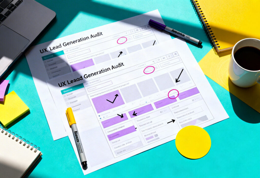
6. Consider UX in web design
UX stands for “User Experience” and it’s one of the most often-overlooked reasons why website users fail to convert.
Your website should be strategically designed to optimise the user experience from the moment visitors arrive until the moment they leave. Each page on your website has a purpose and should be designed to fulfil it from a user’s perspective.
It begins with knowing what sparked visitors’ interest and how they found your website. Next, you need to know what they do once they arrive there and at what point they leave. Consider the following questions:
- What pages do users spend the most time on?
- Are there specific areas where they leave instead of following through with the next step?
7. Include social proof – add customer reviews to increase trust
Whether it’s reviews or case studies, showing your visitors examples of happy customers encourages them to get their slice of the pie. For some businesses, this can be a decisive factor. Build trust by being trustworthy, and keep it genuine.
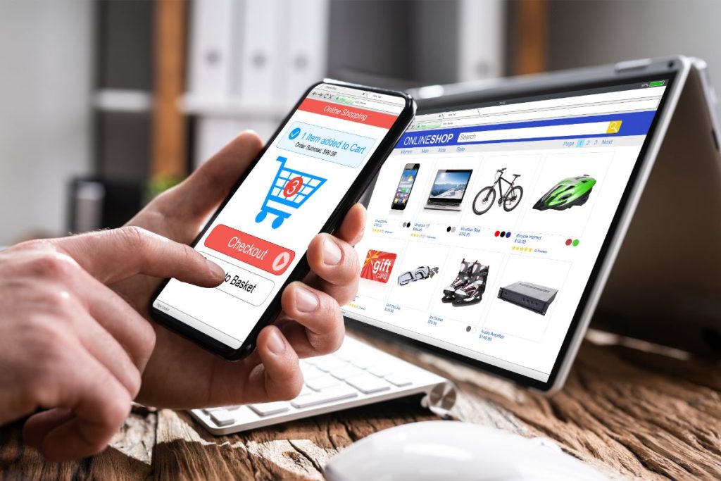
8. Simplify the checkout process
Taking steps to simplify the checkout process can help to increase conversion rates, by making the checkout process seamless. Steps you can take include:
- Reduce the information required to checkout
- Add a guest checkout option
- Ease security concerns
- Be transparent about additional costs, for example shipping costs
- Use a single-pay checkout process
- Make forms easy and quick to complete
- Integrate pay options such as Apple Pay
9. Shorten forms
To reduce user frustration and lower bounce rates, consider shortening forms to only request the most essential information.
Whether it’s a newsletter signup form or a special offer form, the shorter you can keep the form the better.
Find out more in our guide on how to create lead capture pages.
10. A/B test landing pages
A/B testing presents two versions of a page to visitors, helping you determine which one is more effective in driving conversions.
You can use A/B testing to test various on-page factors such as headlines, calls-to-action, page layouts and images.
Find out more in our guide to landing page optimisation.
Improving Conversion Rate Long-Term
To improve conversion rates long-term, the following tactics can be used to improve user experience:
- Optimise landing page design: Ensure your landing page includes clear CTAs, high-quality content and images, and clearly guides the user to taking the desired action.
- Address customer objections: Anticipate user queries by including an FAQs section page on-site and make navigation clear so users can easily find information.
- Enhance content clarity: Craft concise and engaging content that addresses any queries the user may have, making it easier for them to take action.
- Create user behaviour heatmaps: Analyse your current audience behaviour to see where users engage or leave the website, allowing you to identify any pain points and make adjustments.
Conversion Rate Optimisation FAQs
What is a Conversion Rate?
A conversion rate is a percentage that measures how many people take a desired action after visiting your website.
What is Conversion Rate Optimisation?
Conversion Rate Optimisation (CRO) is a strategy that aims to increase the number of website visitors that take a desired action. Conversions can include things like completing a form, clicking through to a page, downloading a report, clicking ‘add to cart’ or making a purchase.
What is a realistic conversion rate?
Conversion rates tend to be around 2% to 5%.
Yellowball is a web design agency based in London, UK. Contact us today, and discover how we can help you enhance your online presence.