Most SEO dashboards fail for one simple reason. They report activity, not decisions.
Traffic is up. Rankings improved. Clicks look healthy. Yet no one leaves the meeting knowing what changed, why it changed, or what to do next.
If you want to know how to create an SEO dashboard that stakeholders actually use, you need to start with the decision. Every metric must earn its place. Every chart must answer a question. Every page must move someone to act.
How to create an SEO dashboard that drives decisions, not vanity reporting
When teams ask how to create an SEO dashboard, they often begin with data sources. Search Console. GA4 reporting. CRM exports. Ranking tools.
That is backwards.
Start with three questions:
- What decisions does this dashboard need to support?
- Who is it for?
- What would trigger action?
An executive dashboard for a CEO should answer different questions than a working scorecard for an SEO manager. Executives want to understand contribution to growth, assisted revenue, and forecast reliability. Practitioners need to see leading indicators, segmentation, and technical drivers.
A decision-driven dashboard has three characteristics:
- It distinguishes leading indicators from lagging indicators.
- It connects SEO KPIs to revenue and pipeline reporting.
- It includes context through annotations and action tracking.
Leading indicators might include non-brand visibility, ranking growth on commercial pages, or organic-assisted conversions. Lagging indicators include closed revenue, marketing qualified leads, and average deal size.
When you design your dashboard, map each KPI to a decision. If a metric does not influence a choice, remove it.
For a deeper breakdown of SEO metrics that matter commercially, this guide to SEO reporting metrics is a strong reference point.
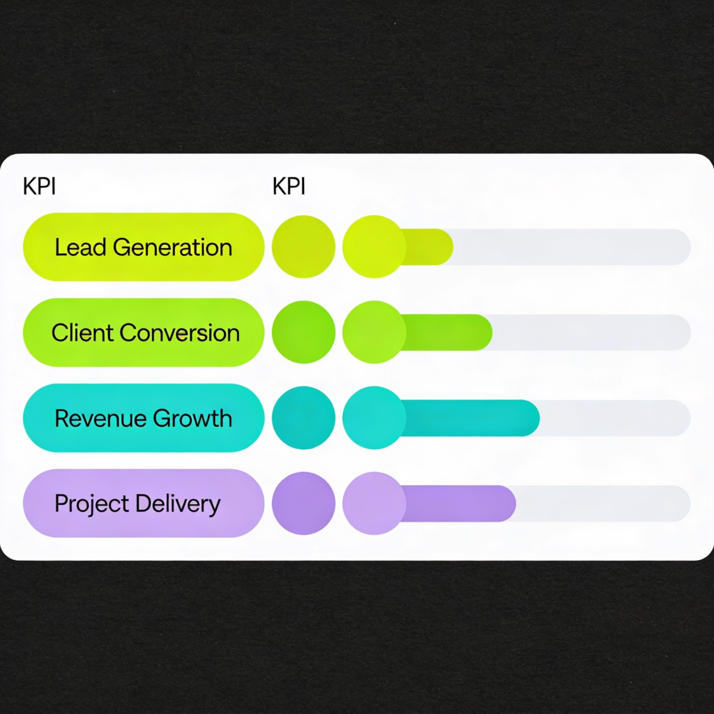
The KPI model. What to include for visibility, demand, and revenue
If you want to know how to create a metrics dashboard that actually reflects growth, think in three layers:
- Visibility
- Demand capture
- Revenue impact
Visibility
This is where most SEO reporting stops. It should not.
Core visibility SEO KPIs:
- Non-brand impressions
- Non-brand clicks
- Share of voice for commercial terms
- Ranking distribution by page type
- Technical health indicators from site audits
Brand vs non -brand matters. Brand traffic often reflects existing demand. Non-brand traffic shows whether you are capturing new demand.
If non-brand impressions grow but clicks do not, you likely have a CTR issue. If impressions fall sharply after a release, you need to investigate technical changes. A structured SEO audit process helps diagnose root causes.
Brand vs non -brand, leads, assisted conversions
Stakeholders need to see more than traffic.
Include:
- Organic leads split by brand vs non -brand
- Assisted revenue from organic channels
- Conversion paths that show how organic supports other channels
- Cohort analysis for organic-sourced users
Assisted revenue is critical. SEO often influences deals that close via direct or paid channels. GA4 reporting allows you to analyse conversion paths and understand organic’s role across touchpoints.
If you see strong non-brand traffic but weak lead volume, examine intent alignment. If leads exist but sales quality is poor, refine segmentation and qualification criteria.
Demand capture and pipeline
Move beyond sessions.
Add:
- Marketing qualified leads from organic
- Sales qualified leads from organic
- Pipeline value attributed or assisted by organic
- Revenue closed from organic-sourced accounts
This is where pipeline reporting elevates SEO from a cost centre to a growth driver.
If organic generates traffic but not pipeline, do not increase content output. Improve conversion mechanics, offers, and page intent.
Revenue impact
Finally, track lagging indicators:
- Closed revenue
- Assisted revenue
- Customer acquisition cost blended with paid
- Lifetime value by organic cohort
This view strengthens the case for investment. It also prevents over reliance on paid. If you want to understand how SEO and PPC influence each other commercially, this comparison is a useful context.
How to build a KPI dashboard. The layout stakeholders understand instantly
Many teams ask how to build a KPI dashboard and then design a 20-page report.
Do the opposite. Build a four-section layout that mirrors how leaders think.
1. Summary
This is your executive dashboard view.
Include:
- Organic pipeline value
- Closed revenue influenced by organic
- Non-brand traffic growth
- A short scorecard rating of overall performance
Add concise annotations explaining major movements. For example:
- Technical fix implemented on 3 March
- New commercial landing page launched
- Algorithm volatility observed
Annotations reduce confusion and improve trust.
2. Drivers
Here, you explain what changed.
Include:
- Ranking gains by page category
- Brand vs non -brand performance
- Segmentation by product line or region
- Conversion rate shifts by landing page
This section answers why the numbers moved.
If traffic grew but revenue did not, investigate the conversion rate by cohort. If conversion improved but traffic fell, look at visibility losses.
Use simple visuals. Avoid overwhelming charts. One insight per chart.
3. Opportunities
This is where most dashboards fail. They stop at reporting.
Include:
- Pages with high impressions and low CTR
- Keywords ranking positions 4 to 10
- Content clusters with traffic but weak conversion
- Paid queries are performing well, but lack organic coverage
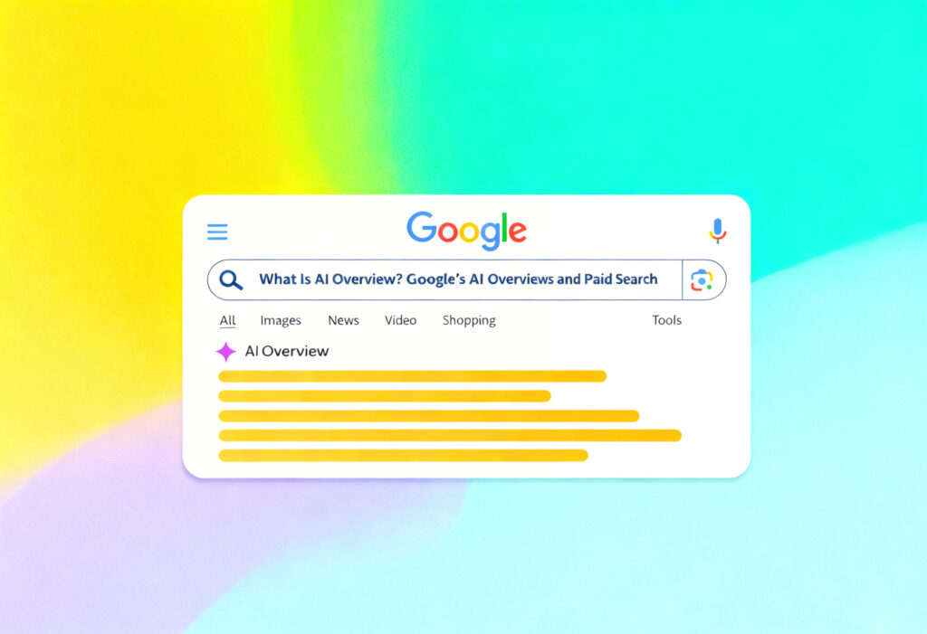
Paid search data often reveals SEO opportunities. Reviewing Google Ads metrics can surface high-intent terms worth targeting organically.
For businesses using Performance Max, understanding how campaign data surfaces intent themes can inform SEO expansion.
Forecasting tools such as Google Performance Planner can also help model demand trends that influence content planning.
4. Actions
This is the most important section.
Document:
- What we will do
- Who owns it
- Expected impact
- Date of review
This is action tracking. Without it, your dashboard becomes a museum of past activity.
Create a Google dashboard vs Excel vs BI. What to choose and why
Tool choice depends on maturity.
Looker Studio and GA4 reporting
For many teams, Looker Studio connected to GA4 reporting and Search Console offers flexibility without high cost.
Strengths:
- Live data
- Visual storytelling
- Easy sharing
Weaknesses:
- Data modelling limits
- Risk of messy blending
- Requires careful data hygiene
If you choose this route, enforce naming conventions, consistent definitions of marketing KPIs, and documented calculation logic.
Excel or Google Sheets
For smaller teams, a structured spreadsheet scorecard works well.
Strengths:
- Simple
- Fast to update
- Clear audit trail
Weaknesses:
- Manual updates
- Version control risks
- Limited automation
Excel works well for monthly executive summaries where depth is less important than clarity.
BI platforms
For larger organisations, a BI platform such as Power BI or Tableau may be appropriate.
Strengths:
- Deep segmentation
- Advanced cohort analysis
- Blending CRM, revenue, and channel data
Weaknesses:
- Higher setup cost
- Requires data engineering
- Risk of over-complexity
Trade -offs by team size and maturity
Small teams with limited technical support should prioritise clarity over sophistication. A clean executive dashboard with 10 strong KPIs beats a complex 50 metric build.
Mid-size teams benefit from Looker Studio with disciplined GA4 reporting.
Enterprise teams need BI integration to support multi-touch attribution, assisted revenue modelling, and granular segmentation.
If you need guidance aligning reporting to commercial strategy, a structured SEO consultancy can help define the right architecture.
Common dashboard mistakes and how to fix them
- Too many metrics
Fix: Tie every KPI to a decision. - No distinction between leading and lagging indicators
Fix: Separate early signals from revenue outcomes. - No brand vs non -brand split
Fix: Segment demand capture properly. - Ignoring assisted revenue
Fix: Analyse conversion paths and attribution in GA4 reporting. - No annotations
Fix: Log releases, campaigns, and external events. - Poor data hygiene
Fix: Standardise UTM parameters, CRM integration, and event naming. - No action tracking
Fix: Add a visible action log and review it monthly.
A simple build process you can repeat monthly
If you want a repeatable answer to how to create an SEO dashboard, follow this cycle:
- Define decisions for the month
- Confirm KPI definitions and data hygiene
- Update core visibility metrics
- Analyse brand vs non -brand trends
- Review pipeline reporting and assisted revenue
- Conduct segmentation and cohort analysis
- Document insights with annotations
- Define next actions and assign owners
Keep the narrative tight. One page summary. Clear drivers. Clear actions.
Over time, your dashboard becomes a strategic asset. It builds authority with stakeholders. It proves commercial contribution. It shows that SEO is not about rankings. It is about predictable growth.
If your current reporting feels noisy or disconnected from revenue, start small. Remove half the metrics. Focus on decisions. Introduce action tracking. Tighten data hygiene. Add context with annotations.
A stakeholder-first dashboard does not impress people with complexity. It earns trust through clarity and commercial relevance.
And that is what makes it useful.
Make your dashboards impossible to ignore
Yellowball is a web design and SEO consultancy that builds SEO and performance reporting that executives actually rely on. We start with commercial goals, not charts. Then we design a clean scorecard that connects SEO KPIs to pipeline, revenue, and real business impact.
Our team helps you:
- Align marketing KPIs with sales outcomes and pipeline reporting
- Separate brand vs non-brand performance to reveal true demand growth
- Connect assisted revenue and conversion paths across SEO and paid search
- Clean up tracking and data hygiene so insights are reliable
- Turn insights into action tracking that keeps teams accountable
Whether you need a simple Looker Studio dashboard or a more advanced reporting framework that ties into your CRM and BI tools, we create systems that bring clarity to growth.
If you want reporting that supports confident decisions, not defensive explanations, let’s get the ball rolling.