We use cookies to ensure that we give you the best experience on our website. If you continue to use this site we will assume that you agree to our cookie-policy

SEO ENQUIRY

First, we need your contact details…

SEO ENQUIRY

Which SEO services are you interested in?

SEO ENQUIRY

Anything you’d like to share with us at this stage?
A brief, technical scope, supporting documents or anything else?

SEO ENQUIRY

How soon are you looking to kick off this project?

SEO ENQUIRY

What budget guidance are you working on this project?

SEO ENQUIRY

What budget guidance are you working on this project?

THANK YOU

Thank you for getting in touch with Yellowball!

We’ve received everything and one of our team will be in touch very soon with the next steps. If your enquiry is urgent, you can call us on 020 8064 1832 – we’re open 9am – 6pm Monday to Friday.

BACK TO HOMEPAGE
YELLOWBALL LITE

Unfortunately, you don’t qualify for a bespoke project, but there is good news!

Lorem ipsum dolor sit amet, consectetur adipiscing elit, sed do eiusmod tempor incididunt ut labore et dolore magna aliqua.

VISIT YELLOWBALL LITE

Step 1

of 6

WEB DESIGN ENQUIRY

First, we need your contact details…

WEB DESIGN ENQUIRY

Which web design services are you interested in?

WEB DESIGN ENQUIRY

Anything you’d like to share with us at this stage?
A brief, technical scope, supporting documents or anything else?

SEO ENQUIRY

How soon are you looking to kick off this project?

WEB DESIGN ENQUIRY

What budget guidance are you working on this project?

THANK YOU

Thank you for getting in touch with Yellowball!

We’ve received everything and one of our team will be in touch very soon with the next steps. If your enquiry is urgent, you can call us on 020 8064 1832 – we’re open 9am – 6pm Monday to Friday.

BACK TO HOMEPAGE
YELLOWBALL LITE

The end-to-end delivery of bespoke web project akin to the style and quality of our portfolio typically start from £25,000.

Based on your budget guidance, we’d recommend exploring Yellowball Lite – our flexible WordPress theme that is perfect for small businesses, startups, consultancies and charities. Learn more about Yellowball Lite and speak to one of our specialists on this dedicated site. It’s all the best from Yellowball, now fast, affordable and available anyone, anywhere.

VISIT YELLOWBALL LITE

Step 1

of 5

GRAPHIC DESIGN ENQUIRY

First, we need your contact details…

GRAPHIC DESIGN ENQUIRY

Which design services are you interested in?

GRAPHIC DESIGN ENQUIRY

Anything you’d like to share with us at this stage?
A brief, technical scope, supporting documents or anything else?

GRAPHIC DESIGN ENQUIRY

How soon are you looking to kick off this project?

GRAPHIC DESIGN ENQUIRY

What budget guidance are you working to on this project?

THANK YOU

Thank you for getting in touch with Yellowball!

We’ve received everything and one of our team will be in touch very soon with the next steps. If your enquiry is urgent, you can call us on 020 8064 1832 – we’re open 9am – 6pm Monday to Friday.

BACK TO HOMEPAGE
GRAPHIC DESIGN ENQUIRY

Most design projects at Yellowball are typically more than £500 and our agency-wide hourly rate is £145 plus VAT.

We’re probably not a good strategic fit for this project but you could try the freelancer networks at Fivver.com or upwork.com.

Step 1

of 5

PPC ENQUIRY

First, we need your contact details…

PPC ENQUIRY

Which PPC services are you interested in?

PPC ENQUIRY

Anything you’d like to share with us at this stage?
A brief, technical scope, supporting documents or anything else?

PPC ENQUIRY

How soon are you looking to kick off this project?

PPC ENQUIRY

What budget guidance are you working on this project?

PPC ENQUIRY

What budget guidance are you working on this project?

THANK YOU

Thank you for getting in touch with Yellowball!

We’ve received everything and one of our team will be in touch very soon with the next steps. If your enquiry is urgent, you can call us on 020 8064 1832 – we’re open 9am – 6pm Monday to Friday.

BACK TO HOMEPAGE
YELLOWBALL LITE

Unfortunately, you don’t qualify for a bespoke project, but there is good news!

Lorem ipsum dolor sit amet, consectetur adipiscing elit, sed do eiusmod tempor incididunt ut labore et dolore magna aliqua.

VISIT YELLOWBALL LITE

Step 1

of 6

GOOGLE ANALYTICS ENQUIRY

First, we need your contact details...

GOOGLE ANALYTICS ENQUIRY

Which Google Analytics services are you interested in?

GOOGLE ANALYTICS ENQUIRY

Anything you'd like to share with us at this stage?

GOOGLE ANALYTICS ENQUIRY

How soon are you looking to kick off this project?

GOOGLE ANALYTICS ENQUIRY

What budget guidance are you working to on this project?

THANK YOU

Thank you for getting in touch with Yellowball!

We’ve received everything and one of our team will be in touch very soon with the next steps. If your enquiry is urgent, you can call us on 020 8064 1832 – we’re open 9am – 6pm Monday to Friday.

BACK TO HOMEPAGE

Step 1

of 5

Mobile Menu
Mobile Menu

Award-winning work, focussed on results

Yellowball
Web Design

Air X

Yellowball
Web Design

City & Guilds

Yellowball
Web Design

Ballet with Isabella

Yellowball
Web Design

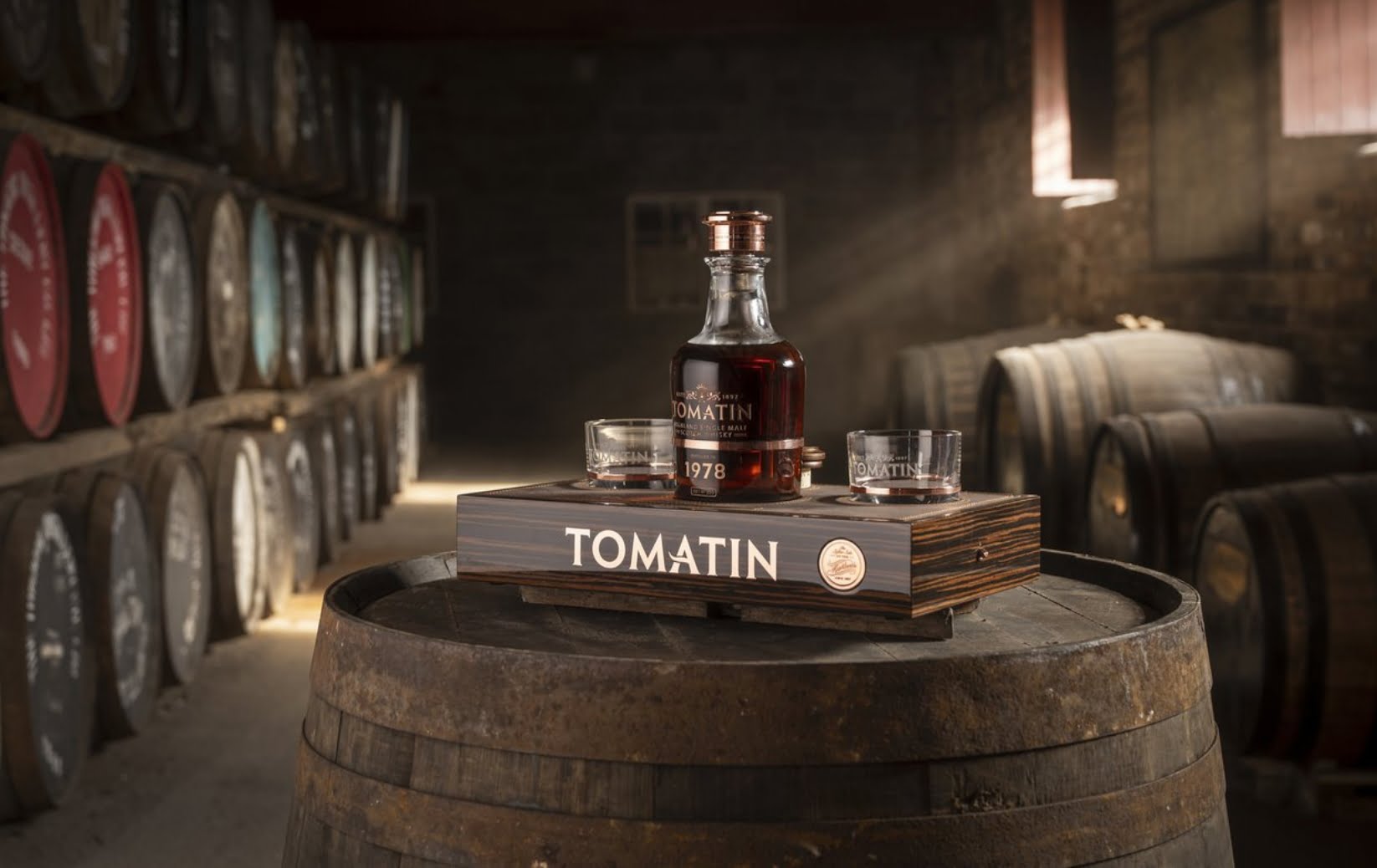
Tomatin

SEE All PROJECTS

KNOW WHAT YOU’RE LOOKING FOR?

Design Glossary.

Whether you are trying to learn design or are looking to hire a design agency, we understand that all of this terminology can often be confusing! As a result, we have laid it all out in plain English. So here it is!

Click a letter to jump to the section

KNOW WHAT YOU’RE LOOKING FOR?

1 - 10

A

A method used to test two different versions of the same webpage. Different versions are displayed to users, often at random and with a set goal in mind. For example, the usage data of those pages can be analysed to determine which version of the page results in higher user engagement or performs better to a given goal.

FIND OUT MORE

A term used to describe the area of a webpage when first loaded, without scrolling down. The term stems from the front page of a newspaper above where the newspaper was folded and was generally considered to be the most valuable real estate for advertisers.

The accessibility of your website refers to how usable a site is to users, regardless of age, disability or impairment. It can also refer to how easily a website is utilised on multiple devices (desktop, tablet, smartphone).

An accordion is a tool comprised of an interactive list of headers that can be clicked on in order to display or hide the content inside them. They are an effective way of streamlining a text-heavy website, whilst making key information available.

FIND OUT MORE

Adobe XD is a vector-based tool used for creating interactive click-through designs and prototypes of user experiences on websites and apps.

A web development technique that enables different components of a webpage to refresh without having to reload the entire webpage, therefore not interfering with the display of the site.

FIND OUT MORE

How varying components of a website; copy, imagery, etc. are situated in relation with one another either horizontality, vertically or centrally.

Application Programming Interface (API) refers to a mechanism that allows two different systems to communicate, often ‘pushing’ information from one to another. APIs are often offered by developers to allow other systems to integrate, such as a CRM offering an API to ecommerce web developers.

FIND OUT MORE

The upward vertical stem on letters such as d or h, as long as it rises above the typeface’s ‘x-height’.

FIND OUT MORE

B

Back end refers to the “behind the scenes” of a website or computer program that front end users don’t interact with. For websites, this will often be used to refer to a database or content management system.

FIND OUT MORE

The main text of any digital or printed material.

A free and open-source CSS framework directed at responsive, mobile-first front-end web development.

FIND OUT MORE

An overview of your brand's history, vision, personality and key values as well as information dictating the way in which your specific font, colours and brand mark should be used. They are used to maintain brand consistency.

FIND OUT MORE

A brandmark is similar to a logo in that it is a singular graphic used to identify your brand. An example would be McDonalds ‘M’ is a brandmark rather than a logo. A brandmark is often an abbreviated version of a full logo, used for more subtle branding or when space is limited. A good example of this is the use of brandmarks on social media profiles, or on a website’s favicon.

FIND OUT MORE

A secondary navigation system often sitting in the top left hand side of a webpage, in a horizontal fashion. It allows users to see where a webpage sits within the site structure. It also allows users to be able to click through to pages that sit directly above the current page in the Information Architecture.

FIND OUT MORE

The program on your computer that reads HTML and displays websites to you, the most popular ones include the likes of Google Chrome, Mozilla Firefox and Safari.

FIND OUT MORE

A common term used to describe an icon placed in the top right or top left corner of a website or app instead of a traditional menu bar. Interacting (clicking or tapping) the burger menu displays further menu options. The burger menu grew rapidly in popularity amongst designers alongside the growth of smartphones, with the reduced space requiring a different navigation system to traditional desktop menus.

FIND OUT MORE

C

In the world of search engine optimization (SEO), it's crucial for your website to be found by your target audience. To achieve this, you need to ensure that your website is indexed and ranked by search engines like Google. One tool that plays a significant role in this process is Google Cache.

FIND OUT MORE

A security measure designed to stop automated programs (bots) from submitting forms or information to a website. Most often used to prevent automated spam.

FIND OUT MORE

In a design sense, if two items are complementary it means that, whilst different, they fit together in an aesthetically pleasing way. This could be two colours such as blue and orange or even two different fonts.

Compression is the process which takes the original file and makes it smaller. In relation to web design, this compression reduces the amount that a browser has to load therefore having an impact on the time it takes to load a webpage.

FIND OUT MORE

The earliest stage of a design idea, a concept could be anything from sketch work to a snapshot of a website homepage. Concepts are often used by designers to provide initial ideas and styles, prior to continuing with much of the project’s ‘heavy lifting’.

A content management system is what is used to control a website’s content, often without the need of web development knowledge. Changing page information or uploading a blog post is done through the CMS. Popular CMSs include Wordpess, Shopify, Drupal and Joomla (amongst others).

FIND OUT MORE

G

A web design philosophy where a website is designed to function properly on modern browsers. However, when the site is displayed on older browsers, graceful degradation would dictate the key functionality and elements that would display on older browsers or smaller screens.

H

See ‘burger menu’

FIND OUT MORE

See ‘Burger Menu’

See ‘Hover State’

FIND OUT MORE

Where design elements respond to a cursor ‘hovering’ over it, without clicking. Can be used on call to actions to entice the user into clicking on a button. However, hover states are not exclusive to buttons. Hover state can be used to describe any animation of an webpage element when the cursor is hovering over it. It can also be used to describe how a cursor changes when over certain elements.

FIND OUT MORE

L

Tracking refers to expanding or contracting the distance between lettering in graphic design.

A common form of placeholder or ‘dummy’ text used by designers. Originally created in the 15th century, it has stood the test of time across various mediums including print and digital designs.

S

A “sticky menu” or “fixed navigation” is a website menu that is locked to the top or side of a webpage so that when a user scrolls, the menu does not disappear. This makes the navigation menu accessible at any point for the user.

FIND OUT MORE

Stock photos are professional photographs of common places, events, or situations that are sold on a royalty-free plan and once purchased, can be used and re-used for commercial or private design purposes.

FIND OUT MORE

SVG stands for Scalable Vector Graphic. Because SVGs are vectors and not rasters, they can be resized and scaled without losing image quality or clarity. This scalability also means that they’re perfect for use across responsive sites, specifically for logos. We wouldn’t recommend using them too regularly though, as their large file size means that they could hinder your site’s load speed.

FIND OUT MORE

T

A template refers to a design that is created to provide a layout or blueprint to be applied to documentation. Templates are frequently used to ensure brand consistency across files. A web design template would be a webpage template that can be reused, with different text and imagery.

FIND OUT MORE

The fold refers to the lowest point on a webpage that a user can see upon first loading, prior to the user scrolling down. The origins of this was the fold of a newspaper.

See ‘Burger Menu’

The art and theory of arranging text, designing a typeface or designing elements that can be applied to text.

FIND OUT MORE

U

Usability refers to the level of difficulty or ease that a user will experience when interacting with a product or website whilst trying to complete an action(s).

FIND OUT MORE

Usability testing is performed in instances where a product is user-focused. It is where people will use the product, often with set questions or prompts, with the aim of completing a specified action. In the case of websites, it enables developers and designers to get a direct and genuine insight into how users will use the product without the bias of previous knowledge.

FIND OUT MORE

Similar to usability testing, UAT is the process through which designers and developers will assess if a website/webpage functions how it was intended, for real users. This is often the final stage of testing prior to sending a website live.

FIND OUT MORE

“UX” is shorthand for “User Experience”. It refers to any and all interaction that a user will have with an interface.

FIND OUT MORE

User flow refers to the steps that would be taken by a typical user on a website or app in order to complete any given task. For example, in the case of an e-commerce site, the steps that a customer progresses through from opening the site to completing a purchase, depict a particular user flow through the site.

FIND OUT MORE

Short for “User Interface”, UI refers to how a user will interact with a website. The interactive elements of a webpage form the UI, commonly thought of as menu options and call to actions. UI Designers will look to use elements to provide the most intuitive navigation through the website possible.

FIND OUT MORE

V

Refers to the importance or ranking of elements within a design. That is to say the order in which someone might see design elements. It is not necessarily in a ‘top down’ format. Various elements will attract the eye more than others and therefore affect their position within the visual hierarchy.

W

A webform allows users of a webpage to input data that is then sent to a server to be processed. Webforms are frequently used to enter information into contact forms or e-commerce functionality to fulfil their specific tasks.

FIND OUT MORE

A web-friendly font is a font that safely renders across the vast majority of operating systems. When a web page loads on your screen, the site’s code specifies the font that your computer should render on the screen. Devices are built with their own pre-installed font selection, this varies from OS to OS.

This is a notorious issue across Windows and Apple computers -- Apple computers as standard are built with one set of fonts installed, however Windows computers are built with another set of fonts installed. As such, if the browser is requesting Helvetica from a Windows computer, it will instead display Arial as a substitute font.

FIND OUT MORE

White space (also referred to as negative space) refers to any section of a document or design that is unused or represents empty space around an object. White space helps to separate graphics, copy and other pieces of information on a document and can help a document to look less crowded.

FIND OUT MORE

An interface that enables a user to access a portion of a larger application to perform a function or access a service. A popular example would be the weather widget displaying on the homepage of your phone. The summary of the day’s weather isn’t the only feature that the app offers, however it provides a portion of the service that the app offers at a glance. Widgets are popular within content management systems, allowing blocks to display repeating information across multiple pages.

FIND OUT MORE

A term used within typography to describe when a single word appears by itself on a line, often at the end of a paragraph. It can also refer to a small group of words that appear on a separate page of a document (separated from the main block of text that they belong to). Widows are generally considered to be ‘lazy’ design and create an unbalanced and messy aesthetic to a document or website’s typography.

A design process through in which only critical elements and structure are included. Often completed in black and white and as part of the concept process, it allows preliminary structures to be agreed prior to more detailed designs taking place.

FIND OUT MORE

WordPress is a content management system (CMS), and website building platform. At the time of writing, there are 75,000,000 using WordPress, with around half of those sites being hosted on the WordPress.com shared hosting installation. It is (by quite a margin) the most popular OpenSource CMS in the world.

FIND OUT MORE

X

The X-Height or corpus size refers to the distance between the base and top of lowercase letters in a typeface. In most cases this is measured by the height of the letter X, however V, W and Z are also typically used.