


 01
01London's #1 web agency with 250+ stunning websites live
 02
02Flexible & affordable packages for every business, brand & budget
 03
03Websites laser-focused on impact, conversions, revenue & results
 04
04Hands-on guidance, support & ideas from our team of UK experts
 01
01A leading award-winning SEO agency with 75+ 5-star reviews
 02
02Extensive experience across multiple industries & brands
 03
03Specialists across technical & onsite SEO, content & link building
 04
04Packages for every business and budget, tailored to your goals
 01
01An official Google Partner PPC agency
 02
02Extensive expertise across multiple industries & campaigns
 03
03From campaign builds to day-to-day optimisation
 04
04Packages for every business & budget

Award-winning work, focussed on results


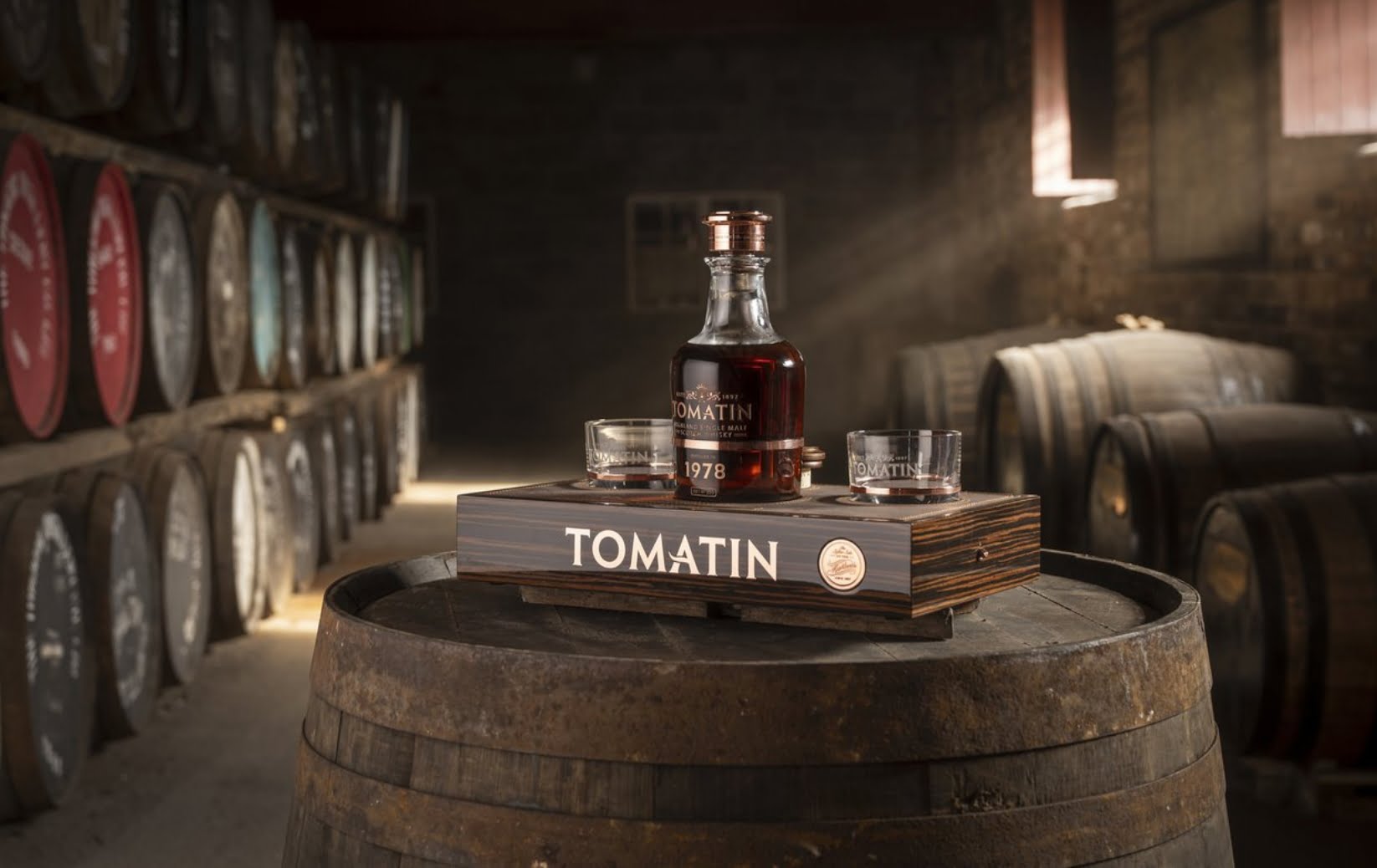
 JENNIFER MASSON, TOMATIN DISTILLERY

 PETE WILLIAMS, GERALD EVE
 DANIEL LORD, CONTENT CATALYST
 DOMINIC DEAR, ADARA
 NICK CARTER, HARDING GREEN
 IDEA DROP
 AMANDA HUBER, THE DINING CHAIR CO.
 POLLY GILBERT, GOODBOX


