


Deciding on what CMS to use is a decision that can make or break your website creation and maintenance experience. So you’ve narrowed the choice down to Webflow vs WordPress, but which one is right for you? In this article, we discuss:


 01
01The UK's leading WordPress agency with 250+ stunning websites live
 02
02Flexible and affordable packages for every business, brand & budget
 03
03WordPress sites laser-focused on impact conversions, revenue & results
 04
04Hands-on guidance, support & ideas from our team of UK WordPress experts
 01
01The UK's leading white label development partner with 250+ stunning web projects live
 02
02Seamless collaboration, technical excellence, cost efficiency & on-time delivery
 03
03Complete confidentiality – your clients remain yours and can operate as a completely silent partner
 04
04Relax with our 10+ years of industry experience, exceptional service and 80+ 5-star Google reviews
 01
01The UK's leading WordPress agency with 250+ stunning websites live
 02
02Flexible and cost-effective plans for all business needs and budgets
 03
03High-impact WooCommerce sites designed for maximum conversions and revenue
 04
04Expert advice, support, and innovative ideas from our dedicated UK WooCommerce team
01The UK's leading Laravel agency with 250+ stunning websites live
02Flexible and affordable solutions for every business requirement and budget
03Cutting-edge Laravel sites built to enhance conversions and boost revenue
 04
04Comprehensive support, expert insights, and inventive ideas from our dedicated UK Laravel team
 01
01SEO
Drive growth with expert SEO services from Yellowball. Our proven strategies boost visibility, leads, and conversions. Get a quote today. 02
02PPC
We are an award-winning PPC agency in London and an official Google Partner. Propel your business forward with our expert PPC strategies. 03
03Branding & Graphic Design
We are an award-winning branding and logo design provider in London. Drive your business forward with our expert branding strategies.Award-winning work, focussed on results
Award-winning work, focussed on results
SEE All PROJECTSDeciding on what CMS to use is a decision that can make or break your website creation and maintenance experience. So you’ve narrowed the choice down to Webflow vs WordPress, but which one is right for you? In this article, we discuss:
How can landing pages increase conversion rates, and why should we optimise landing pages? Marketers and business owners alike who have reaped the benefits understand that optimising landing pages has the potential to turn casual visitors into loyal customers.
Starting to build your business website can feel overwhelming, especially if you’re unsure where to start. In this article we explore the elements to consider when designing and building a business website. This article will:
Choosing between responsive web design vs. adaptive web design can be a tricky decision. This article aims to make it easier for you to choose the right design style for your business.
In this article, you will discover:
Optimising your website for SEO is a key component in driving traffic to and increasing the success of your site. But where should you get started to improve SEO on your WordPress site?

In this article, our web design experts explore the differences between Web Development vs WordPress, the benefits of using WordPress for web development and considerations depending on your business’ site’s requirements.

How to increase conversion rate: Quick tipsProvide easily accessible contact info Use high quality imagery Design for mobile Use in line CTAs Simplify your forms Consider social proof Try a live chat Add videos Consider microinteractions Consider using AI powered toolsWhat does website conversion mean? I am sure you have heard the phrase ‘website conversion rate’ being bounced around the office or at networking events, but what does it actually mean? Essentially it is the measure of how good your website is at getting your users to do w

Just like a physical store or office space, remodelling and updating your website is an important part of keeping your business an up-to-date and appealing space. However, there’s much more to a website redesign than a fresh, new look. By rebuilding the site from the ground up, the redesign process upgrades your website for improved functionality, better content quality, and faster performance, creating the best possible user experience and customer journey – and becoming the foundation of successful digital marketing strategies. What is a

Microinteractions are often overlooked features when you’re busy designing and building a website. When searching for “Key factors to consider when building a website”, none of the searches returned results on the first page of the SERPs even mentioned Microinteractions. This is despite the fact that they’re one of the key pieces of functionality. They provide useful feedback to users when they interact with (and become initially involved with) your business online. What are Microinteractions? Microinteractions (MIs) are small, inst
Yellowball are looking for a seriously talented and experienced SEO Account Manager to join our fast-growing team. Who are we? Yellowball is a multi award-winning digital marketing agency specialising in web, SEO, PPC, video and design, partnering with brands and businesses of every shape and size across the UK. With passion, creativity and razor-sharp commercial focus wired into everything we do, we’re trusted by organisations everywhere to deliver real impact and results. We love what we do and deliver a great, ROI-focussed service. As

What is the importance of content marketing? This article answers this question in detail, exploring its pivotal role in the world of digital marketing. In this guide, we dive into the significance, types, and benefits of content marketing.

Creating a PPC landing page that converts is a common challenge as the digital marketing world is constantly changing. So if you're wondering, "How do I create a PPC landing page that actually converts?", in this guide, we'll unravel the strategies and best practices to ensure your landing page not only captures attention but transforms visitors into valuable conversions.

Do you really need a new website, or is an update sufficient? Keep reading to discover the best solution for you. In this article, we’ll explore the factors that indicate when it’s time to create a new website and what makes a website worthy in the first place.

These days search marketing is more than just SEO and PPC. The quest for information, inspiration, and validation now spans various platforms, from social media to chatbots. That said, the future of search is not just text-based, but it's also visual.
A well-designed website is a powerful tool for attracting, engaging, and converting visitors into customers, however, a visually appealing website alone is not enough. To truly succeed online, you must incorporate SEO into the web design process.

So you want to know how to do a content audit? Well, you've come to the right place. Conducting a content audit is a valuable process for anyone managing a website, but it's not just about reviewing your content, it's about truly harnessing its full potential.

Creating a website can be exciting, but it's important to understand the intricacies of the process. In this article, we answer questions, such as what is a web design process?

Have you been hacked? Seeing strange characters on your website or in Google? If the answer is yes to either of these questions, it's time to up your security game. Websites play a crucial role in personal and business interactions, so ensuring your website's security is of paramount importance.

In this article, we'll explore how to craft an effective website design brief and provide a sample template to streamline the process.

When it comes to eCommerce, having the right set of features on your website can make all the difference as they can help to attract and retain customers. So what are the key features of an eCommerce website? Here are a few that every eCommerce website should consider:
Are you looking to generate more leads for your business? In this article, we explore how to create a lead capture form and page to help you do just that. A lead capture page is a powerful tool for collecting valuable contact information from potential customers in exchange for something of value.

User experience, often abbreviated as 'UX,' has become a central focus in the world of website design. Great user experience means that users can navigate effortlessly in a digital environment, fulfilling their needs, and moving easily throughout the online journey.

Ever heard the saying, "Change is the only constant"? Well, this rings true for many things, and digital marketing and web analytics are no exceptions. The emergence of Google Analytics 4 (GA4) has led many to ponder whether it’s set to replace its predecessor, Universal Analytics (UA).
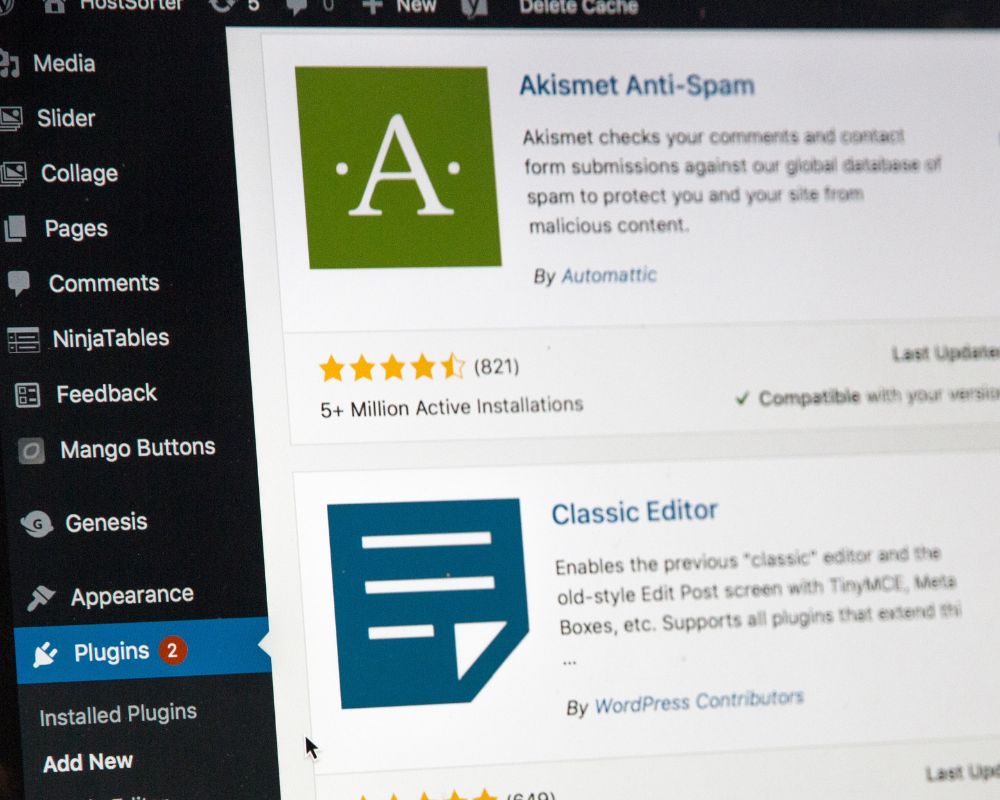
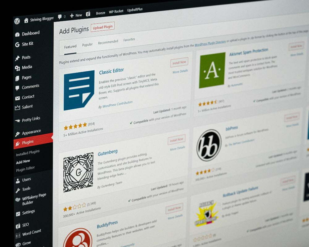
The world of WordPress is overflowing with possibilities, offering over 60,000 plugins to transform and optimise your website. Yet, with such an abundance of choices, selecting the right plugins can be overwhelming. This is why our specialists at Yellowball assist businesses just like yours to install plugins for SEO, Social Media, Backup and Speed, as well as ones to assist in running your business.

If you're wondering "Do WordPress sites need maintenance?", then you should know that they certainly do, much like any other website. Neglecting this crucial task can lead to security vulnerabilities, technical glitches, and a decline in overall performance.

White label web design refers to a practice in which one company offers web development and design services to another company, which then rebrands and resells those services as its own. This collaborative approach allows businesses to provide comprehensive web solutions under their own brand name without actually performing the development work themselves.
In our fast-paced digital world, website speed is paramount. If you find yourself asking, "Why is my WordPress website so slow?" you're not alone. Websites that take a really long time to load can be frustrating for both site owners and visitors as it can lead to decreased traffic, lower search engine rankings, and potentially lost revenue.

When you grasp the full functionality of analytics tools, such as GA4, you can truly harness the power of data. When compared to the previous version, there's a marked difference in its unique features and capabilities, so it's important to be aware of this new and improved version.

Terminology helps people to sum up complex ideas in a word, a few words, or an acronym. But if you're just getting used to a new field, it can be baffling. Your CMS will be very important to your business’s website - and for many businesses, that website is among their top ways of informing the public about what they do and gaining new customers. So, what is a content management system? Once you’ve read this article, you’ll be ready to use the term “CMS” with confidence. Here are the basics.

Updating your website so that it doesn’t start looking dated or off-brand doesn’t necessarily mean that you have to undertake a site migration. In general, that’s pretty good news because it won’t affect all the hard work you put into Search Engine Optimisation (SEO). But when you do need to migrate, a careful SEO site migration process can help you to retain those precious search engine rankings.

Interested in responsive web design? Let’s begin at the beginning by looking at what responsive web design is before getting into some of the basics you’ll need to achieve a responsive website.

It’s not a mistake to think that keywords and content are important to your search engine optimisation (SEO) strategy, but technical SEO matters too. So, what is technical SEO and just how “technical” can it be? Like so many other things in life, it’s easy when you know how, so let’s go through some of the basics you’ll need to cover to perfect your SEO strategy.

You decided it was time your business had its own website. After all, everyone wants to take a look at one’s website nowadays, and websites are also a great way to attract customers who might not otherwise have found your business. You might even attract customers from around the world instead of just your hometown. And, if you’re a local business, a website can help people in your area discover you by searching terms like “electricians in Notting Hill” and the like.

You did your homework, crafted an SEO strategy, and got to work creating content that you hoped would take the world by storm - or at least, make an impression. But then, your posts and pages underperformed. What should you do?

“Just another WordPress website?” It’s a statement you’re unlikely to hear, and in this article we’ll explain the benefits of using WordPress and why it can be as unique as you and your business are. And, once we’ve covered the many benefits of WordPress, we’re confident you’ll see why it’s the choice of professional website developers and businesses around the world. Let’s dive in!

Digital or online marketing promotes brands using the internet and online communication platforms. But the heart of any digital marketing campaign is the website it draws attention to. What if you could attract visitors to your website without paid social media posts, email campaigns that only reach your existing contacts, or costly web-based advertising?
Looking to build a website? You'll be in good company if you choose WordPress. Over 43 percent of websites are WordPress sites and there are very good reasons why this platform is so popular. But if you’re new to all this, you’ll want to understand what WordPress is and get an introduction to a few bits of terminology you’re bound to encounter along the way. So, without further ado, let’s get started.

Ecommerce SEO consists of a set of techniques that are used to improve your ecommerce website’s search engine rankings. When people search online for products or services like yours, they’ll usually only pay attention to the results that appear on the first page of search engine results. Since you want to get traffic to your website where you can pull out all the stops to make sales, getting that page one ranking will be among your priorities. SEO gets you there. Looking for some ecommerce SEO tips? You’ve come to the right place. Let’

You have a website, but unless search engines display it near the top of their rankings for key terms, most people will never find it. Of course, you could pay for your moment in the limelight, but most people trust organic rankings more, and to get them, you need an SEO content strategy.

You’re ready to sell your products to the world and that means having a highly attractive “storefront” on the information superhighway. That’s what an ecommerce website is and you want the best “real estate” you can secure in the world’s virtual business district.

You already know that search engine optimisation (SEO) helps your website to stand out from the crowd in search engine results. But which keywords should you target? Without good SEO keyword research, you’re taking a shot in the dark. You might target keywords that nobody uses in search, or you could err in the other direction and choose keywords for which there is so much competition that you don’t stand much chance of ranking for them. In this article, we’ll look at how to choose keywords for SEO so that you can power your website to s

When you launched your website, you had big dreams and ideas. Presumably, you didn’t get a website just for the sake of having one. You wanted to use it to persuade visitors to take some kind of action. The percentage of visitors who took that action represents your website conversion rate and it’s much more than just another number. It tells you whether you were successful in achieving the goal you set out to reach.

If you’re about to design and launch your own website for the first time or are hoping to create an updated version that matches the best in modern website design, you’ll be looking out for website design ideas. You’d like your website to be unique, but there are many design pitfalls lurking in wait for the unwary. These website design tips cover general principles that every website designer should apply. Use them to guide your decision-making as you work towards creating a website that matches the needs of the most important stakeholde

New to Search Engine Optimisation (SEO)? The term “SEO keywords” is sure to be among the first concepts you encounter. Knowing what keywords do, choosing the right ones to use, and sticking to your keyword strategy will help you to improve your website’s rankings in search engine results. It’s quite a complex area, but this introduction to SEO keywords will help you to get started.

Although old-fashioned marketing methods like print advertising still have their place, most businesses are finding that they get far more bang for their marketing buck by applying online marketing techniques. An SEO marketing strategy can pay off in a big way, but if you’re new to all of this, or even if you already have some idea of it, you may have a few questions. What is an SEO marketing strategy, and what should it consist of? Let’s get started!

You’re inspired and ready to get started on creating a new website. But before all the exciting design activities kick in, you need to get a few basics sorted out. Specifically, you need a domain name and a host. Most of us know that the domain name is the special address a website uses, for example: “yourbusiness.com.” But what is hosting, why do we need it, and what are your options?

SEO, meaning “Search Engine Optimisation” is a term that everyone who has a website should familiarise themselves with. But how does it work? Here are the basics. Search engines have a job to do. When people enter a query, they must offer relevant results. There may be hundreds or even thousands of results for a single search, so search engines attempt to rank them according to how useful they’ll be.
Having a strong SEO strategy is crucial for businesses and website owners seeking online success. Search Engine optimisation (SEO) plays a pivotal role in driving organic traffic and enhancing online visibility.

If you’ve ever worked in SEO, it’s likely there have been many instances where you’ve felt at the mercy of Google. You’re sure that you’ve done everything right, you’ve gone through Google’s guidelines with a fine toothcomb, and yet it’s almost as if Google takes some kind of sadistic pleasure in confining your website to the darkest corners of its search results. Let us start by clarifying something: Google wants you to succeed, providing that you put in the work. This can be seen in how it makes the inner workings of it

“Crawl budget” is one of those bits of jargon that most SEO specialists throw at their clients to either make a point about what content should be placed on the site – or used to reaffirm their expertise to justify a retainer renewal during an annual status review! Either way, a discussion about crawl budget can easily become overly technical or grossly over-simplified, with the results that business owners end up misunderstanding the concept or not knowing why or how it should be applied. In this article, we’re gi

For smaller businesses with limited budgets, digital marketing provides a cost-effective and high-impact means of connecting with your consumers and competing with much larger businesses. This is because many aspects of digital marketing can be managed in-house with available time and resources, or partially outsourced to supplement your own marketing team’s efforts. In this article, we’re taking a look at why Google’s Performance Planner is an essential for any business or marketing manager going this route, as well as how to get started

Depending on the size of your website, the type of SEO audit, and whether you choose a professional or DIY site audit, your costs for an SEO audit can range from the cost of the resources you allocate to the project to several thousand pounds. At Yellowball, we keep the costs of an SEO audit as reasonable as possible for our clients because we know how essential this service is to the overall success of your paid SEO services and strategy. In this article, we’ll look at the different types of SEO audit services, what the audits involve, why t

In the beginning, website hosting services were a niche offering… and then, the internet exploded. Now, the number of web hosting services is in the hundreds of thousands, each promising better client features than the next. So where should you be hosting your WordPress website? And what should you do if you need to migrate your website to a new host? Here’s why migrating your WordPress website to a new host may be the best strategic move for your organisation’s online presence. Who is WordPress? Founded in 2003 as a blogging platform,

Content is a crucial aspect of any SEO strategy and has been for quite some time, and it would be remiss to talk about content without addressing thin content. Ever since the Panda Update, the purpose of content has been providing an enriching and informative user experience rather than simply appeasing search engines. As will be explored throughout this article, content does not exist simply as a vehicle for keywords or a means to fill up space – to bulk up a website and make it look substantial. As we always say: bigger is not better…

If you want more people to come to your website, to make sure your customers find you before they find your competitors, and to make sure that traffic is ready to convert into sales, you need powerful SEO. Here are the best tips and advice from our WordPress and SEO experts to ensure that you create a WordPress website that Google can’t get enough of! Dare We Reiterate, Why SEO matters Search engine optimisation, or SEO, is the practice of aligning your website with the practices that Google uses to rank website pages in search queries. Aft

Every business needs a solid marketing strategy, especially when you don’t have access to the resources and budget that bigger organisations tend to have. Fortunately, there’s no reason why a smaller budget should hold your business back – these days, success is all about marketing strategically and intelligently rather than simply having the biggest billboard or the most expensive prime time ad slot. To make your marketing work for your business, it’s essential to get to grips with the fundamentals, which is why our marketing team in

If you are running a business and want a solid online presence, you’ve probably heard of WordPress, along with competitors like Drupal and Wix. Choosing the right content management system (CMS) for your business website is a critical decision because it will determine how your website works, how it is managed on an everyday basis, its security, how easy it is to modify, and much more. We’ve developed a useful guide to the WordPress CMS to help guide this decision, showing the features, pros and cons of this market-leading CMS. What is Word

If you are considering running a business from home, you’re not alone! The events of 2020 were a catalyst for many people when it comes to working. With the onset of remote working, businesses unable to run, and other challenges, running your own business became a much more viable and popular solution than it had been in past years. To help you out, we’ve put together a quick guide on running an online business from home, including the legalities and some tips on how an expertly designed website can help your business succeed. Defining your

While every aspect of your business’s online presence is important, the ultimate goal of your online presence is to attract potential customers and sell through your website, making it the foundation of your digital operations. Just as with a physical store, your beautiful website design needs ongoing maintenance to keep it running smoothly and drawing in new customers. Our beginner’s guide will cover all the basics of why website maintenance is necessary, what it should include on a weekly, monthly, quarterly, and annual basis, and how to

Our team of website and graphic design team has put together a guide to what makes a good website, looking at the design principles that make a website truly effective as a digital brand platform. 8 Principles of Good Website Design:A Clear Purpose Strong Visuals and Branding Simplicity Design Layout Fast Page Load Speed/Load Times Great, Relevant Content Mobile-Friendly Sites Security1 – A Clear Purpose What is it that you want your website to do? The main functions of your website will help define the design and is especially critical i

Website design is an area that’s creative and constantly evolving, bringing new and interesting ways to showcase a business online. In 2011, parallax scrolling was an emerging design trend, but by 2021, it’s become a well-established and popular way to enhance the visual impact of a website. Here’s some insight into how the parallax scrolling effect works and some stand-out examples of this visually engaging graphic design technique. What is the Parallax Scrolling Effect? This is when the website background images move at a slower pace

A website gives your business a valuable online presence – unfortunately, this visibility not only attracts clients and customers, but it can also attract cybercriminals. If you have a website for your business, it’s important to ensure its properly secured against. Security breach to keep your records and data safe, securing your business and your reputation. Are small business websites safer from security breaches? The reality is that smaller business websites are very appealing targets for cybercriminals. Attacking a large corporation ma

No matter how useful your services, how innovative your product, or how unique your business is, it’s not going to succeed unless you have one thing: happy customers. Like every industry, marketing and advertising constantly changes and evolves, from newspaper and radio ads to TV ads and billboards. Today, marketing is digital. And as with all things digital, the options are endless – to the point of becoming overwhelming. Here’s how to evolve your marketing strategy for a digital world, cutting through the flash and fervour to talk about

One of the most recent trends in the web design industry is a one-page website. In this design, rather than having different pages for different products and services, visitors can see everything they need to know about your brand and business on, well, one page. It’s a simple and elegant solution that’s understandably appealing to many small business owners, but it’s important to understand both the advantages and disadvantages of this web design option before you take the plunge. That way, you’ll be able to choose the option that work

This article will focus on how to create a website for a small business, including a step-by-step guide.

Your organisation’s website is the keystone of your digital marketing strategy; it’s the virtual storefront where you want all your clients, customers and interested parties ending up when they look for the kinds of products and services you are. It takes just 0.05 seconds for a user to form an opinion of your website that determines whether they say or go, so making a good impression online is critical. As a foundational piece of infrastructure, your website marketing strategy must be powerful, effective, and goal-orientated if you want to

“Should we continue with our affiliate programme or not?” We get asked this a lot and it’s an important question. Given that most affiliate links are provided as part of an agreement – that is, in exchange for products or services – they’re viewed as paid links by search engines. As affiliates and paid links aren’t considered ‘organic’ links, they’re not always good for your SEO. This is because Google wants SERPs to be influenced by genuine and natural connections, as opposed to those that are simply paid for. That said, de

The key to driving relevant organic traffic is understanding ‘search intent’. This means getting to grips with exactly what kind of problem the user is trying to solve. As well as this, brands must account for the ways the search engine landscape is changing. Ben Gomes, SVP of search engineering at Google, outlined in 2018 that there would be three fundamental shifts to the way we interact with search engines: From answers to journeys – problem solving is now about providing an experience, rather than simply answering a question. A

In an ideal world companies wouldn’t have to worry about link building. Perfect search engines with perfect algorithms would precisely rank content for every imaginable search. These infallibly indexed web pages would gain links naturally from other websites and we’d all sleep better at night knowing that link earning was taking care of everything. Unfortunately, this image of search utopia is not currently how things work (well, for the vast majority of websites anyway). As everyone in the SEO world is all too familiar, not all webs
My immediate reaction when I spotted that a competitor was bidding on a client brand name, was to blow the whistle and report it to Google. ‘Surely people can’t capitalise on search volumes for your brand name simply by whacking some Google ads budget on it?’ I thought. In fact, the reality is that competitors are within their rights to bid on your brand keywords.However, there are restrictions on exactly how they go about it. We’ve gone through Google’s regulations and included a straightforward rundown with some examples below,

It’s a well-worn trope. You step onto the underground and everyone is staring at their phones, transfixed. Phone screens are demanding our attention more than ever and Google knows it. In response, the search engine giant will begin to prioritise mobile-first indexing for all sites from September this year, meaning that the mobile version of your site will be more important than ever. This appears to be one of the final steps for Google switching entirely to a mobile-first index. What’s this got to do with content? Well, if you haven’t

Last week we saw a strong and often adverse reaction from the SEO community with regards to a video published by Google themselves on 26th February. The video was titled “Tips for hiring an SEO specialist”. It all centres around their 3rd tip: to get a free technical audit before making your decision and was highlighted by Danny Sullivan on Twitter. Our initial reaction was somewhat similar to others. Full audits take a considerable amount of time and as such, any free audit is likely to be automated and of no real value. Then we started in

Page speed is a hot topic for SEO in 2020. The speed of a webpage (or a whole site, for that matter) plays a significant role in conversion rates. In fact, 40% of people abandon a website that takes more than 3 seconds to load, and a 1-second delay in a page’s response reduces conversions by 7%. And page speed’s role is only going to increase. So, shaving a few milliseconds here and there off of your load time can have profound effects on your business. One method for improving page speed is lazy-loading. What is lazy-loading? Lazy-load

In 2020, SEO is vital to businesses looking to reach their audience online. Thinking about investing in SEO? Get the ball rolling by asking yourself these questions:Is your website your main source of revenue? Do you offer something unique within a crowded market? Are you trying to increase visits to your brick-and-mortar store? Are you struggling to get results using ‘traditional’ marketing channels?If the answer to any of the above is yes, you’ve got a real chance of succeeding with SEO, providing you do it well. As an SEO age

To recap we’ve now explored how to prep both teams for the scoping project and also covered the main structure of how to scope a website. Before we move on to using a SoW during the project we just wanted to pump the brakes slightly. As we’ve mentioned before, we can’t just focus on the development side of life so running with that piece of advice we’ve split this article into web design and development. We’re going to be looking at some of the larger items that you will want to cover in your scope and also some common pitfalls to loo

In this article, we’ll be discussing how to scope a website project effectively. We’ll be covering the following main points:

It’s a wonder how there are so many digital agencies. Yes, it’s a service that isn’t sector specific and as such the demand is high. But it’s not an easy sell. A lot of businesses and individuals have had bad experiences with SEO agencies and just about everyone knows/has experienced a nightmare website project. The designing and building of websites has become somewhat of a natural lifecycle. It’s something that we all have to do (some of us more than others), so let’s look at how and why scoping a website project can prevent the b

This blog is the second in a three-part series about outdated SEO tactics that you should avoid. Here, we’ll focus on content and other aspects of on-site SEO. You can read part one here, which details some common misconceptions about keyword research that people still abide, and part three will look at old link building tactics. Get ready to un-learn some archaic SEO! In our previous edition of Archaic SEO, we looked at some outdated concepts and tactics that still plague the use of keywords. Hopefully (if we are doing our jobs well

This blog is the first in a three-part series about outdated SEO tactics that should be avoided. Here, we’ll focus on the use of keywords. Part two looks at outdated concepts in the world of content, while part three concerns link building. Get ready to un-learn some archaic SEO! In the world of SEO, applying outdated tactics or operating on the basis of disproven concepts could potentially be damaging, if not fatal for the online presence of a business. Google are constantly fighting against sneaky strategies that aim to manip

Google is a speed demon. Ever since the beginning of Chrome, Google has placed importance on how fast websites load, seeing it as a fundamental component in user experience. Since then, speed has become a key ranking factor for the search engine giant.And its impact is considerable. Over a decade ago, Amazon concluded that its sales would decrease by 1% for every 100ms delay in response time on their site – that amounted to a cool $245 million over the course of a year. Clearly this sum would be in the billions today! The world has only g
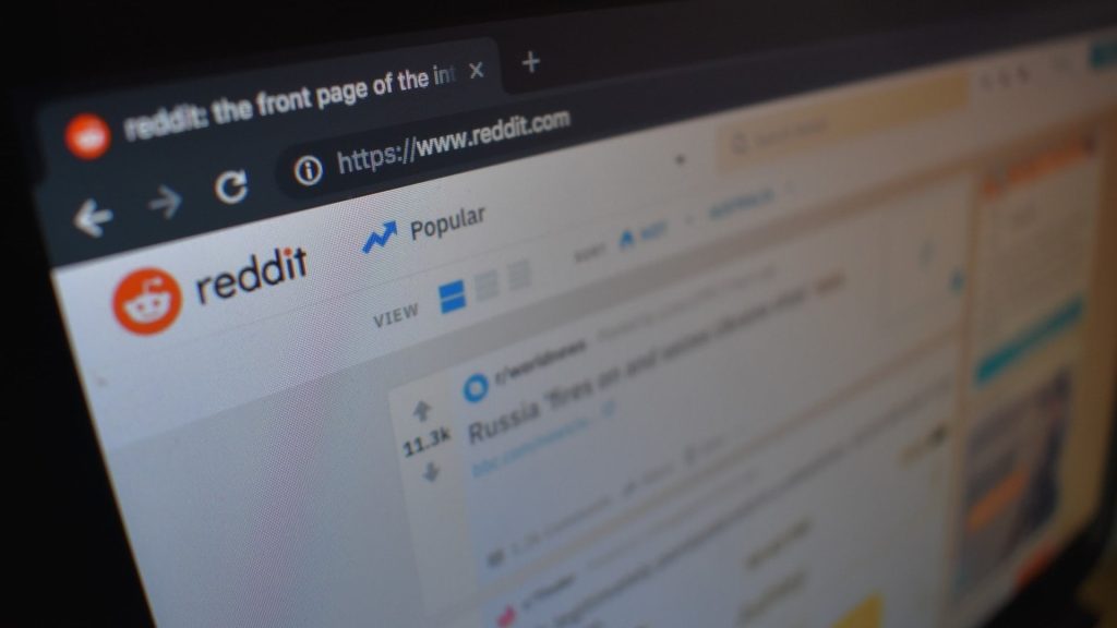
If you think this sounds a little random, it is. The idea was sparked by a random conversation with a complete stranger in the depths of Soho. After explaining what Yellowball did, the person in question asked whether her Reddit presence would be beneficial to SEO. Some questioning and a quick Google was followed by a, “I’m actually going to have to look into that because on the face of it I would say no…..but Reddit is huge so there may be something in it”. I originally wanted this article to be purely related to the potential SEO bene

If there is any topic that’s going to put fire in the bellies of SEOs far and wide, it’s Black Hat Vs. White Hat SEO. Whether you’re a seasoned SEO or just starting, the importance of understanding the implications and techniques of either approach cannot be overstated. We’re going to take a look at the differences between White Hat and Black Hat SEO, the techniques you’ll want to adopt and the ones you’ll want to drop like a hot potato. With the additional help of our handy blog and glossary, you’ll be soaring to the dizzying hei

Every company, regardless of their industry or size, will need to perform a site audit on its website at least once in it’s lifetime. You’d be amazed how quickly websites become dated and fall out of pace with the latest best practices in website design, user experience and search performance. A site audit helps to ensure that your site is working at its optimum. Different digital marketing agencies have different ideas of how frequently you should be undertaking a site audit. Really, it varies from site to site. For smaller website

For companies looking to revitalise their brand, a new website has many benefits. However, relaunching or ‘migrating’ a website will always have some form of impact on search engine rankings. In this article, we will advise on site migration best practice. This will hopefully help organisations create a foolproof website migration SEO checklist. What is a website migration? The term ‘website migration’ encompasses any large-scale changes that may influence SEO performance. Examples include:Changes to design, site structure, and navig

It’s not an understatement to say that Apple App Store and Google Play are two of the most important marketplaces in the world. There are around 1.83 million apps on the Apple App Store and over 2 million apps on Google Play Store with 5.11 billion mobile users in the world using these apps. Not only are apps on the increase in terms of number and users, they are also quickly increasing into a highly profitable revenue source. In 2018, the global mobile app revenues amounted to over $365 billion US dollars, forecasted to increase to $935 bill

On 3rd of September 2019, our Head of Design and Managing Director held a talk at AutumnFair 2019 in regards to “Building an E-Commerce Website that Works for You and Your Customers”. Having had such a positive response from those at the talk, we thought we’d transcribe the talk to share with the world. Without further adieu, here’s a number of useful tips for e-commerce sites, from improving an existing site, all the way through to designing and building a website bespoke, from scratch. The process of developing an e-commerce websi

As SEOs, it’s our goal to make sure that we’re doing everything we can to improve your website’s rankings and get it seen by the right people at the right time. It’s also our responsibility to make sure that we’re doing so in the most ethical and effective ways possible. This means abiding by the guidelines set out by Google’s Webmaster Guidelines. The basic principles outlined in these guidelines are: Make pages primarily for users, not for search engines. Don’t deceive your users. Avoid tricks intended to improve search e

Have you ever designed an interface or website and spent hours selecting the perfect font for your UI to find that as soon as your XD or Sketch designs are developed into a coded website, your ever so carefully selected font now looks a lot different on a web browser? Often the main issue as web designers we find is the font increases in weight. This can be a very frustrating realisation and can result in a website that you’re not completely happy with or more time spent finding a compatible font. Why do fonts render differently inside a brow

Video marketing has been increasing in popularity ever since YouTube started to rise to fame. Optimising your YouTube channel and videos as part of your digital marketing strategy is key to ensuring the success and ROI of these marketing tools. However, knowing where to begin is not always easy. If you use our simple guide to YouTube Optimisation, you’ll be shooting to the dizzying heights of the YouTube search pages in no time! Conduct Keyword Research Before doing anything else, the top priority for YouTube SEO is keyword research. There ar

QUESTIONS How much experience do you have? Determining how much experience your new SEO agency has is a key factor in deciding whether or not to hire them. Whilst everyone has to start somewhere if the person/team running your SEO has minimal experience in SEO, previous employment or otherwise, it simply does not bode well for the success of your campaign. How do you measure the success of a campaign? Any SEO agency worth their salt should have appropriate and effective KPIs in place to ensure that your campaign is on the right track. For examp

Setting foot into the world of opening your own Shopify shop is an exciting time for any new entrepreneur. However, it’s important to make sure that it’s the right thing for you and that you have all of the facts and information before diving into your new business venture. So without further adieu, let’s get down to brass tacks. Pros Usability Shopify’s ease of use for businesses and consumers alike makes it an attractive solution to an often complicated problem – eCommerce. When setting up an online store the more that can be au

A picture’s a picture, right? Not when it comes to web design and SEO. Believe it or not, image optimisation has a dramatic effect on your website’s SEO. So dramatic, in fact that we wrote an entire blog on it! Each file type has its own benefits, drawbacks and have their purpose. So, what’s the difference between PNG and JPEG? GIF and SVG? A Picture’s worth a thousand words (or 1,091)... Before we dive into the ins and outs of image file types, we’ve created this handy infographic for you to download, share with co-workers or frien

Visual Hierarchy (VH) is the design principle that outlines the order in which a user of any given website interacts with and processes information on a page. By manipulating elements of a website to have a clearer hierarchy and designing a site effectively around this principle, designers can influence the importance that users perceive information across the website to have. You can guide your user’s eyes around through your website, focusing on CTAs and integral pieces of information. The 8 elements of Visual Hierarchy are:Positioning Si

Before you get too deep into this article, we advise you to first read our post on whether featured snippets are worth it for SEO, if you haven’t already. It sets the scene for the items we’ll be covering here, providing some background before we get into the more juicy ‘how-tos’ of this post. We’ll be expanding on how to identify the correct snippets to go after, as well as providing some tips on how to structure your content in order to get yourself featured. Why should you target featured snippets? Over the last 10 years, Google ha

What is this new button? Google has added a new feature – the “Request a Quote” button. This button enables searchers to directly request a quote for your services, directly from the SERPs. It’s there to be more seamless, reduce friction between users searching for your business, and answers the no.1 question – “What will cost?”. So, what does this button mean for your SEO, and how do you get it? How do I get Google’s request a quote button? The only way to get the feature is to turn on the messaging feature in Google My

There has been great outcry from industries that are seemingly under attack from the Big G. The search engine is constantly improving their service for searchers, offering flight comparison, job boards, books and more. This is all well and good for the users that make up 3.5 billion searches a day. However, it can be detrimental for platforms that have built their businesses on providing this service. But are Google really stealing traffic from publishers? As we discussed in our post on featured snippets, Google claim to be conscious of their p

Once upon a time, SEO was solely focussed on getting to that number one position for high value search terms. The SERPs were linear and the goal was clear. To an extent this is still the case. Ranking at the top of the SERPs for your most prominent keywords can be incredibly lucrative. However, the SERPs are continually growing in complexity. Our analytics capabilities are getting stronger and stronger. Even the way in which we use search engines has changed dramatically. Remember this clip from College Humor? Notice anything different? We now

Maybe you have one website and all your content is in English, but you’ve realised that you have a lot of customers visiting your site from China. Or maybe you are expanding your services beyond your native country’s borders, and want to target English-speakers worldwide, and not just in England or America. When you are looking to implement SEO for a multi-language website, you’ll need to look into language targeting. Language targeting is when you market your services or products towards users across the globe who all speak the same la

You’ve made the decision. You’ve started looking beyond your own borders and want to start selling your service or products to customers abroad as well as domestically. But how do you get your website ready for international expansion, and how do you make sure it’s SEO optimised for targeting users in multiple countries? When it comes to implementing country-specific SEO, country targeting is the best option available to you. Country targeting is when you market your services and products specifically towards audiences in more than one co

What is Image Optimisation? Image optimisation is the process of adjusting aspects of the imagery that is used across your website. It helps you achieve the perfect balance between quality and readability for humans and robots alike and is a key part of SEO. Factors such as the file size of your image, the file type (JPEG, GIF, PNG) and even the thumbnails in your site can all have an effect on the load speed of your website, and therefore your SERPs (search engine results pages) rankings. So, what does optimising your imagery entail? Let’s t

Expanding into new markets is a thrilling time for any business, but it can also be a risky one. You’re moving up in the world, moving into new, uncharted markets (at least by you) and are eager to make the most out of the exciting opportunities that they offer. However, there’s also the risk that it won’t pan out. When you decide that you want go international with your website, it’s an all or nothing scenario. You can’t dip your toe in the water when it comes to making changes to your website to best target your new audiences. Y

No, you haven’t hit your head and ended up back in 2007. Custom cursors are back like they never left and they’re the latest accoutrement to website UI/UX worldwide. These aren’t the gimmicky space invaders and sparkling unicorns of yester-year. The latest generation of custom cursors are sleek, sexy and designed with the user in mind… for the most part. Are they worth it? As with everything, it’s not necessarily the product - it’s how it’s made. Similar to the iPhone/Android debate, whilst some people love the physical desi

Investing the time, energy and resources into a beautiful website without also investing in SEO, is like buying a new car and not buying petrol. It’ll sit on your driveway looking pretty, but it’s not going to get you anywhere. However, entering the world of SEO, how it works, and trying to make a decision about the best route forward for you and your business can seem like a mind-boggling task. We’ve taken stock of what’s out there and the different SEO solutions that are available. We’ve put together a comprehensive, transparent pro

Let’s get one thing straight. The Yoast SEO plug-in is one of, if not the most popular SEO plugin for WordPress websites. It’s been around since 2008. It has over 5 million installations and at the time of writing, a 4.9 out of 5 rating from over 26,000 reviews on WordPress.org. It’s really useful. We use it at Yellowball on a lot of our clients’ websites. The plugin allows webmasters to update meta data with consummate ease. We’d highly recommend using it! However, there are some common misconceptions around Yoast’s SEO and readabi

The concept of performance based SEO campaigns is simple. Formerly known as ‘Pay for Rankings’ campaigns, they’re based upon the agency being paid only as and when they deliver results (or a substantial amount of monthly fees withheld until results are produced). Awesome! If agencies are so confident in their SEO abilities, surely they would be happy to put their money where their mouths are? On the surface of it, yes. It looks great and believe me, as an agency, if we could make it work it would make our lives a hell of a lot easier when

Reviewing our SEO predictions of 2018 At the end of each year, it’s become somewhat of a tradition for agencies to compile their SEO predictions for the following year. Back in January, we thought we’d look ahead as well! However, not many of these websites actually look into how accurate their predictions turned out to be. Considering the year is now coming to end, we thought it would be a good idea to see how well our SEO predictions played out throughout 2018. Continued rise of AI 2018 saw Google make some serious advancements in art

There are 3 main options to consider when building a website from scratch, including:Free website builders Bringing in a designer to amend a template Bespoke website designDiscover more about these three options and the advantages and disadvantages of each choice in this article. You might have a website, but either now or in the future it’s going to need a new lick of paint. Or it might be that your business is wanting to rebrand and you need a website to suit its new look. Or the management are in agreement that a new website is imp
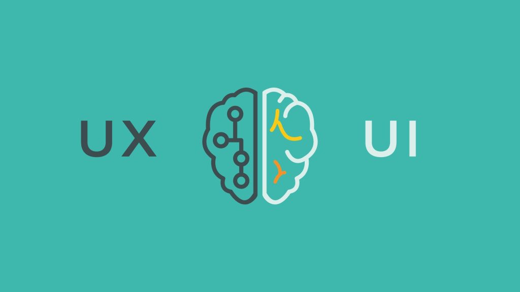
UX and UI are both terms that are bandied around a lot, but there is often confusion as to what the difference is. There are important differences between the two, but they are becoming increasingly inter-mingled, as it is very tricky to have one without the other. This guide will outline the key differences and some of the history and theory of UX and UI design. The Basics UI (USER INTERFACE) UI, or User Interface, is the surface look of a website and UI designers aim to maximise the usability and efficiency of a website. They will take

When we think of Google and how it can impact our businesses, or our clients’ bottom line, two main areas come to mind: AdWords and SEO. AdWords being Google’s ads that dominate the top spots and represent their cha-ching machine, while SEO is the process of optimising your website and content to increase organic rankings naturally, over time (as you are probably totally aware of). AdWords is hugely popular, first and foremost because it is instant; once set up, your ads (and website) are on Google’s first pages. Secondly, it’s tang
Understanding how SEO works is meaningless if you do not also understand if it’s working. Marketers and businesses should always pay close attention to the effects of their SEO work in order to perfect their approach and drive valuable results. This is where metrics come in. Yes, they may seem boring at first, kind of like Times New Roman or Morrissey fans. But trust us, SEO reporting metrics are your friends. They help us understand the impact of our efforts. But how exactly should you go about effectively measuring the success of an SEO cam

When you hear people talk about search engine optimisation you are most likely going to hear them talk about content and links. It’s no surprise considering that Google themselves have said that content and links are two of the three most important ranking factors (Rankbrain being the third). However, whilst these three may well garner the most attention, you are also likely to hear that there are ‘over 200 factors’ that influence a website’s ability to rank in the SERPs. These can range from title tags to preparing for Google’s upcom

At its core, SEO is the practice of increasing a website’s ability to rank at the top of the search engine results pages (SERPs) for a set of target keywords, also known as ‘search terms’. In turn, this results in increased traffic to a website from search engines. There are no underhand tricks, it does not involve arcane magic or entry into a cult. Sure, granular details can get a little heavy, especially on the technical side, but we believe the core theories of search engine optimisation are easy to understand. If you only remember two

It happens all the time. You have a task that you know is going to involve something reasonably arduous. The difficulty can manifest itself in multiple forms whether that be some hard work, an investment of time or money or even just require a devotion of brain power. Your tasks may not even be that arduous, there might just be a lot of them. Whatever the reason is, the entirety of the task appears too daunting to even start. Too much to do, too complex, too little time, costs too much….all seemingly viable reasons. We see this all the time.

So you want to learn about this thing called ‘Search Engine Optimisation’… We know, it’s daunting, it’s confusing, there’s so much to learn, and there’s all sorts of SEO specific terminology. Luckily for you, we live in the age of the internet: almost anything can be self-taught using the wealth of free resources available online. But with so much available on the web, how do you even get started without getting headaches from the information overload? We’ve done some of the legwork for you by pooling together a handy list o
The layman would be forgiven for thinking that marketing was all celebrity endorsements and outrageous give away competitions. Sure there are areas of the marketing industry that capitalise on stratospheric budgets, but for those of us that aren’t on first name terms with messers Dicaprio and Pitt, we have to choose the most effective marketing channel for our clients’ needs. Disclaimer: many of us at Yellowball have devoted a lot of time to becoming experts in the world of search engine optimisation so we hold our hands up…we are pro

By its very nature, search engine optimisation is about increasing your website’s ability to rank for given search terms, which in turn should result in more conversions from the search engine results pages (SERPs). No wonder then that for a long time the primary focus of SEO campaigns has been on getting people to rank higher for their ‘target keywords’. The problem is that a blinkered focus on keyword rankings, especially if it is on a handful of ‘money keywords’ is a not a true measure of success. It can also lead you into some fun

Content first design. It’s pretty much what it says on the tin. Creating your website’s main messaging and content before starting the design process.As designers we can completely understand the urge to charge ahead and kick start the design process. The content stage can often be far more time consuming and complex than you might initially think and usually requires the most investment from your end. When you have just signed off to start a website design project, to hold off on seeing the actual designs seems deflating after the init
Does Google take into account how people interact with your site when deciding to rank your website in their search results? A subject somewhat shrouded in mystery and confusing literature – leaving people unsure as to whether user and usage data is a ranking factor for SEO. Regardless of whether you read the evidence we have gathered below, along with some more speculative theories…improving user experience and flow through your website should be important to you regardless of whether or not it has an effect on SEO. Concentrating o

As web interfaces continue to evolve, it is becoming increasingly important not to get distracted from the main purpose of a site: to deliver a message. In order for this message to successfully reach your audience, the website needs to be easy to use – intuitive, with good information architecture and (preferably) beautiful. As the web has evolved, it has become an alternative world – a new “dimension” where we while away hours upon hours. Crucially, the web is all-inclusive and accessible. Therefore one factor we must not forg

A beautifully designed website with well-constructed copy will be undermined if the accompanying imagery is not high quality. Impressive imagery will engage the user, instigating authenticity and professionalism. Furthermore, studies show that visuals are not only processed 60,000 times faster than text by the brain but they also transmit significantly more information. Therefore, the right imagery improves the user experience, allowing visitors to navigate your site with ease and enjoyment. As a result, they are less likely to become frustrate

In 2019, Google enabled Mobile first indexing by default for all new websites. Mobile accounts for approximately half of web traffic worldwide! In Q4 of 2023, mobile devices accounted for 58.67% of global web traffic.

The confusing world of undefined metrics The SEO world has traditionally been thought of as the darker corners of the marketing ecosystem, full of hard ‘dark arts’ and terminology. Sure it takes a little time to get your head around all of the various factors involved and the terminology can be overwhelming but at Yellowball we love to provide clarity on the subject. So here we are again, this time looking at the overarching SEO metrics available to you. Which ones are important, which ones are redundant and should you pay attention to them

Minimalist design is everywhere. As a trend, it has been around for a long time with varying levels of popularity. While there are plenty of examples of early minimalism, its current form dates from the post-war era especially, such as Architect Ludwig Mies van der Rohe’s infamous “Less is more” quote. It is characterised by a complete focus on what is valuable and essential to the user, minimising or stripping away any unnecessary distractions.

Impressions, clicks, CTR, queries, position, bounce rate, time on page. These are just a few examples of the overarching data that you can derive from Google Analytics and Google’s Search Console (formerly known as Webmaster Tools). It can all get rather confusing, especially when they all have their own merits for understanding the success of an SEO campaign. We wanted to deep dive into how you can improve your website’s appearance in search, therefore improving click-through rates from search engine results pages. High CTR = More Traffic

Branding is one of the most fundamental aspects of your business to get right. It is the appearance of your business, it is your reputation and it is the beating heart of your organisation. Yet so many companies fall short of seeing the importance of a strong brand, or how to go about creating one. ‘Branding’ is a word that’s thrown about a lot, but what does it actually mean and what does it encompass? Essentially, a brand is people’s perception of a company, from their customer service and reputation to their logo and much, much more.

The old adage of ‘you get what you pay for’ rings true for the majority of industries and SEO is certainly no different. There are a multitude of companies and lone wolves offering cheap SEO services with grand promises of first page rankings and fast. In reality, the only way to achieve such a promise is by employing suspect black-hat techniques, which can land you in big trouble with the Overlord Google. With cheap SEO your risk profile for penalties and ultimately ending up in a worse position than when you started increases substantiall

You may have noticed (well, we hope you have!) that we recently launched our shiny new website. We are absolutely delighted with the result and the response it has gained so far. Nevertheless, it has not been without its stresses and it is easy to underestimate the scale of such a task.The launch of a website is far more intricate than a beautiful new look and cool new features - there are a whole myriad of elements and issues to consider. As SEO experts, we also understand the importance of transferring any previous ranking authority over

Get to the top of a super competitive feed With a myriad of businesses all vying for the top spot in the Facebook news feed, it has never been more important to pay close attention to the organic reach of your posts. Facebook is a powerful marketing tool for businesses but competition for visibility in the news feed is constantly increasing; it is all too easy for posts to get lost in the depths of the ever overpopulated news feed. Businesses must step up their game in order to give their stories the best possible chance of featuring prominent

Information Architecture (IA) is the method of structuring and organising content. The term is used in a variety of industries but as you might expect we are referring to it in the context of websites. Just like the foundations of a building, information architecture is the essential building blocks of a website. Without it, the rest of the site could fall apart. Despite this, IA can be an underestimated part of the web design process. Furthermore, often it is wrongly based on opinion alone, as opposed to careful research and planning. The aim

Last week saw the bold release of Instagram Stories. Users can now share a string of photos and videos edited with drawings and captions that last for 10 seconds and self-destruct after 24 hours. Sound familiar? Familiar may not be a strong enough word. Rather, it seems more like blatant plagiarism of Snapchat’s most popular feature, reflected in their brazen choice to even use the same name. Nevertheless, the decision to introduce this new feature in such an unabashed manner seems to be a tactical move from Instagram. They want their users

User experience (UX) is used to describe the way a person feels when interacting with a system. In a modern context, the term is most commonly applied with regards to a person’s experience with a website, web application or digital software. The aim of UX is to provide a high level of usability and satisfaction in order to establish an overall refined and exemplary experience for the user. The aim of this blog series is to consider the various factors that play into the broad topic of UX design. In this first post of the series, we will discu
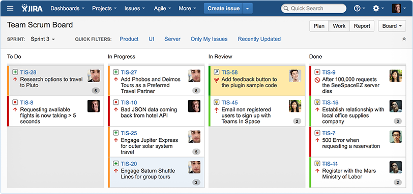
Yellowball have successfully planned, designed, developed and launched hundreds of successful web projects in the last few years. This experience has given us a unique insight into the best and most effective ways to manage and oversee the successful delivery of projects for our clients. To achieve this, we deploy a range of project management methodologies for website design and development, depending on the requirements, complexity and time scale of each project. One methodology that is becoming increasingly successful is agile. What is agil

I’ve spoken to many companies on this topic over the years, and it is the ones that have gained a clear understanding of how, why and where to collect data on their customers and prospects, that have become highly successful. The general opinion is that no lead-generating marketing campaign can be successful without high quality data. So, I thought I’d share with you what I felt seemed to be a consensus amongst all these data conscious businesses. Let’s start off with the how… All businesses should use a CRM (client relationship ma

How users perceive a website is paramount to its success; does it give them value? Is it easy to use? Is it enjoyable to use? These questions run through their subconscious as they interact with the web. If the answers are positive to these then it is likely that they’ll be converted into a regular user. Here we want to share with you some expert tips to User Experience (UX) driven design. You have probably guessed that User Experience (UX) is essentially how a person feels when interacting with a website, application or piece of software. Th
The new Google update, dubbed #mobilegeddon has turbocharged conversations around the need to be ‘mobile friendly’. Although we would certainly not argue against the importance of being mobile friendly in order to appear on mobile Google searches (it is very, very important), in actual fact only the top 5-8 results on Google get any meaningful traffic from the search engine. So if your website does not rank on Google’s mobile search results, do you need to invest in a mobile friendly site? Let’s weigh up the pros and cons, as well a
At Yellowball we have seen direct results from the email marketing campaigns that we have managed for ourselves and for our clients. Email still represents a platform on which we spend a considerable amount of time, especially during working hours. Combine this with smartphones and email marketing can be an incredibly effective strategy. Here are our top 6 tips to running a successful campaign: 1. Utilise the gatekeeper Let’s face it, opening emails that are obviously sent out en masse is not particularly high on our daily ‘to do’ list.
Search Engine Optimisation can be a tricky business at the best of times. With over 200 factors to take into account it is all too easy to get distracted and miss out a few crucial first steps. The result? You can spend weeks, if not months, working on your site only to gain no more visibility on the search engines than you did previously. Fear not though, not only will a lot of your efforts be beneficial in the long run (except for the in the case of the last point in this article), but we at Yellowball have put together a list of easy-to-make
Award-winning bespoke websites
Audits & end-to-end campaigns
We're an official Google partner
Experience across every format
Award-winning bespoke websites

Yellowball’s expert web design teams have over a decade of experience across every imaginable style, scope and format for brands and businesses of every shape and size. With our extensive web portfolio and 70+ five-star reviews, we’re your perfect web design partner.
Audits & end-to-end campaigns

We’re one of London’s leading SEO agencies. We’ll help you increase visibility, traffic, conversions and sales through best-in-class SEO strategies. Need help growing your traffic and conversions through organic search? Ask about our SEO audits and fully managed campaigns.
We're an official Google partner

As an official Google partner, our PPC team are trusted by clients everywhere to increase revenue, visibility, leads and conversions online by expertly managing and optimising your paid search spend. Whether you have existing campaigns or you’re starting from scratch, we can help.
Experience across every format

Yellowball’s award-winning team of designers work with passion and razor-sharp commercial focus on and offline across every format for brands and business of every shape and size. From branding and visual identity, to pitch decks, social assets, magazine design and everything in between.
Yellowball’s award-winning team of designers work with passion and razor-sharp commercial focus on and offline across every format for brands and business of every shape and size. From branding and visual identity, to pitch decks, social assets, magazine design and everything in between.


